Your living room looks fine. It’s clean, it’s decorated, it has a couch and a coffee table and a rug. So why do guests always seem to drift toward the door before the night really gets going? The answer almost never has anything to do with cleanliness. It has everything to do with a handful of quiet design signals that tell people, at a subconscious level, that this room wasn’t built for them to stay in.
Interior designers flag these same mistakes over and over – and homeowners almost never see them coming. Some of these will make you glance across your room mid-read. A few might genuinely sting. The last one is the silent killer that’s probably been draining your gatherings for years.
#16 – Furniture Shoved Against Every Wall
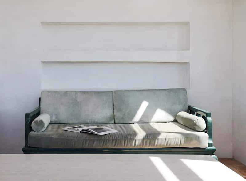
Pushing everything back toward the walls feels like smart space management. It almost always creates the opposite of what you want. Designers have called this one of the most universal layout mistakes in American homes – lining every piece against the perimeter doesn’t open the room up, it turns it into a waiting room. Guests sit far apart, staring across a vast empty center, and the whole space feels stiff and weirdly formal before anyone’s even said hello.
The fix costs nothing. Pull your main sofa just 18 inches off the wall and float at least one key piece toward the center of the room. That single move changes the entire energy – suddenly there’s a defined gathering zone, a place where conversation has somewhere to happen. A room where furniture hugs the walls is a room where people hug their coats and count down to a polite exit.
At a Glance
- Furniture against all walls creates a disconnected, “waiting room” feel
- Floating your sofa just 18 inches forward defines a real gathering zone
- Designers consistently rank wall-hugging layouts as one of the top U.S. living room mistakes
- A centered rug anchoring floated furniture pulls the whole arrangement together visually
#15 – No Surface Within Arm’s Reach of Every Seat
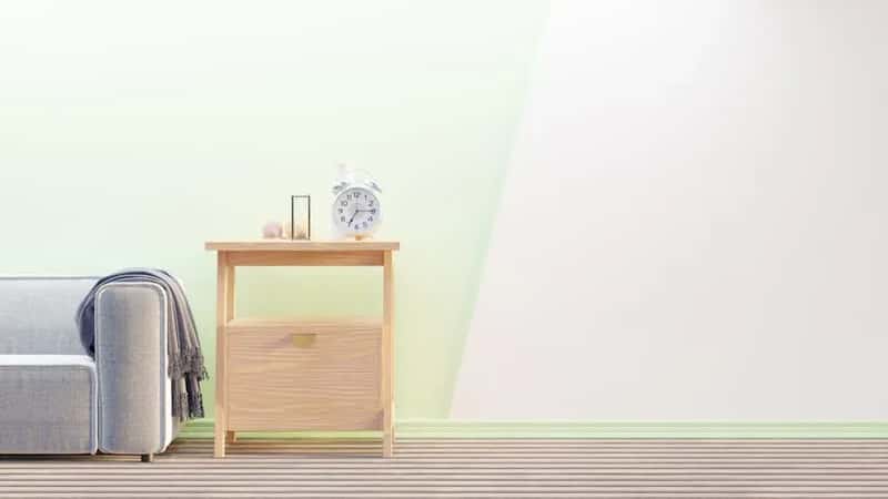
Guests shouldn’t have to balance a drink on their knee for two hours. But in countless living rooms, that’s exactly what happens – beautiful seating, zero side tables, no obvious spot to rest a glass or set down a phone. People feel this in their bodies before they can name it. They’re shifting around, holding their drink awkwardly, and somewhere in the back of their brain a quiet timer starts running.
Every seat in your living room needs a surface within arm’s reach – a side table, a small stool, an ottoman with a tray on top. This is one of those details that looks minor on a floor plan and feels enormous in real life. A room that doesn’t accommodate the most basic physical comfort isn’t really designed for guests. It’s designed for a furniture catalog photo shoot.
#14 – Curtains Hung Too Low or Cut Too Short
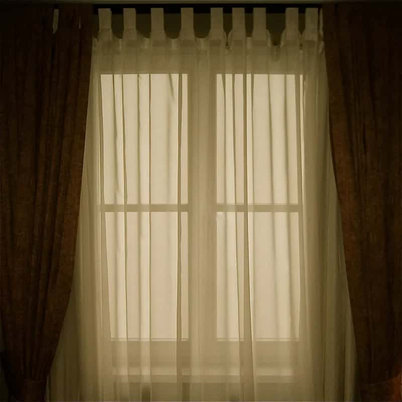
Short curtains are one of those mistakes that registers the moment a guest walks in, even when they couldn’t explain what’s bothering them. Curtains that hover awkwardly above the floor – or worse, that are mounted directly on the window frame – compress the entire room visually. The ceiling feels lower, the walls feel shorter, and the whole space takes on a cramped, unfinished quality that no amount of good furniture can overcome.
The rule is simple: hang the rod high – ideally a few inches below the ceiling – and let the curtains fall all the way to the floor. That one adjustment elongates the walls, makes the ceiling feel taller, and gives the room the kind of polished, intentional quality that makes guests feel like they’re somewhere worth staying. Short curtains whisper “amateur.” Floor-length ones whisper “come in, get comfortable.”
#13 – One Harsh Overhead Light Doing All the Work

A single overhead fixture blasting down on the room is a design problem that designers flag constantly – and guests feel viscerally without understanding why. Overhead-only lighting flattens the room, casts unflattering shadows on everyone’s faces, and creates an atmosphere that feels closer to an airport terminal than a home. The bright white glare makes people feel on display rather than at ease.
The solution is layering. Add a floor lamp in at least one corner, table lamps near the seating, and if possible, a dimmer on the overhead so you can dial it down as the evening settles in. Guests linger in warm, multi-source light. They flee from fluorescent-style glare. Lighting is the single most mood-defining element in any room, and most homes are getting it wrong in the most obvious possible way.
Quick Compare
| Lighting Setup | What Guests Feel |
|---|---|
| Single bright overhead only | On display, restless, ready to leave |
| Overhead + floor lamp | More relaxed, room feels larger |
| Layered: overhead dimmed + table lamps | Warm, at ease, lingering mood |
| Candles or accent lights added | Intimate, unhurried, genuinely comfortable |
#12 – A Rug That’s Way Too Small for the Space
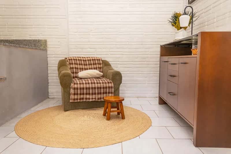
The undersized rug is one of the most widespread living room mistakes in America, and it silently makes everything else look wrong. Designer Pattie Kelly has called it out directly: “Homeowners habitually purchase rugs that are way too small for the space, either to save money or because they’re not sure what size is appropriate. This one mistake can have a giant, negative impact in the room, making it feel awkward and disjointed.” The furniture ends up looking like it’s floating on an island of bare floor.
The minimum standard: all front legs of your major furniture pieces should sit on the rug. Ideally, the entire seating arrangement fits within it. When the rug is properly scaled, the room has a sense of groundedness that guests feel the moment they walk in. When it’s too small, even an otherwise well-designed room looks like a mistake. A tiny rug doesn’t save money – it silently undermines everything around it.
Fast Facts
- An 8×10 or 9×12 rug fits most standard U.S. living rooms
- At minimum, front legs of the sofa and chairs should rest on the rug
- A 5×8 rug typically ends up floating under the coffee table only – making the room feel smaller, not larger
- “One of the worst design mistakes you can make is to use too small of a rug” – a point interior designers repeat constantly
- Leave at least 6 to 8 inches of bare floor between the rug edge and the wall
#11 – Complete Silence the Moment Guests Walk In
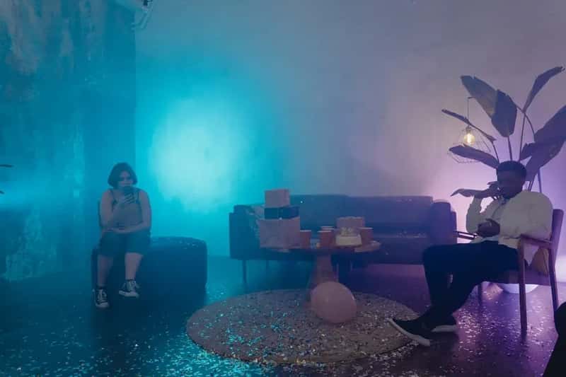
Dead silence in a social setting is more uncomfortable than most hosts realize. When there’s no background sound, every pause in conversation feels amplified – every clink of a glass, every awkward lull lands like a minor catastrophe. Guests start mentally composing their exit strategy within the first 15 minutes. The silence signals, at a low frequency, that this room isn’t quite ready for company.
A pre-made playlist at low volume fixes this completely. It doesn’t need to be loud – it just needs to exist. Background music fills the natural gaps in conversation, makes the space feel alive and hosted, and gives people something to react to. “Oh, I love this song” has launched a thousand longer conversations. A silent room closes them down before they start.
#10 – A Coffee Table That’s the Wrong Size or Placed Wrong
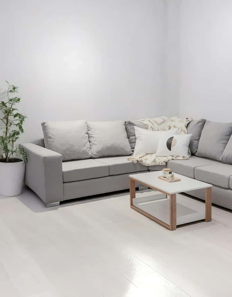
The coffee table has a lot of jobs – visual anchor, drink landing pad, leg-room determinant. When it’s wrong, guests feel it physically every time they try to sit down or stand up. A table that’s too large forces everyone to tuck their knees sideways and do a small shuffle just to reach the kitchen. A table that’s too small looks like a prop. Either way, the room sends a quiet message: this space wasn’t thought through for you.
The guideline most designers agree on: roughly two-thirds the length of your sofa, and 14 to 18 inches of clearance between the table and the nearest seat. That gives everyone comfortable leg room and easy reach without turning the seating area into an obstacle course. Comfort beats aesthetics every time. A room that’s physically easy to inhabit is one people stay in. One that isn’t sends people home with sore knees and vague excuses.
#9 – Visual Clutter That the Host Has Stopped Seeing
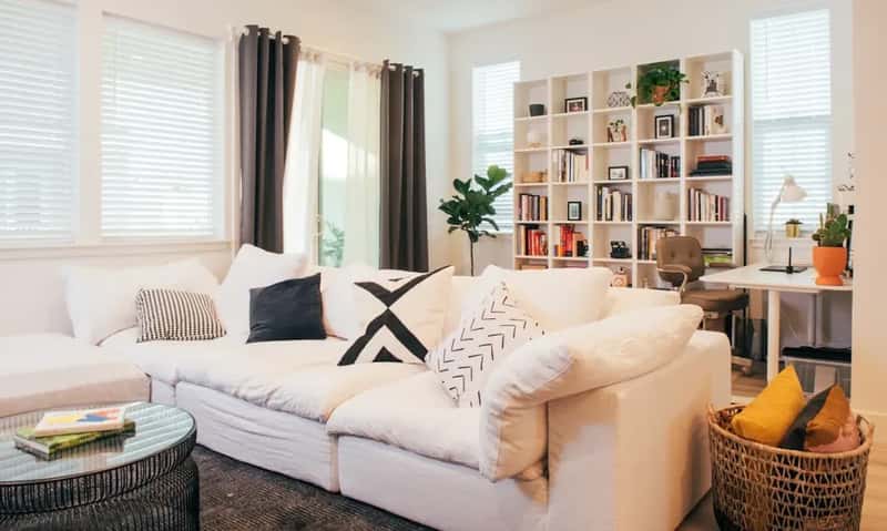
A cluttered living room isn’t just an eyesore – it registers in the brain as unfinished business, and that low-level anxiety makes people antsy. The particularly cruel part is that the host has usually gone completely nose-blind to it. The pile of mail on the side table, the nest of cords behind the TV, the collection of small decorative objects that’s grown one piece at a time over three years – guests see all of it. They can’t unsee it. And it subtly tells them this room is lived in by one person’s habits, not designed for their comfort.
Try walking in through your front door the way a guest would – fresh eyes, first impression. Or ask a brutally honest friend. Surfaces should breathe. The goal isn’t a sterile showroom; it’s enough visual calm that guests can settle in mentally without their attention being snagged in a dozen different directions. A little mess is fine. Visual chaos is a slow-acting exit signal.
Worth Knowing
- Hosts go “clutter-blind” – the pile you stopped seeing months ago is the first thing guests notice
- Designer rule: if you can’t name every object on a surface in under 5 seconds, there’s too much on it
- Cord chaos behind the TV is one of the most-cited visual annoyances in living rooms
- Walk in through your own front door with fresh eyes – the first 3 seconds reveal what guests actually see
#8 – Furniture That Turns the Room Into an Obstacle Course
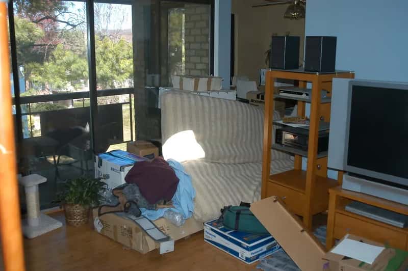
When guests have to turn sideways to squeeze between the sofa and the side table, the visit is already off to a bad start. Cramming too many pieces into a living room – oversized sectionals are the biggest offender – creates a layout that feels more like a showroom floor than a place to relax. People feel claustrophobic before they’ve even sat down, and that closed-in feeling never fully goes away, no matter how good the conversation gets.
The standard most designers recommend: at least 30 inches of clear walking space between furniture pieces for main pathways, and at least 24 inches between armchairs. If guests have to do a sideways shuffle to get from the front door to the sofa, something needs to move. Less furniture, better placed, beats more furniture crammed in every single time. A room you can move through freely feels bigger and more generous than one stuffed to the edges with seating no one can comfortably reach.
#7 – The TV Is the Undisputed King of the Room
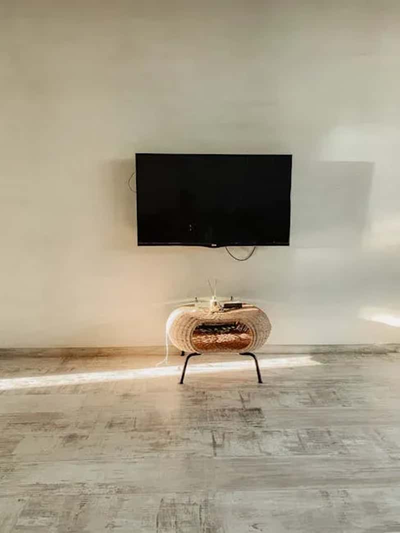
When every seat in the living room points at the television, you haven’t designed a gathering space – you’ve built a home theater. And home theaters are not places people linger and connect. The TV becomes the default focal point, conversation has to compete with whatever’s on screen, and the room subtly communicates that its real purpose is passive entertainment, not actual human interaction.
The TV should serve the room, not define it. Arrange your seating so that it promotes face-to-face interaction first, then figure out where the screen fits. Two chairs or a loveseat facing the sofa changes everything – suddenly the room has a conversation at its center, and the television is just one option, not the whole point. Guests remember the talk. They almost never remember what was on.
#6 – Not Enough Seats for Everyone in the Room
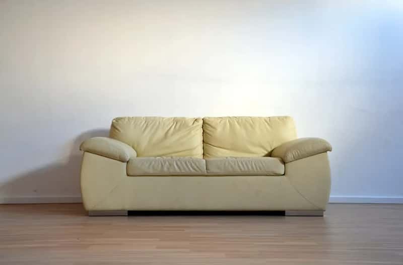
This one stings because the host usually doesn’t notice it until someone is already perching awkwardly on an armrest. When there aren’t enough seats, somebody ends up on the floor or hovering near the doorway, and the whole gathering takes on an unintentional “let’s wrap this up” energy. The hesitation at the door when guests first arrive – that three-second scan for somewhere to sit – quietly sets the tone for everything that follows.
Hosting expert Aleka Shunk puts it plainly: “Guests should never sit on the floor or be forced to stand.” The smartest solution is moveable seating – ottomans, poufs, and lightweight chairs that can be tucked away and pulled out in 30 seconds. Flexible seating says “we planned for you.” A shortage of chairs says the opposite. Guests who feel like an afterthought tend to leave like one.
Why It Stands Out
- Ottomans, poufs, and folding chairs can double your seating in under a minute
- The 3-second “seat scan” guests do at the door sets the tone for the whole visit
- Perching on armrests or standing near the doorway are both silent “we should go” cues
- Moveable seating is the highest-ROI hosting upgrade after lighting
#5 – A Sofa That’s the Wrong Size, Shape, or Comfort Level
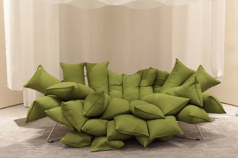
The sofa is the centerpiece of the living room, and when it’s wrong – too large, oddly shaped, or just genuinely uncomfortable – guests feel it within minutes. An oversized sofa makes the room look smaller and crowds out the breathing room that makes a space feel relaxed. A sofa that’s too deep has people sliding forward awkwardly to keep their feet on the floor. Either way, there’s a constant, low-level physical discomfort that translates directly into a shorter visit.
Be honest about how comfortable your sofa actually is. If guests are constantly shifting, adjusting pillows, or sitting on the edge, the couch is the problem. The most beautiful sofa in the world fails if nobody wants to sit on it for more than 20 minutes. When in doubt, choose the softer option – comfort is what keeps people in their seats, and discomfort is what has them quietly checking their phones and manufacturing reasons to leave.
#4 – Lighting With No Dimmer and No Mood Range

Most living rooms have exactly one lighting setting – whatever the overhead fixture decides. That’s a problem, because the mood of a gathering shifts over the course of an evening, and the lighting needs to shift with it. Operating-theater-bright light at 9 PM signals, subconsciously, that the evening should wrap up. Nobody curls up for a long conversation under lights that make everything feel like a productivity session.
Ambient lighting on tables and walls, paired with ceiling fixtures also on dimmers, provide a wash of warm, inviting light.
Designer JoryHerman
A dimmer switch is a $15 hardware store fix that might be the highest-ROI hosting upgrade you can make. There’s a reason restaurants dim the lights as the evening deepens – it signals that time is opening up, not closing down. A room that can’t get softer and warmer as the night goes on is a room that subconsciously hustles people toward the door. Give your light somewhere to go.
#3 – A Room With No Texture and Zero Warmth
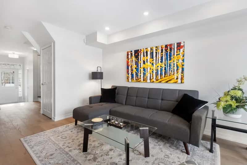
A living room where everything matches perfectly – same finish, same material, same visual weight throughout – feels staged rather than lived in. And a staged room is one nobody feels comfortable enough to truly relax in. When every surface reflects the same sheen and every fabric has the same weight, the space looks impressive in photos and feels oddly cold in person. Guests are physically present but somehow feel like they’re intruding on a display.
Mixing textures is what makes a room feel genuinely inhabited – linen against wood, a chunky knit throw over a leather cushion, a stone tray on a woven ottoman. Family photos, books with cracked spines, a real plant that isn’t perfectly symmetrical – these are the details that give guests permission to relax. Perfection repels. Warmth invites people to pour another drink and stay another hour. A room that looks like no one actually lives there will feel, to guests, like somewhere they shouldn’t get too comfortable.
#2 – Cleaning Up While Guests Are Still Mid-Sentence

Nothing ends a gathering faster than a host who starts tidying while people are still talking. Stacking plates, wiping down the kitchen counter, straightening pillows – even doing it quietly sends one loud, unmistakable message: the party is over. Guests feel it instantly. That low-grade “we’re overstaying our welcome” anxiety sets in, and within 10 minutes, coats are being located and excuses are being made.
Clear empty glasses if you have to, but save the real cleanup for after the last guest leaves. A little mess is the price of a good gathering – and it’s a price worth paying. The host who is relaxed, present, and clearly in no hurry to restore order is the host people remember fondly. Guests who felt genuinely welcomed come back. Guests who felt gently rushed out the door tend to find other plans next time.
#1 – A Layout That Makes Conversation Feel Like Physical Work
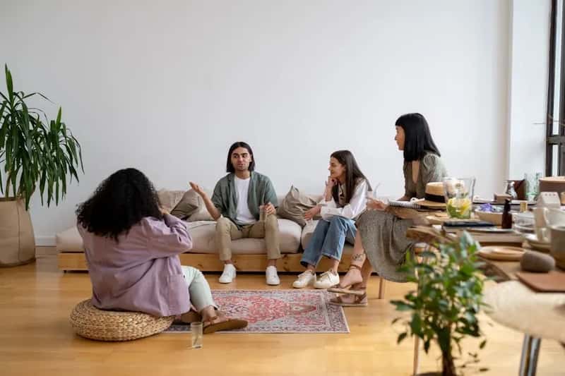
This is the one that quietly drains gatherings that should have been great. When the furniture arrangement forces people to raise their voices across a vast empty center, or to crane their necks at odd angles just to make eye contact, conversation becomes exhausting without anyone knowing why. Guests start feeling strangely drained after 45 minutes. They can’t put their finger on it. They just know they’re ready to go – and they’ll blame traffic, or an early morning, or the dog.
The entire purpose of a living room is human connection, and the layout either supports that or quietly sabotages it. Arrange seating close enough that people can lean in, lower their voices, and talk without effort. When guests can do that – when the room is built for intimacy rather than distance – they stop tracking time. They stay. That’s the whole game, and it starts with moving furniture, not buying new ones.
Fast Facts
- Ideal conversation distance between seats: roughly 8 feet or less – beyond that, people start raising their voices
- A U-shape seating arrangement (sofa + two facing chairs) is the layout designers recommend most for gatherings
- Floating furniture away from walls, even just 18 inches, measurably tightens the conversational zone
- Guests who feel conversationally at ease stay longer – the layout is doing the hosting work before you say a word
Most of these 16 mistakes cost nothing to fix. Float your furniture, layer your lighting, scale your rug, put on a low playlist before anyone arrives – these aren’t renovations, they’re decisions you can make this weekend. The rooms people never want to leave aren’t always the most expensive ones. They’re the ones that were designed, deliberately, with other people in mind. Take a fresh walk through yours and see what you’ve stopped noticing. Which one hit closest to home?