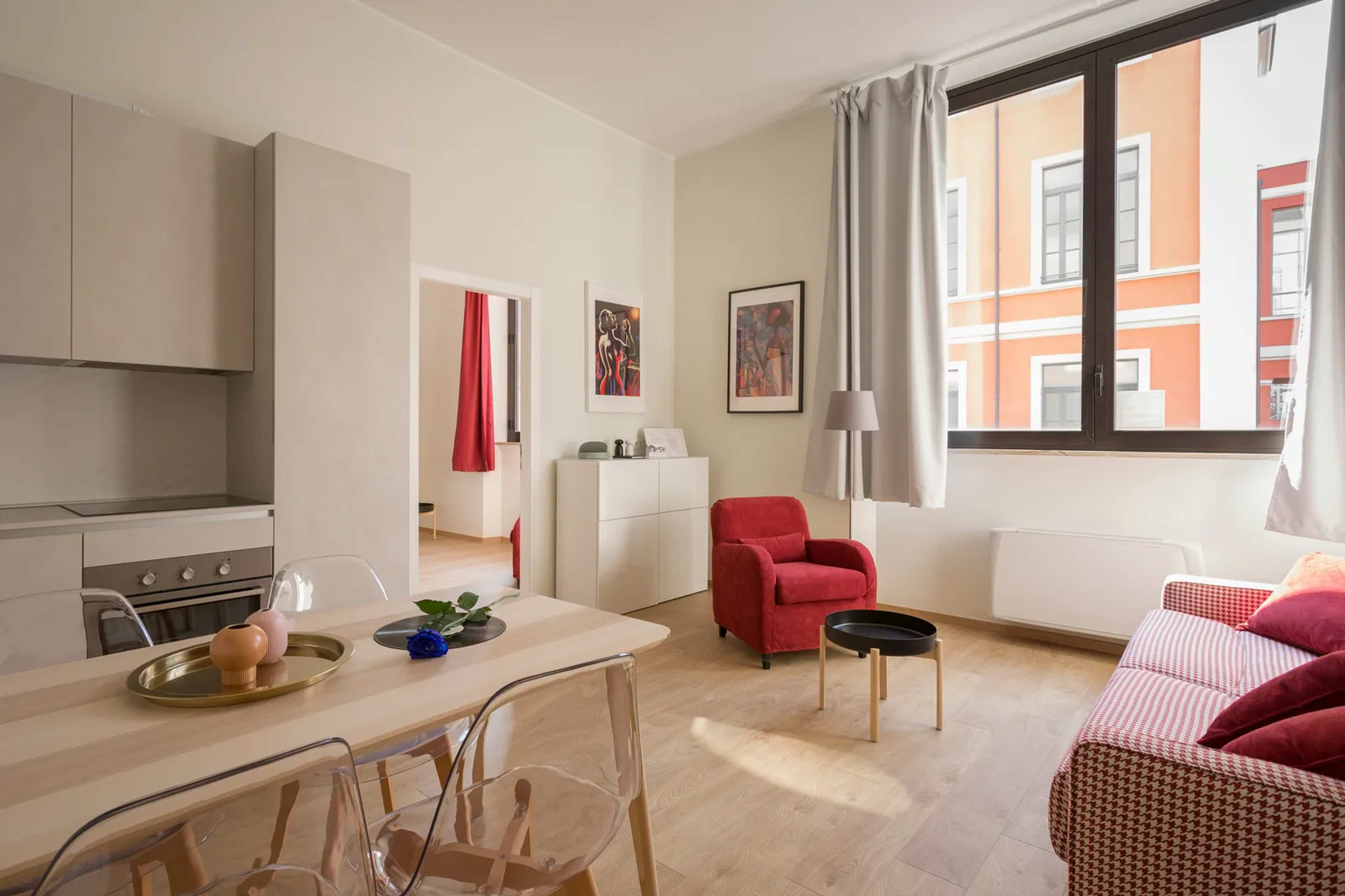
Most people assume their home looks current because they followed trends when they decorated. That’s exactly the trap. What felt fresh and modern five years ago has quietly become the thing that makes guests do a double-take the moment they walk in.
The really surprising part? Some of these trends were everywhere just a few years ago – splashed across Pinterest, HGTV, and every home renovation show in America. Chances are good that at least a few of them are sitting in your living room right now. Here’s what’s actually dating your space, counted down to the one that stings the most.
#13 – The All-Gray Everything Palette
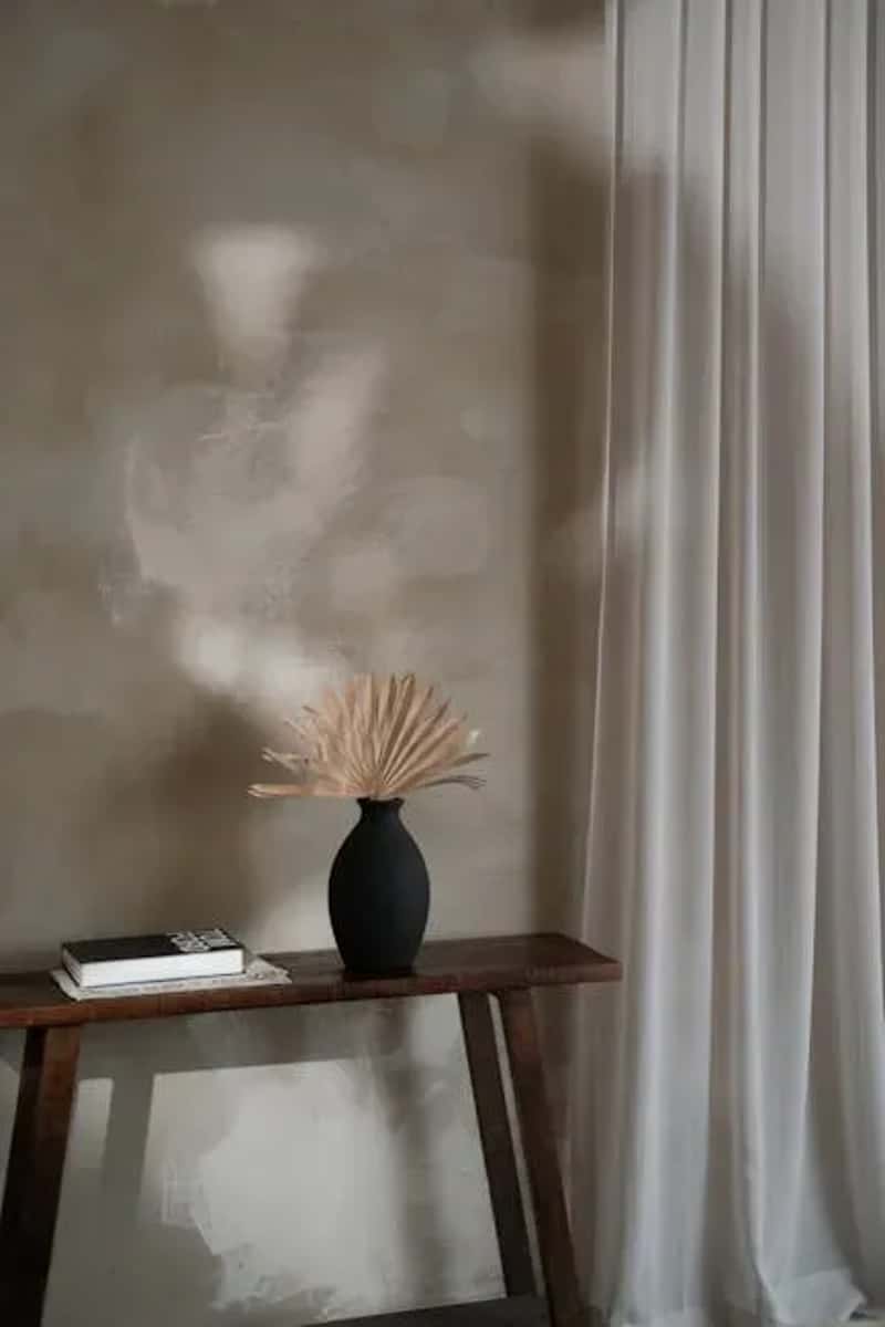
Gray walls were supposed to be the safe, sophisticated choice – and for a while, they were. TikTok creators have since coined the look “Millennial Gray” to describe how an entire generation color-drenched their homes in the same cool, noncommittal hue as a rebellion against the warm tones of the ’90s. Once a color becomes a generational punchline, it’s almost impossible to rescue it. The safe, neutral gray palette that dominated the 2010s has lost its grip on interiors – and what once felt sleek now reads as timid and lacking imagination.
It’s not just the walls, either. Gray floors look unnatural – the color barely exists in nature – and they drain the warmth right out of a room. The fix doesn’t have to be drastic. Warmer off-whites, earthy taupes, and soft clay tones are replacing gray-on-gray across the board. The word designers say they hear most from clients right now is “warmth” – a wholesale shift from cool whites and grays to tans, beiges, and creams. If your walls are still Agreeable Gray or Repose Gray, the clock is ticking.
At a Glance
- “Millennial Gray” is now a design-world punchline – same category as avocado green in its day
- Gray floors are widely criticized for looking unnatural and cold underfoot
- Replacement picks: warm off-whites, earthy taupes, soft clay, and creamy linen tones
#12 – Mass-Produced “Fast Furniture” From Big Box Stores
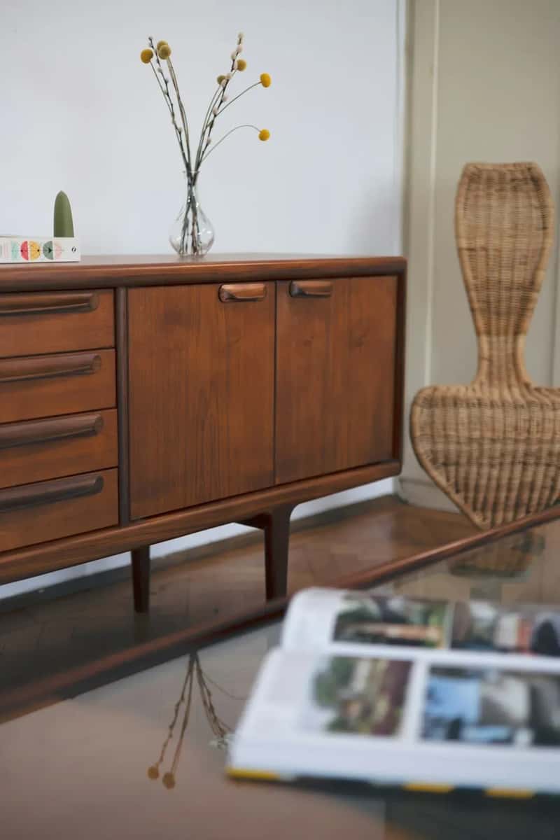
You know the look: the matching particle-board dresser, the assembled-in-an-afternoon sofa, the entire living room sourced from one store’s coordinated “collection.” Mass-produced furnishings that once felt safe and classic have become predictable. Worse, they signal what designers are calling “fast furniture” – the interior equivalent of disposable fashion. Consumers are becoming more environmentally conscious, which means there’s a real downtick in furniture that’s destined for a landfill in three years. Secondhand and vintage pieces, meanwhile, continue to surge in popularity.
The real tell isn’t just the quality – it’s the visual sameness. A room that looks like it was assembled from a single catalog page in 2019 reads instantly as dated today. The antidote is intentional mixing: one quality vintage find, one heirloom, one new piece. Rooms that look collected over time – rather than purchased in a single afternoon – are exactly what makes a space feel considered rather than just bought.
#11 – Word Art and “Live, Laugh, Love” Signage
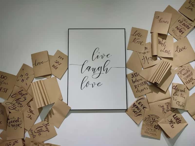
Somewhere around 2013, slogan signs invaded American homes and never quite left. “Gather” above the dining table. “Blessed” on the entryway wall. Farmhouse-font word art on reclaimed wood boards. Even designers who love rustic warmth are now calling these signs one of the fastest ways to date a room. Ditching the “Live, Laugh, Love” signage in favor of antique landscape prints or original artwork is one of the first updates designers recommend – and one of the easiest to pull off.
The deeper problem is that word art substitutes sentiment for actual personality. A room filled with signs telling you how to feel is a room that doesn’t trust its own decor to do the work. What started as a style meant to blend rustic warmth with contemporary simplicity became a checklist: motivational signs, buffalo check everything, distressed wood that was never actually old. Replacing even one of these with a single piece of original art – even something inexpensive – instantly reads more personal and more current.
#10 – Matching Bedroom and Living Room Sets
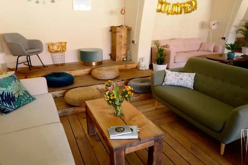
Buying a full matching furniture set – every piece sharing the same wood finish, hardware, and silhouette – used to feel like a smart, grown-up decision. Turns out, it’s one of the clearest signals that a room hasn’t been touched since the early 2000s. The perfectly synchronized bedroom suite now reads less like sophistication and more like a hotel room at a mid-tier chain. Matching sets are on their way out; the trend is toward mixed pieces that come together for a beautiful, curated design.
The same rule applies to living rooms where every sofa, loveseat, and armchair came from the same SKU family. What’s emerging instead is a craving for meaning and uniqueness – rooms that feel like they belong to a specific person, not a showroom floor. The antidote is intentional mixing: a vintage armchair paired with a modern sofa, a reclaimed wood nightstand next to a sleek contemporary bed frame. Collected over time always looks better than purchased in a single afternoon.
Quick Compare
- Matching set (dated): Every piece same finish, same silhouette, same store — reads like a showroom floor
- Curated mix (current): Vintage armchair + modern sofa + one heirloom piece — reads like a real person lives there
- Matching set (dated): Bought in one afternoon, assembled by the weekend
- Curated mix (current): Collected over months or years, each piece with a story
#9 – All-White Kitchens
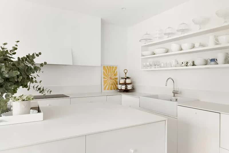
For nearly a decade, the all-white kitchen was the gold standard of modern home design. Stark white cabinets, white quartz countertops, white subway tile backsplash – it photographed beautifully and sold homes. But the look has officially curdled. What once felt clean and fresh now feels clinical and cold. In person, these kitchens can feel like operating rooms rather than the heart of a home.
The numbers back this up: according to the National Kitchen and Bath Association’s 2025 trend reports, 71% of designers now prefer a colorful kitchen over the all-white designs that dominated for most of the 2010s. That’s a stunning reversal. Warm whites with yellow undertones, sage green lowers, navy islands – these are the kitchens designers are actually proud to show off. Homeowners are craving warmth, personality, and mixed materials, and the all-white formula simply can’t deliver any of those things anymore.
#8 – The Single-Color Accent Wall
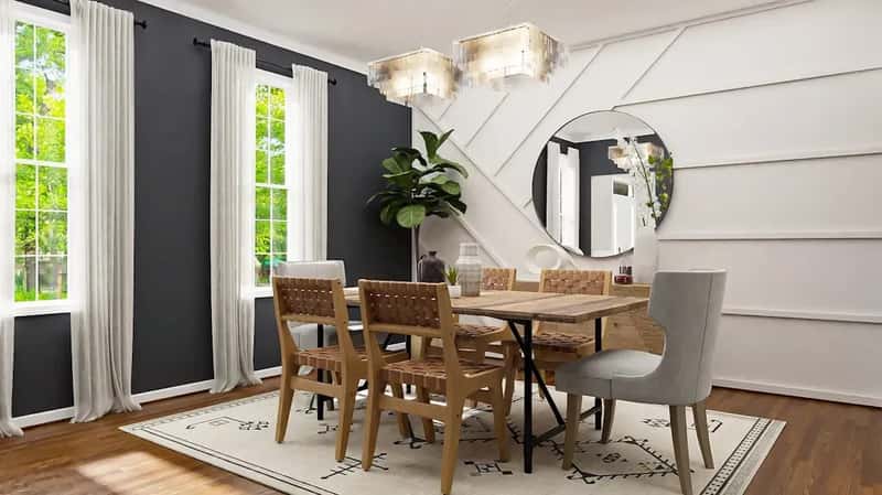
The accent wall had a long run. One wall painted a bold color – or covered in a geometric pattern – was supposed to add drama without full commitment. In theory, it made sense. In practice, it almost always looks awkward: a random splash of color that interrupts a room rather than anchors it. Designers are now saying accent walls usually end up creating visual tension for the wrong reasons, and that it’s far more harmonious to paint the entire room.
The random boldly painted wall in the dining room, or the one living room wall covered in geometric wood strips – these were super trendy in the 2010s and now feel unmistakably of their era. The design world has moved firmly toward “color drenching” instead: painting all four walls, the ceiling, and sometimes the trim in coordinating tones for a deeply immersive effect. Bold, saturated colors are making a major comeback in 2026 – just applied to the whole room, not one awkward wall of it.
“I am hoping 2026 is the year we kindly retire the accent wall. Instead, I’m leaning into color drenching — painting everything the same color. It makes a room instantly feel warm and playful without trying too hard.”
Merissa Haas, founder of Studio M.Haas
#7 – Open Kitchen Shelving (The Poorly Styled Kind)
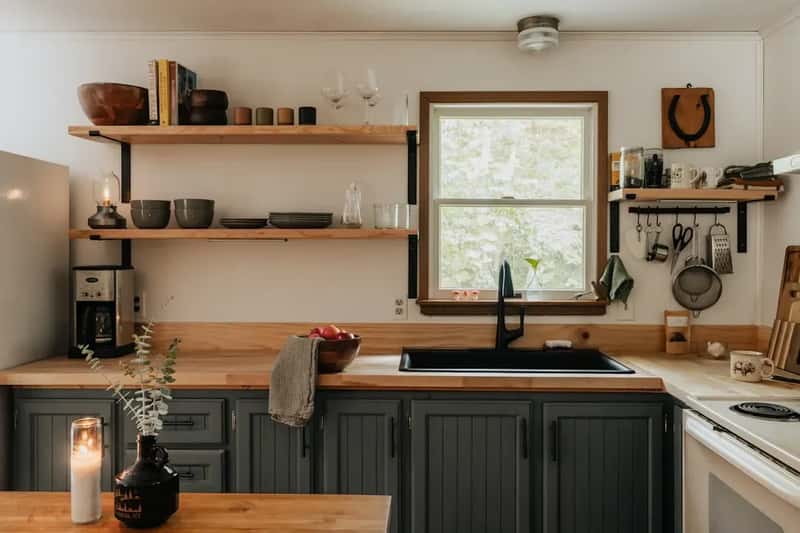
Open kitchen shelving was sold as a way to make your kitchen feel like a curated boutique. Display your beautiful dishes! Show off your cookbooks! In magazine photos, it looked effortless. In real kitchens, it became a dust-catching, clutter-collecting chore that most homeowners quietly resent. The appeal was always real – handmade ceramics, neatly stacked linens, artful objects – but daily life demands a level of upkeep that most households simply can’t sustain.
Designers who still use open shelving in 2026 treat it as a very deliberate editorial choice: one or two shelves, intentionally styled, not an entire wall of exposed dishes and mismatched mugs. Cabinets are reclaiming their rightful place, with today’s cabinetry designed around intelligent interior storage that keeps clutter concealed while maintaining a clean, elevated look. The days of the fully open kitchen wall – pretty in theory, exhausting in practice – are largely over.
Worth Knowing
- Open shelving looks great in a styled photo shoot; it takes about 72 hours of real life to undo that
- Grease, dust, and daily cooking residue settle on open shelves faster than most people expect
- Designers still using open shelving in 2026 treat it as a single, highly intentional accent — one or two shelves maximum
- Closed cabinetry with smart interior organizers is the current answer: clean lines outside, full functionality inside
#6 – Sliding Barn Doors
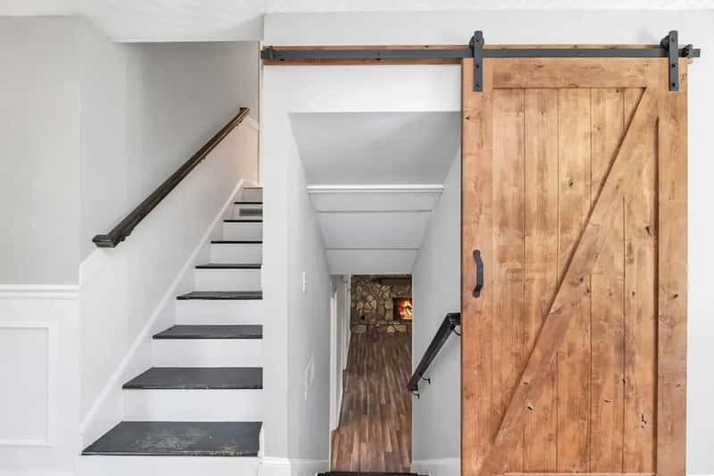
Few trends captured the American renovation imagination as completely as the sliding barn door. They exploded during the peak of the modern farmhouse wave from roughly 2015 to 2020 – reclaimed wood, dark iron hardware, and a silhouette that made even ordinary rooms feel architectural. At the time, they offered a triple win: space savings, texture, and character. But the sheer saturation of the look has stripped away every bit of that original charm.
People also started realizing the practical problem: barn doors never fully close. On a bathroom, that’s not a minor issue – it’s a dealbreaker. The privacy gap alone is enough reason to reconsider, but the design world has moved on regardless. Cleaner pocket doors or well-detailed swing doors with architectural hardware are what’s replacing them. If you still have a barn door and love it, that’s fine – just know that buyers and guests are clocking it as a 2017 relic the moment they see it.
#5 – Shiplap Walls on Everything

Credit – or blame – Joanna Gaines. When she popularized shiplap on Fixer Upper, she sparked a design movement that would dominate American homes for over a decade. Search interest for “modern farmhouse” surged year over year well into the 2020s, and millions of social media posts tagged the aesthetic. The problem with that level of saturation is that the look stopped feeling special and started feeling like a template. Designers are now actively avoiding shiplap so a space doesn’t feel too rustic, too predictable, or too clearly stamped with a specific TV show’s influence.
The deeper design failure wasn’t the shiplap itself – it was the indiscriminate application of it. Suburban homes, urban condos, beach houses – none of them had any architectural reason for shiplap, but up it went anyway. The result was a material that felt out of place and needlessly rustic in rooms where it had no business being. Limewash plaster and board-and-batten wainscoting with more sophisticated proportions are taking its place. Both carry texture and warmth without the Fixer Upper timestamp.
Fast Facts
- Shiplap first surged in mainstream homes after Fixer Upper debuted in 2013 on HGTV
- The criticism: it became “builder-grade” — the opposite of the special feature wall it was meant to be
- Replacing it: limewash plaster, textured venetian plaster, and refined board-and-batten at better proportions
- Shiplap in coastal or genuinely rural homes still works — the problem was the copy-paste suburban application
#4 – Stark Minimalism and Bare, Cold Spaces
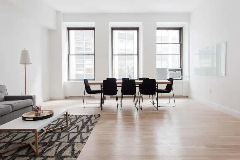
The “less is more” aesthetic had a long, dominant run. Sparse furniture, bare white walls, nothing on the counters, everything hidden away. In theory it was peaceful; in practice, many of these spaces ended up feeling sterile – and frankly a little sad to actually live in. Minimalism wasn’t just about fewer items: it meant hiding away anything without an obvious purpose, shunning color, and reducing a room to its most austere geometry. Clean, maybe. Welcoming, rarely.
All-white, overly pared-down rooms are now losing their appeal precisely because they feel lifeless rather than personal. The irony is that a home decorated in 2018’s strict minimalist style looks just as dated as a home decorated in 2005’s Tuscan villa style – both are unmistakably from their era. Design has shifted toward spaces that tell a story, that embrace contrast and individuality, that feel like they belong to a person rather than a concept. Layers, warmth, and a little beautiful imperfection are what’s replacing the cold, curated void.
#3 – Dark Honey Oak and Heavy Dark Wood Cabinets
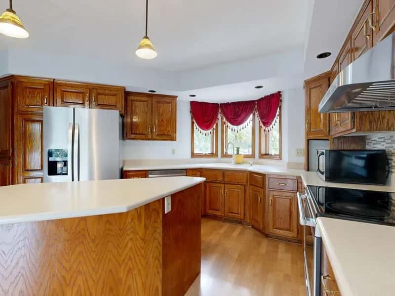
Orange-toned oak cabinets were the defining kitchen material of the 1990s and early 2000s. They were everywhere – in new construction, in renovations, in starter homes coast to coast. And now they’re one of the single fastest ways to date a kitchen by at least 20 years. If your kitchen still has them, every buyer and visitor can estimate roughly when your last renovation happened – and it wasn’t recent. The honey oak kitchen is so tied to a specific era that it functions almost like a timestamp on the wall.
Heavy, ornate dark wood cabinetry and faux finishes from the early 2000s feel equally out of step with the lighter, more natural materials trending today. The good news: this doesn’t require a full gut renovation. Refinishing the cabinetry – painting the doors or sanding away the honey tones and restaining them lighter – transforms the entire feel of a kitchen without tearing it apart. A lighter, more natural wood finish or a soft painted color does more for a dated kitchen than almost any other single update.
#2 – Fully Matching Matte Black Hardware Everywhere
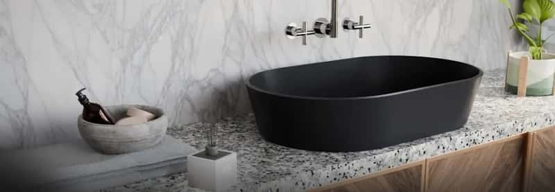
Matte black hardware was the antidote to the gold rush of the mid-2010s. It felt modern, edgy, and intentional. Then it spread – from cabinet pulls to faucets to light fixtures to shower fixtures to door handles – until every room in the house was a study in uniform, matching matte black. “Matching black plumbing, bath hardware, and cabinet hardware are out,” says designer Andrea Lackie. The problem was never the color itself. It was the relentless, room-to-room, surface-to-surface matching that made it feel like a formula.
After the all-black wave, designers say clients are now ready for warmth, color, and softer tones across the board. Mixing different metals – unlacquered brass, warm bronze, brushed nickel – in the same room now reads far more intentional than a single matchy hardware story applied to every surface. Mixing it up creates depth and authenticity, making spaces feel layered and lived-in rather than assembled to look perfect. A single finish throughout an entire home stopped being sophisticated the moment everyone started doing it.
Why It Stands Out
- The issue isn’t the color — it’s applying the exact same finish to every single surface in the home
- Unlacquered brass, warm bronze, and aged nickel are the finishes designers are reaching for instead
- Mixing two or three metal finishes in the same room now reads more sophisticated than any single-finish approach
#1 – The Modern Farmhouse Formula (All of It, Together)
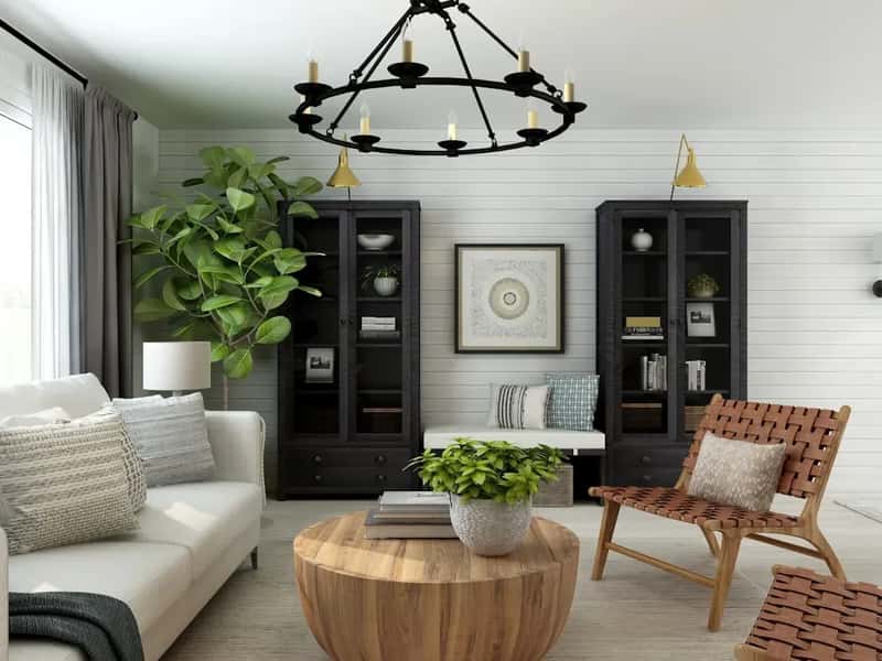
Here’s the one that stings the most, because it was genuinely beloved. The modern farmhouse aesthetic – shiplap walls, barn doors, open shelving, white-and-black palette, distressed wood, sliding hardware, word art – took over American homes so completely that it stopped being a design choice and became a default.
Shiplap, barn doors, and rustic signs have reached peak saturation. The mass commercialization of the modern farmhouse stripped away the very charm that made it appealing in the first place. Designers aren’t abandoning rustic warmth entirely – they’re approaching it with more subtlety and real restraint, favoring genuine antique pieces with actual history over mass-produced “weathered” items from big box stores. The homes that executed farmhouse style with true restraint and genuine character age beautifully. The ones that checked every box on the formula? They now look like a 2018 Pinterest board rendered in three dimensions.
Most of these trends didn’t fail because they were bad ideas. They failed because they were copied so aggressively that they lost all individuality. Homes that leaned too far into one viral aesthetic all at once wear it like a timestamp. The ones that hold up over time were never fully surrendered to any single trend in the first place. A good update doesn’t always require a renovation – sometimes it’s one wall of paint, a few new hardware pulls, or finally taking down that “Gather” sign. Which of these hit closest to home? Drop it in the comments.