

Somewhere in America right now, there’s a kitchen with almond-colored appliances, laminate countertops that have seen better decades, and honey oak cabinets that peaked during the Reagan administration. Most homeowners who live with these spaces have stopped seeing them – they’ve become invisible, just the room you pass through to get coffee. But when AI design tools were turned loose on 30 of these time-capsule kitchens, something remarkable happened: people who had given up on ever affording a renovation suddenly saw their actual kitchen transformed into something they couldn’t stop staring at.
Some of these before-and-afters are subtle – the kind of change that makes you wonder why nobody did it sooner. Others are full-on unrecognizable, the visual equivalent of someone opening a window in a room that’s been sealed for forty years. We counted down all 30, and saved the most jaw-dropping transformation for last. Fair warning: #1 will make you look at your own kitchen differently.
#30 – The Harvest Gold Galley That Got a Warm Wood Revival
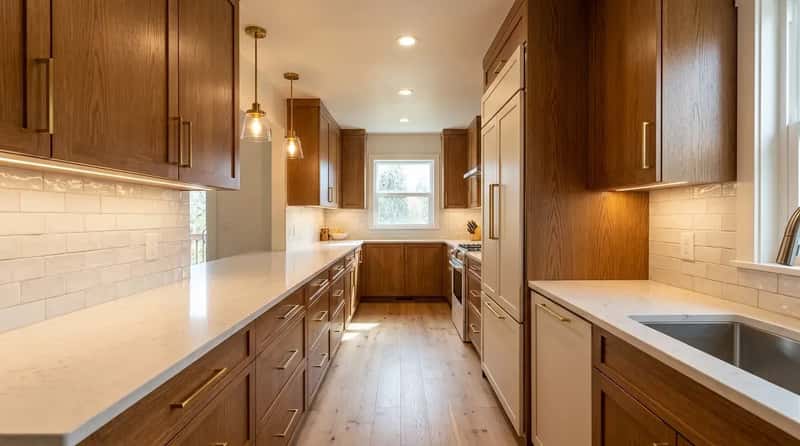
This narrow galley kitchen had every hallmark of 1985: harvest gold appliances, a drop ceiling with fluorescent tubes, and dark laminate floors that absorbed every bit of light in the room. The whole space felt like a tunnel you had to sprint through to escape. The AI kept the existing footprint exactly as-is – no structural changes – and focused entirely on finishes and light.
The result swapped the harvest gold appliances for integrated paneled fronts in a warm linen finish. Rich wood cabinetry, sleek brass hardware, and a bright backsplash brought warmth and character back to the space, while under-cabinet LED strips and two small pendants over the prep counter replaced the fluorescent box entirely. Same 90 square feet. Completely different decade.
Fast Facts
- Modern AI kitchen design apps generate photorealistic renders in as little as 10 seconds from a single photo
- A traditional design consultation costs $2,000–$5,000 and takes 1–3 weeks just for initial renderings
- AI tools preserve your kitchen’s structural layout – walls, windows, and plumbing stay exactly where they are
- Leading apps offer 30–70+ architectural styles, from Japandi and Coastal to Tuscan and Mid-Century Modern
- Paid plans start as low as $13–$29/month – less than a single countertop sample from a stone yard
#29 – The Brown Tile Nightmare That Became a Coastal Dream
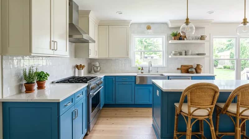
Brown. Everywhere. Brown subway tile backsplash, brown laminate countertops, brown-stained oak cabinets, and brown vinyl flooring with a faint geometric pattern that had long since worn through. This Ohio kitchen was a cautionary tale in monochromatic neglect – every surface technically different but somehow all the same muddy hue. The homeowner had lived with it for 22 years because she couldn’t visualize anything better.
AI kitchen design from a photo lets you preview dark vs. light cabinets, wood tones, backsplash, and lighting in your real space before committing a dollar. The AI generated a coastal-inspired reimagining with soft white upper cabinets, cerulean blue lowers, and a white marble-look quartz countertop. Large-format pale gray floor tile replaced the vinyl. The brown backsplash became glossy white subway with thin charcoal grout. It looked like someone had moved the kitchen to a beach house – without moving a single wall.
#28 – The Almond Appliance Era Kitchen Reborn in Matte Black
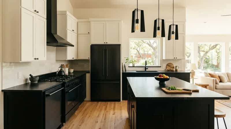
Almond appliances were everywhere in the ’80s. This Texas kitchen had the full matching set: almond refrigerator, almond dishwasher, almond range, all sitting against cream cabinets with rounded brass pulls. The laminate countertop had a faux butcher block print that had never fooled anyone. Even the ceiling fan above the island was almond – a detail so committed it almost looped back around to impressive.
The AI went bold: matte black lower cabinets, warm white shaker uppers, and honed black granite countertops. The contrast felt intentional and editorial rather than dated – the kind of kitchen that reads as a choice rather than an inheritance. The almond era, officially closed.
#27 – The Dropped-Ceiling Horror Show Turned Sleek Minimalist
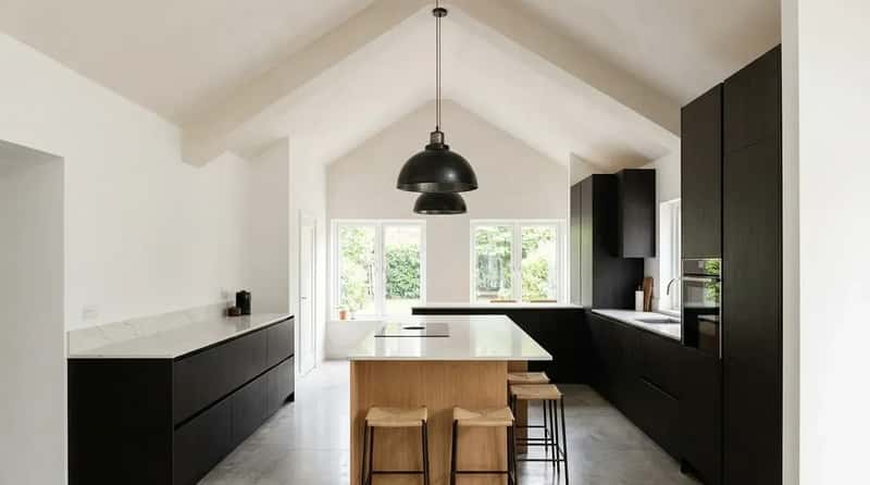
Dropped ceilings in kitchens were a hallmark of post-war renovation logic: hide the pipes, add fluorescent lighting, lower the energy bill. This 1984 New Jersey kitchen had a dropped ceiling hovering at exactly 7 feet – oppressively low – with those iconic 2×4 foam tiles that had yellowed considerably over four decades. Paired with white melamine cabinets and a laminate countertop in a faux black marble print, the kitchen felt like a basement office that someone had put a stove in.
The AI’s proposal tore that visual ceiling open with a vaulted treatment rendered in warm plaster white, anchored by two industrial-style pendants hanging at different heights. The melamine cabinets became handleless flat-front panels in deep forest green. Pendant lighting continues to lead kitchen design in 2025, with sculptural fixtures that act as both light source and statement piece – and here, they did exactly that. The before was oppressive. The after felt like a boutique hotel kitchen.
#26 – The Oak Cabinet Ocean That Finally Found Its Shore
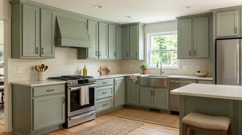
Honey oak cabinets defined the late ’80s and ’90s kitchen more than almost any other single element. This Pennsylvania kitchen had them floor to ceiling, wall to wall – every surface a warm orange-yellow wood tone that designers now tactfully describe as “of its time.” There was so much oak that the kitchen felt like the inside of a barrel. Even the hood vent was wrapped in matching oak veneer.
The AI proposed painting all the existing oak boxes in a dusty sage green while replacing just the doors with shaker-style fronts – a cost-conscious move that preserved the cabinet bones. The oak floors stayed, stripped and refinished to a lighter natural tone. According to the National Kitchen & Bath Association’s 2025 report, 76% of design professionals say green will be the most popular color to incorporate in kitchens this year – and this kitchen made the case perfectly. Suddenly the room felt designed on purpose.
#25 – The Popcorn-Everything Kitchen That Got a Scandinavian Reset
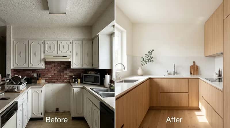
Popcorn ceilings, popcorn texture on the walls, and a faux brick backsplash panel that came as a sheet from a hardware store in 1987. This Florida kitchen was a textural overload, and none of the textures were working together. White cabinets with ornate routed detail competed with the fake brick and the bumpy ceiling for visual dominance. The result was chaos – every surface demanding attention, none of it deserved.
The AI chose a Scandinavian-minimalist direction: smooth flat surfaces, light ash veneer cabinets, and a single-slab white quartz backsplash that ran countertop-to-ceiling. Scandinavian kitchen design is defined by simplicity, natural light, and practical materials – a neutral palette and a clutter-free atmosphere that lets the space breathe. From a textural fever dream to a serene, functional workspace in one render.
#24 – The Country Blue and Goose-Stencil Kitchen, Reimagined
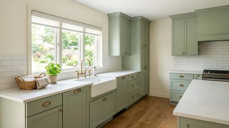
If you grew up in the ’80s, you know the goose stencil. This Indiana kitchen had them on the walls, on the valance above the sink window, and – incredibly – on the cabinet door panels in faded country blue paint. The countertops were a white laminate with a tiny floral print. The floor was peel-and-stick vinyl in a faux terra cotta tile pattern. It was charming once, in 1986. It had not aged gracefully.
The AI proposed a modern farmhouse direction – but the polished 2025 version, not the shiplap-everything version. Painted shaker cabinets in sage green, light quartz countertops, an apron-front sink, and vintage-inspired hardware brought warmth and intentionality without a single barnyard reference. No geese. No stencils. Just clean, timeless farmhouse with a conscience.
At a Glance: What AI Kitchen Tools Actually Change
- Cabinet color & style – swap honey oak for navy, sage, or warm white instantly
- Countertop material – preview quartz, soapstone, marble, or concrete before you buy
- Backsplash – test subway tile, zellige, slab, or patterned ceramic side by side
- Flooring – see wide-plank oak, large-format tile, or limestone in your actual room
- Lighting – visualize pendants, recessed cans, and under-cabinet LEDs all at once
#23 – The Mirror-Tile Backsplash That the ’80s Still Owns
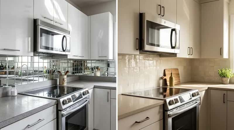
Mirror tile backsplashes were a genuine trend in the early-to-mid ’80s – the logic being that reflective surfaces would make a small kitchen feel larger. This Maryland kitchen doubled down with mirrored tiles behind the range and continuing all the way around the perimeter above the counters. The cabinets were a high-gloss white with chrome handles, and the countertop was a speckled gray laminate. Every surface was competing to be the most reflective thing in the room.
The AI replaced the mirror tiles with handmade zellige ceramic in warm ivory – less reflective, infinitely more sophisticated. Soft, neutral cabinetry let natural light do the work instead of bouncing it chaotically off mirrored surfaces. New brushed brass hardware, under-cabinet lighting, and a clean stone countertop tied the design together. The kitchen felt brighter and more spacious without actually changing a single dimension.
#22 – The Bi-Level Island That Confused Everyone, Fixed by AI
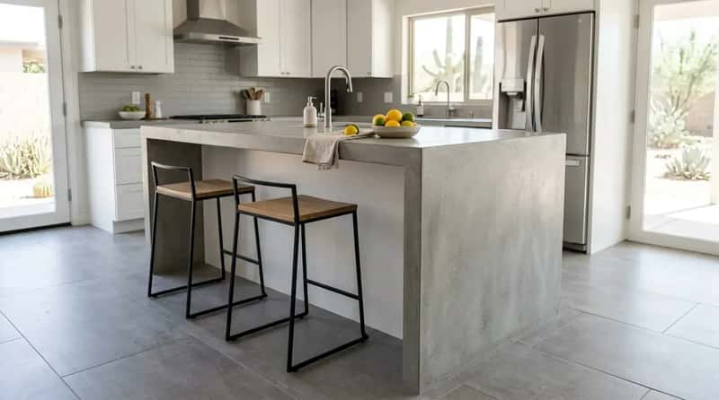
The bi-level kitchen island was peak ’90s design logic: one level at counter height for prep, a raised section at bar height for casual seating. This Arizona kitchen had one – laminate on one level, tile on the other, with round oak spindle legs between the tiers that were technically structural but looked purely decorative. The whole thing was exhausting to look at and, somehow, exhausting to use. Two levels, zero cohesion.
Kitchen islands in 2025 are the ultimate multifunctional space – prep surface, dining table, workstation, and storage hub all in one clean form. The AI proposed a single-level waterfall island in honed concrete, with a flush overhang on one side for bar seating. No spindles, no competing levels, no tile-laminate compromise. Just one surface doing multiple jobs with quiet confidence.
#21 – The Rooster-Theme Kitchen That AI Finally Set Free
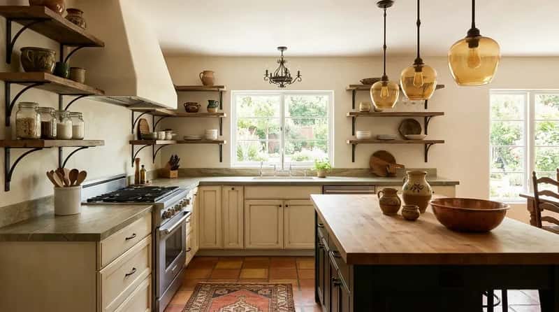
This Georgia kitchen had committed fully to a rooster motif. Rooster ceramic tile backsplash. A rooster silhouette etched into the glass cabinet inserts. A rooster-print valance above the window. Rooster canisters on the counter, which was a hunter green laminate. The cabinets were cream with dark walnut stain on the routed edges. It was a very specific vision, executed with terrifying commitment since approximately 1988.
The AI, diplomatically, suggested a Tuscan-Mediterranean direction – warm terra cotta floor tiles, cream plaster walls, open shelving in wrought iron, and warm amber pendant lights. Today’s kitchen design leans into global inspiration: Mediterranean, Japandi, vintage Euro, layered in ways that feel rich and personal rather than themed. The roosters were retired. The kitchen got a passport.
#20 – The All-White Sterile Kitchen That Found Its Soul
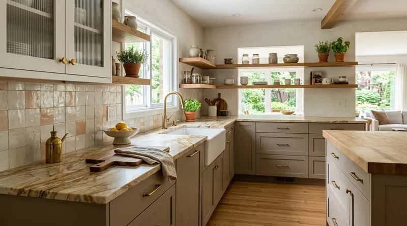
This all-white kitchen in suburban Chicago wasn’t from 1985 – it was a 2009 renovation that followed the all-white trend that dominated the 2000s and early 2010s. White cabinets, white countertops, white subway tile, white walls. Technically updated, technically inoffensive, and completely devoid of any personality. The homeowner described it as feeling like “eating in a doctor’s office.”
Interior design in 2025 marks a clear shift away from cool minimalism – all-white and all-gray kitchens are giving way to warmer earth tones, according to 67% of design experts surveyed in a recent industry report. The AI introduced warm greige lower cabinets, a veined amber quartzite countertop, open wood shelving, and a zellige tile backsplash in cream and ivory. The white bones were still there. The soul had finally arrived.
#19 – The Pastel Pink Kitchen That Actually Came Back Smarter
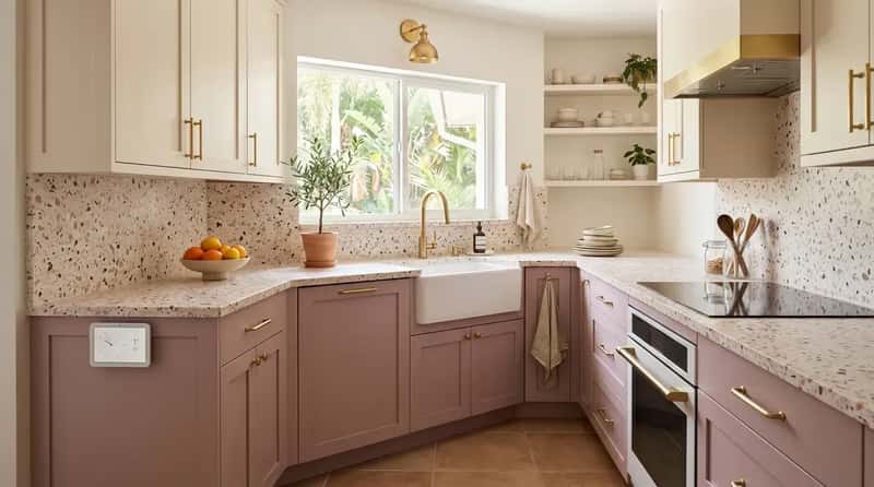
The 1985 pastel kitchen – particularly in pink – is one of the most polarizing spaces in American home history. This Florida kitchen had it all: pale pink cabinets, a mauve laminate countertop, pink ceramic tile floor, and frosted pink glass light fixtures. It was simultaneously retro and, in 2025, almost accidentally fashionable again. The question was whether to lean in or run.
The AI leaned in. It kept the pink palette but refined it – dusty mauve lower cabinets, warm cream uppers, a terrazzo countertop in blush and cream, and unlacquered brass hardware. Retro finishes and pastel tiles have made a genuine comeback in 2025, but the difference between nostalgic and dated is restraint and intention. This version had both. The result was retro in the best possible way – coveted, not pitied.
Quick Compare: Dated ’80s Finishes vs. Their 2025 Upgrades
| Then | Now |
|---|---|
| Polished yellow brass hardware | Unlacquered satin or aged brass |
| Honey oak cabinets | Painted sage, navy, or warm white shakers |
| Laminate countertops | Quartz, soapstone, or honed natural stone |
| Fluorescent overhead box | Layered warm LEDs + statement pendants |
| Almond or harvest gold appliances | Matte black, integrated panel, or pro stainless |
#18 – The Dark Wood Cave Kitchen That Discovered Natural Light
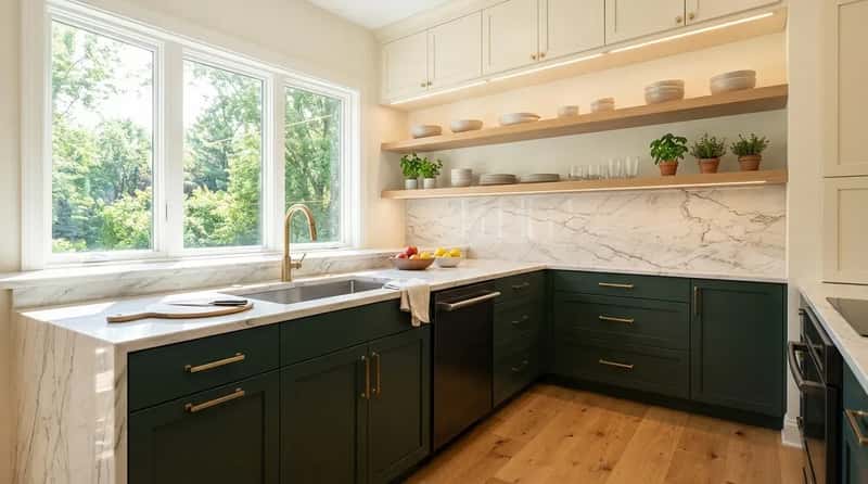
Some kitchens don’t just lack light – they actively repel it. This 1983 Minnesota kitchen had floor-to-ceiling dark walnut stained cabinets, a near-black granite tile countertop, dark slate floors, and a single incandescent overhead fixture centered on the ceiling. At 10am on a sunny day, this kitchen looked like midnight. The homeowner kept a lamp on the counter just to see what they were cooking.
The AI kept the dark lower cabinets – shifted to a deep hunter green – but moved the uppers to a warm cream and added a full-height marble-look slab backsplash in white and soft gray. A long run of under-cabinet LED task lighting and floating shelves with built-in LEDs on the flanking walls completed the transformation. The kitchen didn’t gain a single square inch, but it tripled its perceived light. That’s not interior design – that’s visual alchemy.
#17 – The Linoleum Battlefield That Became Warm Wide-Plank Heaven
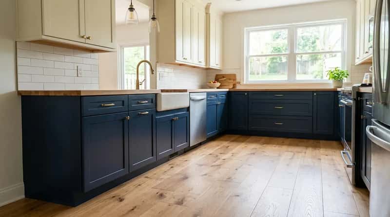
Sheet linoleum flooring was the practical kitchen choice from roughly 1960 through 1995. This Ohio kitchen had a pattern best described as “abstract confusion” – a beige, brown, and rust geometric that once had a clear repeating design but had worn through enough that the original motif was mostly speculation. The laminate cabinets above were a lighter beige. The countertop was a speckled brown laminate. Every surface was a different shade of beige giving up.
The AI swapped the linoleum for wide-plank European oak flooring in a natural tone, immediately grounding the space in something warm and real. The beige laminate cabinets became a two-tone scheme – navy below, soft cream above – with clean bar-pull hardware that felt modern without trying too hard. The linoleum confusion was gone. In its place: intention.
#16 – The Wallpaper Kitchen That Couldn’t Let the ’80s Go
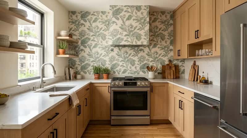
Wallpaper in kitchens peaked in the 1970s and ’80s, and this New York kitchen was a museum piece. A dense floral wallpaper in green, rust, and gold covered three walls from chair-rail height to ceiling. The cabinets were a pickled white oak. The appliances were black-on-black from a 1991 renovation. And the laminate countertop had a gray edge detail that had been cutting into the homeowner’s hip at the exact same spot near the dishwasher for thirty years.
The AI replaced the dense floral with a single accent wall of a large-scale botanical print in muted dusty green and cream – far more curated, far less overwhelming. Wallpaper is having a genuine 2025 comeback, but the key word is intentional. The pickled oak cabinets became warm white shakers with brushed nickel hardware. The laminate countertop gave way to honed Carrara marble. Same bones. Different century.
#15 – The Corner Pantry That Ate the Kitchen, Solved by AI
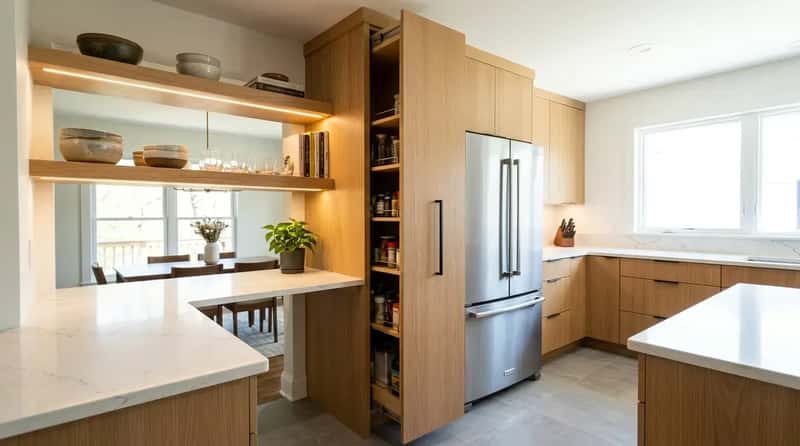
Corner pantry cabinets in the ’80s were massive, boxy affairs – typically floor-to-ceiling, occupying an entire corner with doors that required a full arm-span to open. This Tennessee kitchen had two of them flanking the refrigerator, creating a wall of dark oak boxes that completely blocked the sightlines from the kitchen to the dining room. The space wasn’t just dated – it was claustrophobic in a way that felt architectural and therefore permanent.
The AI redesigned the storage wall with a built-in system matching refrigerator depth, replaced the double doors with a single pull-out pantry column, and freed up an entire corner for open shelving with interior lighting. AI software can analyze how a family actually uses their kitchen – storage needs, traffic flow, cooking frequency – and generate optimized designs based on those habits rather than gut instinct. The kitchen gained 40 visual square feet without moving a single wall.
#14 – The Galley Kitchen That Felt Like a Hallway, Opened Up
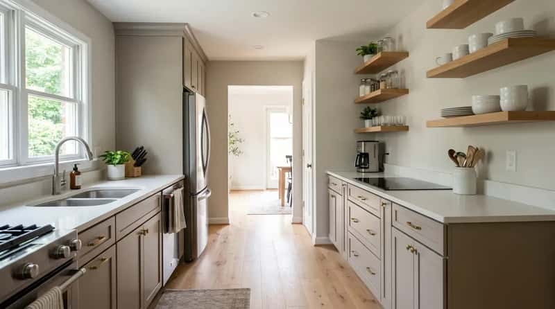
Galley kitchens are inherently efficient – modeled on ship galleys where every inch matters. But the galley in this 1987 Virginia townhouse had one fatal flaw: a solid wall on one end that dead-ended the entire space. Combined with dark upper cabinets, a low ceiling, and vinyl floors with heavy dark grout lines, this kitchen felt less like a cooking corridor and more like a hallway with appliances. It was 11 feet long and felt like 7.
The AI proposed removing the upper cabinets on one side entirely and replacing them with open floating shelves – a move that visually doubled the width without touching a single structural element. Light warm-gray lower cabinets and a pale oak floor completed the transformation. The kitchen finally looked like a kitchen instead of an afterthought someone had plumbed.
Worth Knowing: The Highest-ROI Changes in Any Kitchen Redesign
- Lighting layers – warm-white recessed cans + pendants + under-cabinet LEDs at 2700K make the single biggest visual difference per dollar
- Cabinet color – repainting existing boxes costs a fraction of replacement and changes the entire room personality
- Hardware swap – replacing all pulls and hinges takes an afternoon and signals an entirely different decade
- Countertop material – natural stone surfaces age beautifully; laminates just age
- Backsplash – 67% of designers favor mixed-material or textured backsplashes as the room’s defining statement in 2025
#13 – The Tile Countertop That Time Forgot, Replaced in Style
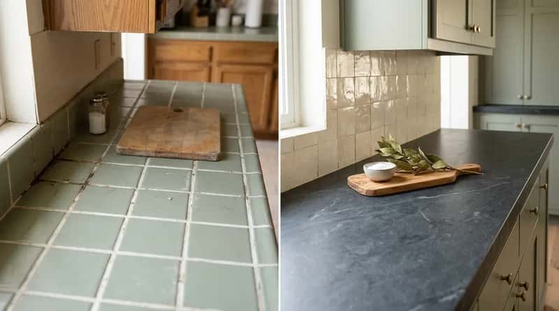
Tile countertops were wildly popular in the 1970s and ’80s – colorful, easy to install yourself, and considered both practical and stylish. This California kitchen had them in a dusty sage green ceramic with wide white grout lines. The problem with tile countertops was never the tile. It’s the grout. Forty years of grout collecting everything that was ever cooked, dropped, or splattered in that kitchen. No amount of bleach was going to fix this.
The AI proposed replacing the tile countertop with a thick honed soapstone slab – grout-free, heat-resistant, and the kind of material that actually improves with age. The dated sage tile above became a handmade Moroccan zellige in warm ivory. Natural stone countertops in quartzite, soapstone, and marble remain top material choices in 2025 for exactly this reason: they age gracefully rather than just getting older. A 40-year problem, elegantly solved.
#12 – The Fluorescent Nightmare Kitchen That Found Warm Light
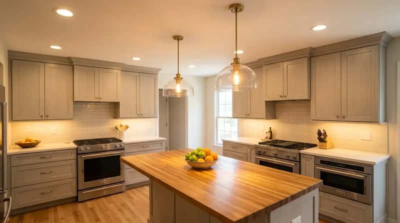
Fluorescent lighting in residential kitchens was once considered both economical and sufficient. This 1986 Wisconsin kitchen had a single 4-foot fluorescent fixture centered on the ceiling, plus a light strip under the upper cabinets that had buzzed audibly since 1989. The combined effect was a flat, cold, blue-white wash over everything – the kind of light that makes food look unappetizing and people look like they need a nap.
Lighting is one of the highest-return changes in any kitchen redesign, and 84% of design professionals now say lighting fixtures are a standout kitchen feature – not just a utility. The AI layered in three types: warm-white recessed cans on a dimmer, two statement pendants over the island, and continuous LED strips under the upper cabinets at 2700K – the warm tone that makes a kitchen feel like an evening you want to stay in. The buzzing box was gone. The kitchen glowed.
#11 – The Formal Kitchen Nobody Used, Reimagined for Real Life
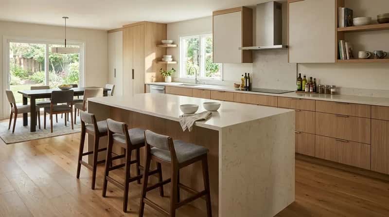
There’s a type of ’80s kitchen designed to look impressive rather than function well. This Connecticut kitchen was precisely that: enormous cabinets with glass fronts displaying china that hadn’t been used since 1994, a center island with no seating, a range hood so ornate it looked borrowed from a Baroque cathedral, and marble tile on the floor that was cold, slippery, and nearly impossible to maintain. Beautiful in theory. Miserable in practice. Every contractor who’d quoted it had suggested starting over.
The AI rethought the space for how people actually live. The ornate hood became a sleek integrated column. The island got a flush overhang for four barstools. The marble floor was replaced with large-format porcelain in warm greige – durable, slip-resistant, and far easier to keep clean. AI-powered kitchen design now lets homeowners see the functional result before committing, not just the aesthetic one. Formal became livable. Nobody mourned the hood.
#10 – The Kitchen in Beige Hell That Found Color Again
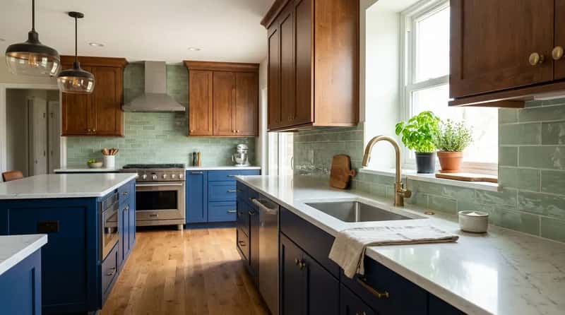
Beige. Taupe. Cream. Greige. Sand. Linen. This Missouri kitchen had committed to every possible iteration of the same non-color – beige cabinets, a taupe laminate countertop, cream vinyl flooring, and a sand-colored ceramic tile backsplash. It wasn’t ugly exactly. It was just aggressively, relentlessly beige. Even the stainless steel appliances looked beige in that lighting. The homeowner had stopped noticing it entirely, which is arguably the most alarming outcome.
The NKBA’s 2025 Kitchen Trends Report found that blue (63%) and brown (56%) rounded out the top color choices alongside green – a clear signal that the all-neutral era is closing. The AI delivered all of it: deep navy lower cabinets, warm white uppers, a terracotta zellige backsplash, and warm wood open shelving. The beige era, concluded. The room finally had a pulse.
#9 – The Two-Kitchen Problem: Old Addition, Modern Main, AI Fixed Both
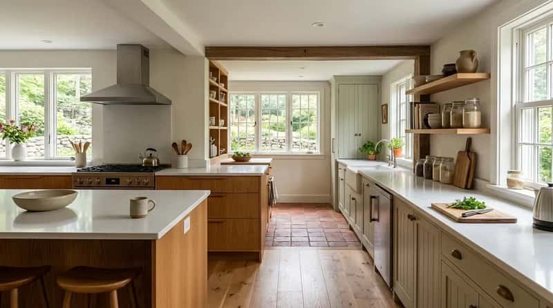
This Massachusetts colonial was renovated in 1987 when a kitchen addition was tacked onto the original 1920s kitchen. The result was two distinctly different kitchens awkwardly merged into one: the original section with painted bead-board cabinets in pale green, and the addition with laminate oak cabinets and a different floor tile. There was a visible seam at the 6-foot mark where the floors didn’t match and the ceiling height changed by two inches. Every designer who’d seen it suggested starting from scratch.
The AI’s solution was clever: rather than forcing uniformity, it embraced a two-tone design intentionally – using the original section as a pantry-and-prep zone with open shelving and the addition as the main cooking zone, with a continuous countertop slab running through both spaces to tie them together. Two-tone cabinetry is one of 2025’s strongest design moves – mix dark and light shades, or let a bold accent color answer a neutral one. The seam that had been an embarrassment became the design feature.
#8 – The Sunken Kitchen That AI Pulled Back to Earth
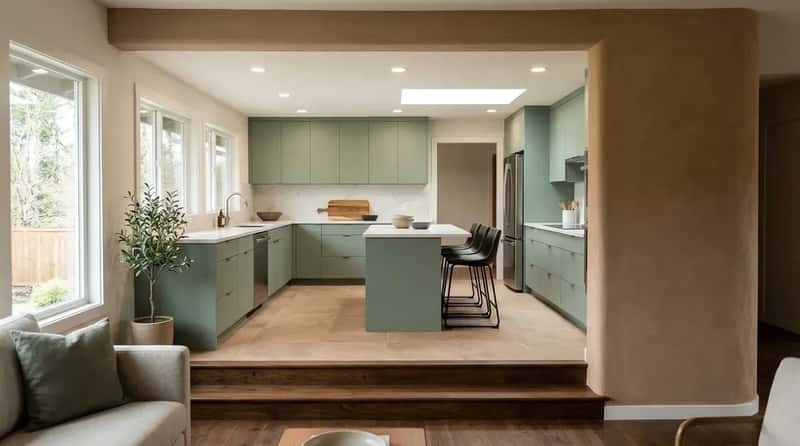
Sunken rooms were a genuine architectural trend in the 1970s and early ’80s – the idea being that stepping down created intimacy and spatial definition. This Oregon home had a sunken kitchen: three steps down from the living room, surrounded by oak cabinetry, with a peninsula jutting into the sunken area at an angle that made sense to exactly nobody. The low ceiling over the sunken section was made worse by a track lighting system that hung low enough to brush tall visitors on the head.
The AI worked with the architecture instead of against it. The descent wall got a warm plaster treatment – visually framing the drop as a deliberate arrival rather than a construction accident. The track lighting was replaced by a long linear pendant running the length of the peninsula, low-hanging by design rather than by default. Mid-century modern details – walnut accents, clean lines, warm metal finishes – gave the space a retro flair that finally made the sunken floor feel intentional. It was suddenly worth all three steps down.
#7 – The Builder-Grade 2000s Kitchen That Felt Older Than the ’80s One
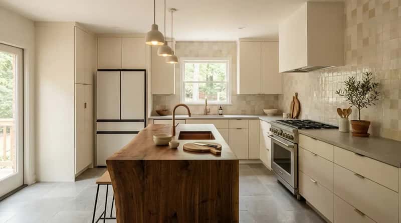
Here’s a fact that surprises people: many early-2000s builder-grade kitchens look more dated in 2025 than actual 1985 kitchens do. Why? Because the early-2000s aesthetic – golden oak, black appliances, thin maple cabinets, glass block windows, cultured marble countertops – aged without any nostalgia to cushion it. This Georgia kitchen was a textbook case: built in 2002, renovated never, and somehow feeling more tired than any harvest-gold kitchen in this list. No charm, no character. Just beige compromise at scale.
The AI’s reimagining went full organic modern: warm-white flat-front cabinets, a live-edge walnut island counter, honed limestone flooring, and a handmade Moroccan tile backsplash. In 2025, designers report that heavily ornate cabinetry and overly matching finishes are declining fast in favor of dynamic, personalized designs with real material contrast. This became the kind of kitchen people photograph. The 2002 original was not that kitchen.
Why It Stands Out: What Makes an AI Render Actually Useful
- The AI reads your room’s 3D geometry – preserving perspective, window placement, and structural elements
- It applies realistic material textures: marble veining, wood grain, tile grout lines all render accurately
- Lighting simulation shows how natural daylight and ambient light interact with new finishes
- You can test 5–10 completely different styles on the same photo before calling a single contractor
- Modern tools reach 90–95% visual accuracy compared to the finished renovation result
#6 – The Cluttered U-Shape That AI Opened Into an Airy L
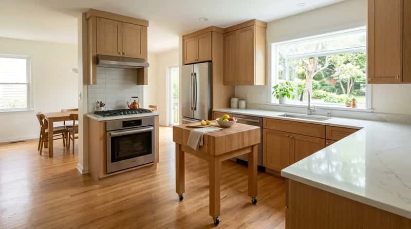
U-shaped kitchens are efficient on paper. But a U-shape in a kitchen under 150 square feet creates a peninsula that acts more like a wall than a workhorse. This Illinois kitchen left exactly one person’s width of walking space in every direction. Two people couldn’t cook simultaneously without significant negotiation. The peninsula forming the bottom of the U had a built-in cooktop that hadn’t worked since 2011 – but it was still there, occupying space and generating guilt every single day.
The AI removed the defunct peninsula entirely, converting the U to an L-shape with a freestanding island on wheels – flexible, functional, and freeing. In a real-world parallel, AI design software can generate multiple optimized layout options from a room’s dimensions in seconds, letting homeowners choose a direction before any contractor ever enters the picture. The kitchen immediately felt twice the size. The dead cooktop was finally gone.
#5 – The Kitchen With Brass Everything That Got a Grown-Up Upgrade

There is brass from the ’80s – shiny, yellow-gold, coating every hinge, cabinet pull, faucet, and light fixture – and there is brass from 2025, which is unlacquered, aged, and deliberate. This North Carolina kitchen had the former: polished brass on every possible surface, including a chandelier-style island fixture with 11 bulbs that required a stepladder to change any of them. The cabinets were white, which should have helped, but the sheer volume of brass overwhelmed everything in the room.
The AI kept only the island fixture and the cabinet hardware in brass – but switched both to an unlacquered satin finish that would patina naturally over time. Every other metal surface became matte black: faucet, pot filler, towel bar. The contrast was immediate and striking. Matte black and brushed brass used together read as intentional in a way that all-brass never could. The obsession became an accent. Enormous difference.
#4 – The Ranch House Kitchen That Got a Full Japandi Soul Transplant
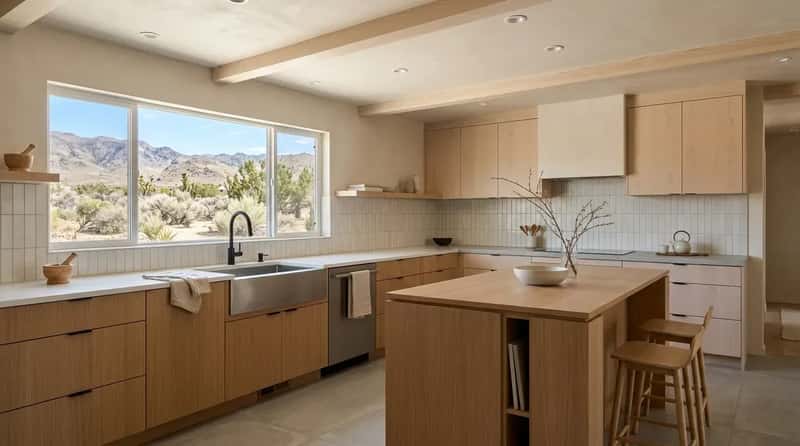
Ranch-style homes from the ’60s and ’70s were often renovated in the ’80s in ways that doubled down on dark wood and low ceilings. This Nevada ranch kitchen had both: a 7-foot ceiling, dark walnut stained oak cabinets, a laminate countertop in a faux wood grain print, and rust-colored ceramic floor tile cracked in three places. The window above the sink looked out onto a genuinely beautiful desert landscape. The kitchen itself seemed to resent it.
Japandi design blends the clean lines and function-first thinking of Scandinavian style with the peaceful simplicity and organic materials of Japanese aesthetics – the result is a calming, clutter-free space that’s as beautiful as it is livable. The AI delivered exactly that: handleless ash-veneer cabinets, a honed concrete countertop, and warm sand-toned plaster walls that finally echoed the desert outside. Integrated handles, warm wood finishes, and a handcrafted tile backsplash brought craftsmanship without clutter. The view and the room were finally in conversation.
#3 – The 1985 Kitchen That Thought It Was a French Country Château
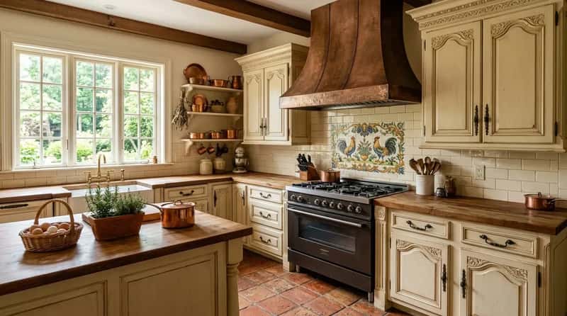
French country kitchens were enormously popular in the ’80s and ’90s among a certain bracket of American homeowners. This Virginia kitchen executed the vision completely: cream cabinets with ornate carved door profiles, a rooster tile mural inlaid into the backsplash, wrought-iron hardware, a copper range hood hand-hammered to look artisanal, and terracotta floor tile imported from somewhere in the American Southwest that bore no actual relation to France. It was ambitious. It was earnest. It had not aged like a fine Bordeaux.
The AI stripped away the theatrical elements while honoring the warmth underneath. The ornate cabinet doors became clean shaker fronts in the same cream tone. The rooster mural became a full-slab natural travertine backsplash – warm, stone, quietly beautiful. A clay farmhouse sink and hand-painted tile accents kept the artisan spirit alive, but with modern restraint. The copper range hood stayed, aged to a rich verdigris. Some things are worth keeping. The rooster was not.
#2 – The Split-Level Kitchen Disaster That Became a Magazine Cover
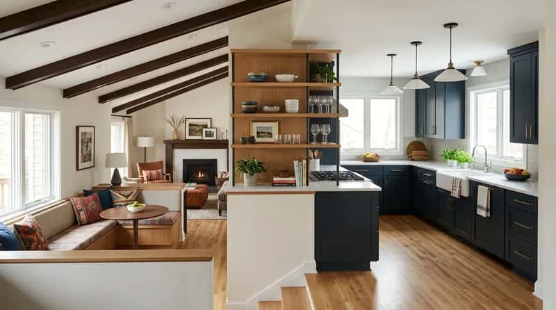
Split-level homes from the ’60s through ’80s often forced their kitchens into awkward architectural positions – half a level up from the living room, squeezed between a garage wall and a staircase. This Colorado kitchen was in exactly that position: oddly shaped, with an angled wall on one side, a chimney bump-out interrupting the cabinetry run, and a ceiling that sloped from 9 feet at the entry to 6 feet 8 inches at the far wall. Every contractor who’d ever looked at it had quoted $80,000 and called it a problem.
The AI embraced every constraint instead of apologizing for them. The angled wall became a built-in banquette nook. The chimney bump-out became an open shelving display with picture lights. The sloped ceiling became a deliberate design feature with exposed warm-wood beams tracking the slope. High-contrast navy lowers and white uppers, a bold geometric tile backsplash, and a colorful island that popped against the neutral surroundings completed the picture. It looked like a spread from Architectural Digest. Nobody called it a problem anymore.
The details are not the details. They make the design.
Charles Eames
#1 – The 1985 Kitchen That Became the One Everyone Saved on Pinterest
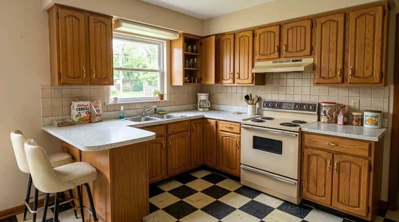
This is the one. A 1985 suburban kitchen in Michigan – the kind that existed in hundreds of thousands of American homes simultaneously. Honey oak cabinets with rounded edges and routed vertical lines. Black and white vinyl floor tile in a checkerboard that had yellowed to cream and gray. A laminate countertop in white-and-black speckle. A fluorescent light bar over the sink. A small peninsula with two vinyl barstools. An electric range in bisque – not white, not almond, but the specific shade of bisque that says “1985” more precisely than any calendar. It was not bad. It was just completely, perfectly, heartbreakingly stuck in time.
The AI generated six different directions in under a minute. The one that stopped everyone was the Japandi-meets-organic-modern proposal. Honey oak became warm white handleless flat-fronts. The checkerboard vinyl became large-format warm limestone tile. The bisque range became a professional-grade matte black range with brushed brass knobs. A waterfall island in honed Calacatta marble replaced the peninsula. Under-cabinet LEDs, a statement pendant in smoked glass, and a floating shelf of living herbs above the sink finished the picture. The before was a time capsule. The after was the kind of kitchen people save to Pinterest boards titled “someday.” The most powerful thing AI design tools have given homeowners isn’t a rendering – it’s proof that the past doesn’t have to be permanent.
The single biggest barrier to kitchen renovation has never been money – it’s been imagination. Kitchen remodels cost $25,000–$75,000 on average according to Remodeling Magazine’s 2025 Cost vs. Value report, with cabinets consuming 30–40% of the budget and labor another 25%. When two-thirds of your investment goes into things that are nearly impossible to change once installed, seeing the result before you commit isn’t a luxury. It’s the only sane way to start. Which of these 30 transformations hit you hardest? Drop it in the comments.