Walk into a well-preserved 1960s dining room today and you will see things that make absolutely no sense by modern standards – a bowl of plastic fruit nobody ever touched, a clock shaped like an exploding sun, a cabinet full of dishes that were apparently too good to eat off of. These weren’t design mistakes. They were completely intentional choices that made perfect sense to everyone in the room, every single time. The 1960s dining room was its own universe, governed by rules that were never written down but were universally understood by anyone who lived through them.
Most people assume the decade was all about mod wallpaper and bold colors – and yes, that’s part of it. But the real story lives in the details nobody talks about anymore: the padded vinyl table protector hiding under every tablecloth, the chrome percolator that never left the buffet, the fondue pot sitting in a cabinet like a sacred object waiting for its one annual moment. Some of what’s coming will hit you like a memory you forgot you had. Some of it will make you wonder how any of it was considered normal. Here are all 27 details, one at a time.
#27 – The Starburst Clock Hanging Above the Buffet Like a Mid-Century Sun God
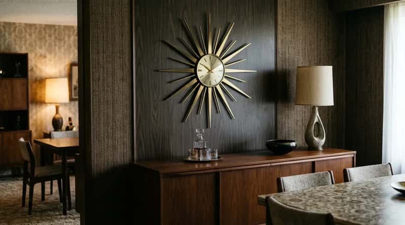
The starburst clock – brass rays of varying lengths shooting outward from a simple clock face, hung above the buffet – wasn’t just decorative. It was a statement. A starburst clock said that this household was modern, optimistic, and forward-looking. It was the Space Age rendered in wall decor, and it worked surprisingly well against dark paneling or flocked wallpaper. Nobody questioned its presence any more than they questioned the sun itself.
The Sunburst and Sputnik styles were everywhere from about 1955 through the late 1960s, and many of them are still running today in antique shops and very stylish apartments where people are paying real money to find the exact same clock their grandmother ignored for thirty years. Gen Z design influencers are hunting these things down on Etsy right now. Your grandmother probably had two and never thought about either of them.
Fast Facts
- The original starburst clock design is credited to Irving Harper of George Nelson Associates, one of mid-century modern’s most important studios.
- Vitra Design Museum restarted production of authentic George Nelson starburst clocks in 1999 — authentic versions now sell for over $700.
- The design appeared in the 1958 Sears Wishbook alongside dozens of other atomic-age clock styles.
- Once considered dated, starburst clocks are again in demand — thrifters now race to snag them before someone else does.
#26 – Flocked Wallpaper With a Texture You Could Actually Feel With Your Fingernails
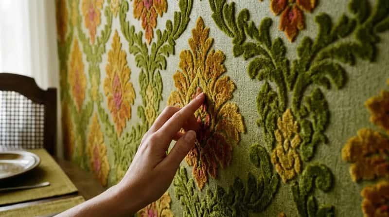
Flocked wallpaper had a raised velvet texture pressed directly into the pattern, so the dining room walls felt like a tactile art installation. Pea green, harvest gold, deep pink, and burnt orange were popular colorways, often with oversized floral or damask patterns that made the walls feel heavy in the best possible way. English decorator David Hicks was a major influence on interiors of this era, popularizing what he called “psychedelic patterns and acid-edged colors” that peaked between 1967 and 1973.
Most people under 35 have never encountered wallpaper you could pet. Running your fingernail along the raised pattern was irresistible, and every child who grew up in a flocked-wallpaper dining room knew the specific satisfaction of tracing those soft ridges while waiting for dinner. That was a completely normal dining room wall in 1965 – sensory, tactile, and oddly alive in a way that painted drywall simply isn’t.
#25 – The Padded Vinyl Table Protector That Lived Under Every Tablecloth
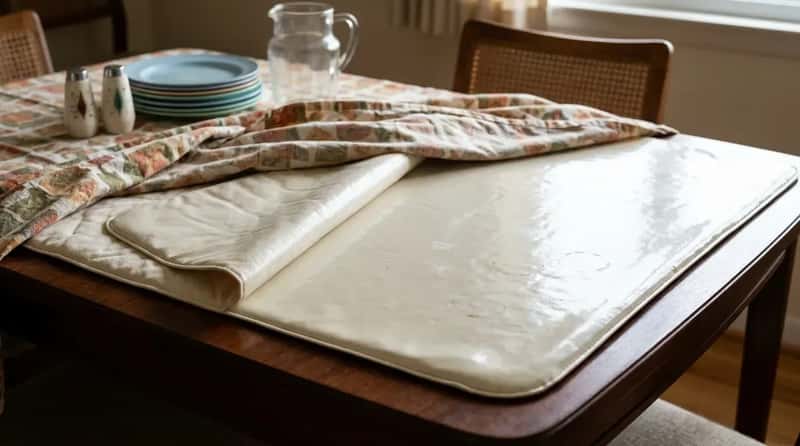
Under every tablecloth in America, there was a padded vinyl table protector. Cream or off-white, slightly quilted on one side, shiny and wipe-clean on the other, with the faint plasticky smell of something that had absorbed thirty Thanksgiving dinners and two dozen birthday cakes. It stayed on the table all year. The tablecloth went over it for company and came off again after. The protector never moved.
It was the unsung workhorse of the 1960s dining room – protecting that mahogany surface from hot dishes, spills, and the general entropy of family life. Nobody showed it off. Nobody talked about it. It was simply always there, like a permanent, slightly warm foundation layer beneath everything else. Anyone under 35 who finds one at an estate sale has no earthly idea what they’re looking at.
#24 – Dark Wood Paneling on at Least One Wall, Sometimes All Four
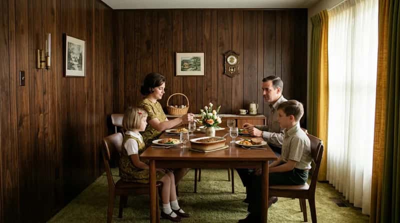
Dark wood paneling did something to a room that no paint color has ever quite replicated. In 1960s dining rooms it was everywhere – applied in long vertical strips directly to the walls, usually in a walnut or mahogany tone that swallowed light and made every meal feel vaguely formal even when it was just a Tuesday. Avocado green and harvest gold were frequently paired with that paneling for a cozy, enclosed warmth that the era genuinely prized.
By the early 1960s, kitchens were being opened to adjacent family rooms, and wood paneling was part of the same “warm and lived-in” philosophy driving those changes. Today, people rip it out during renovations without a second thought. In 1965, installing it was a genuine upgrade the whole neighborhood noticed – the kind of home improvement you invited people over specifically to admire.
#23 – The Swag Lamp Hanging From a Hook on a Fully Visible Chain
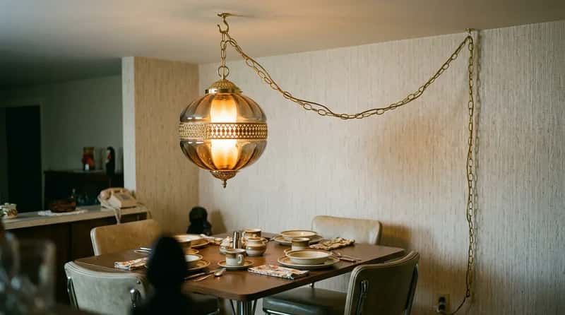
Swag lamps hung from a ceiling hook and draped across the room on a visible chain before plugging into a wall outlet. This made them easy to install and reposition without any electrical work, which appealed to homeowners who wanted a stylish update on a weekend afternoon. The chain was not hidden. The cord was not tucked away. Both of them just hung there in plain sight and everyone thought it looked spectacular.
Their designs ranged from simple glass globes to more elaborate options with colored glass, metal filigree, or fringed shades, and the warm downward glow they cast softened the harder surfaces of chrome, laminate, and vinyl that dominated the rest of the room. A cord visibly running to a wall outlet is now considered an eyesore worth concealing at any cost. In 1963, it was the focal point of the entire dining room.
#22 – The Hostess Cart Wheeled In From Nowhere Like a Magic Trick
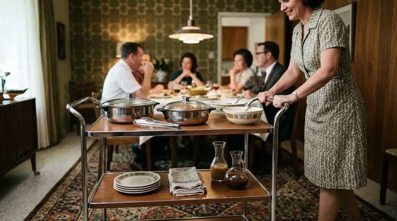
The hostess cart peaked in American homes between 1958 and 1972. Department stores like Sears and Montgomery Ward sold them alongside fondue sets and electric carving knives in the home entertaining sections. They largely disappeared when open-plan kitchens made the kitchen itself the entertaining hub. But during their heyday, nothing announced “we are a sophisticated household” quite like rolling a heated cart full of food directly to your guests without breaking conversation.
The hostess cart’s real superpower was that the host never had to disappear into the kitchen mid-party. The food simply arrived, warm and organized, from a chrome-trimmed cart parked beside the table. Nobody under 35 has ever needed one because open-plan living made the whole concept obsolete before they were born. But for one golden era, it was the dinner-party essential above all others – and the moment it rolled into the room, every guest understood that a serious host lived here.
#21 – The China Cabinet With the Little Interior Light That Glowed Like a Reliquary
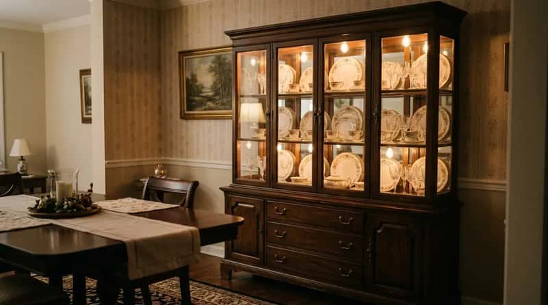
The china cabinet was a piece of furniture with genuine presence: dark walnut or mahogany, glass fronts, and that little interior light that made the dishes inside glow like objects of genuine importance. The good china sat in there for years. Sometimes decades. Some families had sets that were used maybe eleven times in thirty years and yet were treated with the reverence of museum pieces.
These cabinets combined upper glass display sections – often with interior lighting and mirrored backs – with lower buffet storage featuring drawers and cabinet space below. The result was a commanding piece that served both as functional storage and as an elegant showcase for china, crystal, and collectibles. Today’s dining rooms have open shelving or nothing at all. These rooms had illuminated shrines to dishes nobody was allowed to touch, and somehow that felt completely correct.
#20 – The Corner Hutch Built Into the Wall as Permanent Architecture
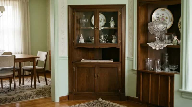
The built-in corner hutch told you more about a family in thirty seconds than most conversations would in an hour. Upper shelves displayed the decorative pieces – the crystal candy dish, the commemorative plates, the figurines – while the lower cabinet held the good linen napkins and the extra tablecloths. Opening those lower doors was a small ceremony of its own every time a holiday approached.
The hutch was permanent in the architectural sense: builders framed it into the corner, and you did not move it when you redecorated. You worked around it. Builders stopped including them to save costs sometime in the 1970s and never looked back. Anyone who grew up with one understands exactly what was lost when that happened – a specific kind of built-in domesticity that no freestanding furniture has ever quite replaced.
At a Glance: The Built-In Corner Hutch vs. Modern Open Shelving
- Corner hutch: Framed into the wall, permanent, architectural — removed the wall with it if you changed your mind
- Open shelving: Freestanding or bracket-mounted, easily swapped, no commitment to the room
- Corner hutch: Upper display glass + lower closed storage — two functions in one fixed piece
- Open shelving: Everything visible all the time, styled like a photo shoot, dusted constantly
- Corner hutch: Builders included them as standard in many postwar homes — then quietly stopped by the mid-1970s
#19 – Heavy Floral Drapes That Pooled on the Carpet and Required a Stepladder
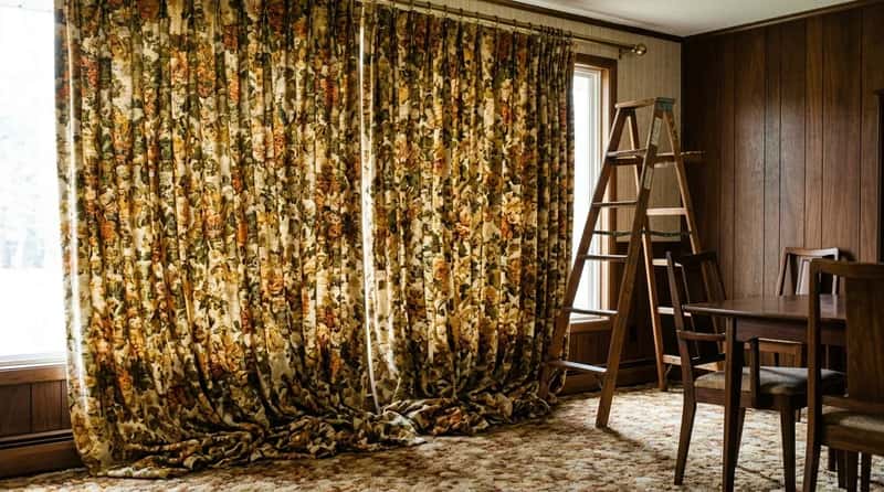
The heavy floral drapes of a 1960s dining room went floor to ceiling, pooled slightly on the carpet, and featured blooms the size of dinner plates in colors that could be described charitably as autumnal and accurately as overwhelming. They were lined, interlined, and hung on brass rods with hooks that required a stepladder to reach. These were not window treatments. They were an architectural commitment.
The sheer weight of these curtains meant they held their shape long after you stopped touching them. They blocked light, absorbed sound, and made the room feel like a separate world from everything happening outside. No one under 35 has ever sewn curtain hooks onto the back of a lined drape panel at midnight before a dinner party – and that specific dedication to a room’s atmosphere is one of the things that quietly vanished from American domestic life without anyone holding a funeral for it.
#18 – The Plastic Fruit Bowl That Sat on the Table Permanently and Was Never Discussed
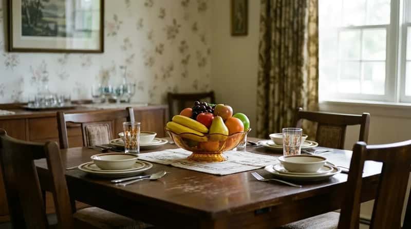
The plastic fruit bowl occupied the center of the table like it had always been there and always would be. Guests did not comment on it. Children were not allowed to play with it. It was permanent, untouched, and vaguely proud of itself. Some households had wax fruit instead, which had the added drama of occasionally softening in summer if you left the windows open too long on a hot afternoon.
The idea that decorative fruit should be permanent table furniture – always present, always inedible, always faintly gleaming – sounds absurd until you realize it solved a real problem: the center of the table always looked finished, and nobody had to water it, replace it, or remember to buy more. That’s not the worst design philosophy ever articulated. It just looks extremely specific to its decade when you encounter it now.
#17 – Avocado Green and Harvest Gold as a Complete Design Philosophy
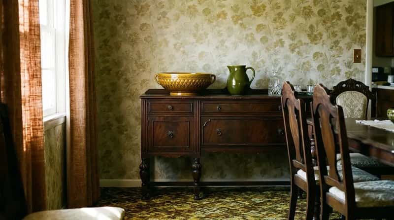
If there’s one color palette that defined the late-1960s dining room, it’s avocado green, harvest gold, and coppertone brown. Refrigerators, ovens, and dishwashers from brands like General Electric and Westinghouse fully embraced this earthy shift, and the colors followed those appliances into every adjacent room. These tones reflected a broader design evolution – sleek modernism beginning to blend with warmer, more organic influences as the decade moved toward its close.
The fascinating thing is how these colors invaded formal dining rooms that otherwise had traditional Victorian-era furniture handed down from grandparents. A grandmother’s mahogany sideboard with a harvest gold ceramic bowl sitting on top of it was completely unremarkable at the time. Today it would be called eclectic and photographed for a design blog. Then it was just Tuesday – and the contrast between old wood and new color was genuinely invisible to the people living with it.
Worth Knowing
- Avocado green and harvest gold were introduced as appliance colors by manufacturers in the mid-1960s specifically to sell homeowners on replacing perfectly functional white appliances — and it worked.
- The colors migrated from kitchen appliances into every room of the house, including rooms that contained no appliances at all.
- Fondue pots of the era were also sold in matching avocado green, harvest gold, and coppertone brown to coordinate with the kitchen aesthetic.
- The palette peaked roughly between 1967 and 1975 before earth tones gave way to the country-oak and mauve combinations of the 1980s.
#16 – The Chrome Percolator That Lived on the Buffet Like a Trophy
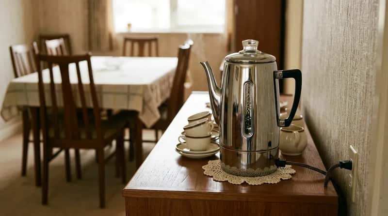
That rhythmic percolating sound was the dinner party soundtrack nobody talks about anymore. Before the drip machine changed everything in the early 1970s, the chrome percolator sat on the dining room buffet like a gleaming trophy, plugged into the one outlet that required moving the entire sideboard to access. The coffee it produced was, frankly, over-extracted and bitter. Nobody cared because the ritual mattered far more than the taste.
The percolator wasn’t stored and brought out for company. It lived on the buffet all the time – always ready, always slightly too hot to touch, always contributing a low gurgling ambience to any meal happening near it. It was a functional object elevated to decor status purely through placement and repetition. Younger generations have pour-overs and espresso machines. But they’ve never had a coffee ritual that required its own dedicated piece of dining room real estate, visible from every seat at the table.
#15 – The Teak Dining Set With Tapered Legs That Barely Touched the Floor
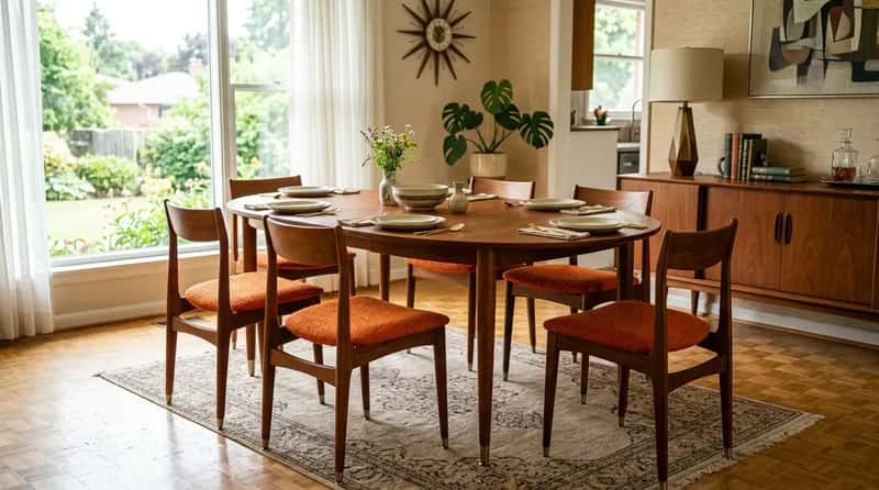
The tapered leg – that knife-thin, angled wooden leg that comes to an almost-point at the floor – is the single most recognizable silhouette of 1960s dining furniture. From Broyhill Brasilia’s dramatic sculpted arches to Kent Coffey Perspecta’s striking rosewood inlays, mid-century dining furniture offered a level of artistic character that transformed ordinary weeknight dinners into something that felt designed. These were not just tables. They were a considered object in a considered room.
Upholstered chairs with bright fabrics, paired with elegantly proportioned tables in teak or walnut, created an atmosphere that furniture manufacturers invested serious effort into achieving. The use of organic shapes and honest materials made these sets genuinely beautiful in ways that flat-pack furniture simply cannot replicate. Anyone who’s ever knocked one of those tapered legs with a vacuum cleaner knows exactly how deceptively fragile the design was – they looked permanent but bruised at the first opportunity.
#14 – The Fondue Set That Was Both a Centerpiece and a Commitment
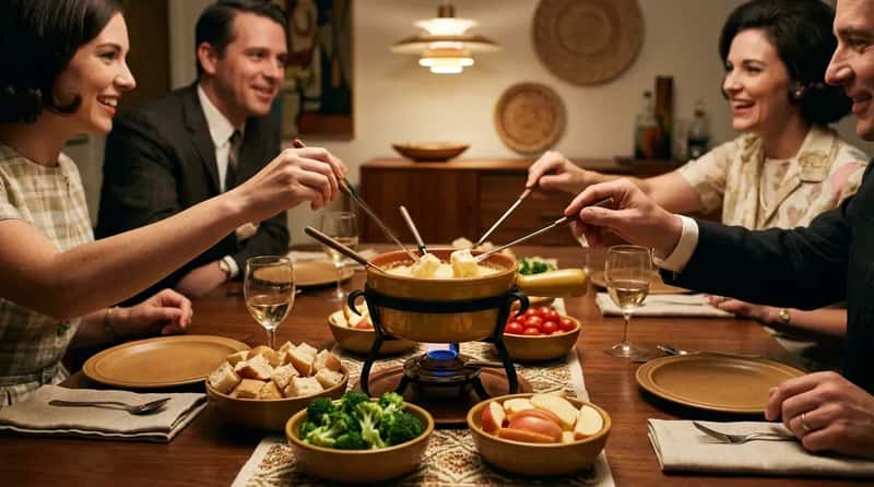
Fondue sets were among the most popular wedding gifts of the 1960s. Most of them are still out there, haunting estate sales in perfect condition, because the fondue night required a level of coordination – open flame, long forks, someone willing to stir, guests willing to lean in – that occasionally exceeded what a Tuesday evening could sustain. Cheese fondue was the approachable entry point. Chocolate fondue was the dessert flex. Meat fondue in hot oil was for households that had truly committed to the bit.
Fondue fit the broader cultural shift toward casual entertaining and shared meals as the decade progressed. A fondue gathering emphasized experience over formality – everyone leaning toward the center of the table, everyone involved in the same pot at the same time. As a party mechanic, that’s actually genius. Nobody under 35 has hosted a fondue night with a completely straight face. Their grandparents did it every other weekend and considered it the height of modern entertaining.
Quick Compare: Then vs. Now
- 1964: Fondue introduced to American audiences at the Swiss Pavilion at the New York World’s Fair
- Late 1960s: At least 37 different brands of fondue pots available in U.S. stores; 9 brands sold premade fondue in packets or cans
- Early 1970s: Fondue pot popularity peaked, then faded as dual-income households made convenience cooking the norm
- Today: The Smithsonian’s National Museum of American History has a fondue set in its permanent collection — filed under “things we used to do”
#13 – The Geometric Formica Tabletop With Boomerang or Starburst Patterns
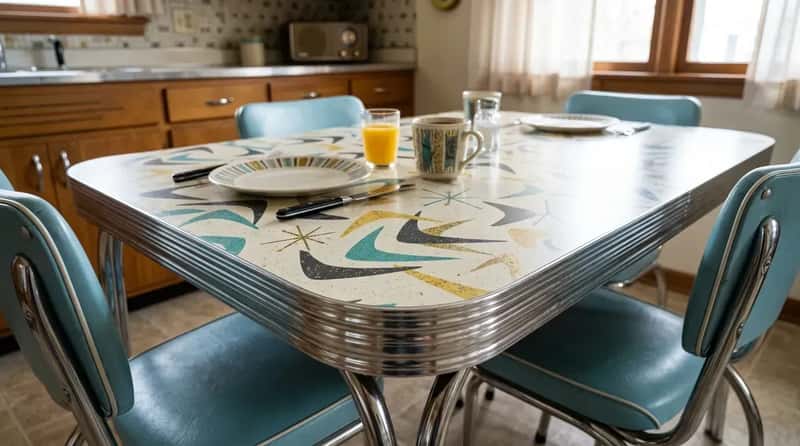
Formica surfaces defined the visual identity of many 1960s dining spaces in their boldest Atomic Age expressions. Boomerang patterns, starbursts, and abstract geometric prints flecked with gold captured the era’s fascination with space-age futurism and modern materials. Set against chrome edging and clean-lined cabinetry, Formica created a sleek yet playful look that announced: this household has moved on from wood grain and linen. The early 1960s favored brighter, more optimistic palettes; later versions shifted toward the earth tones that closed the decade.
The boomerang pattern – those kidney-shaped, overlapping curved forms scattered across a laminate surface – is so specific to its era that seeing it now immediately transports you to 1962 without any other context required. Younger generations refinish these tabletops the moment they inherit them. Collectors actively seek out the originals and pay serious money for intact, unrestored surfaces. The thing people once covered up is now the thing people are driving to estate sales to find.
#12 – Vinyl-Upholstered Dining Chairs in Colors That Matched Nothing and Everything
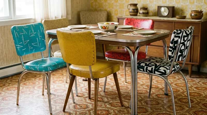
Vinyl upholstery in turquoise, red, mustard yellow, or bold black-and-white patterns tied into either the playful graphic energy of the early 1960s or the deeper neutral tones popular toward decade’s end. Practical, wipe-clean, and available in colors that genuinely committed to themselves, these chairs embodied the balance between modern efficiency and casual family life that defined the era. The entire sales pitch was: it cleans up with a damp cloth. It worked.
What nobody tells you about vinyl dining chairs is that they were legitimately loud. Shifting your weight produced a sound that could silence a conversation across the room. In summer, the surface got sticky, and standing up meant the chair briefly tried to come with you. Most people under 35 think vinyl chairs are retro chic, a charming throwback to be sought out at thrift stores. The people who grew up eating three meals a day on them know the full, squeaky, sweaty truth.
#11 – The Lazy Susan Spinning in the Center of the Table Like a Condiment-Covered Carousel
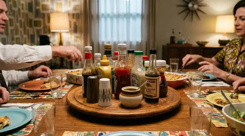
The lazy Susan found its fullest expression in the 1960s dining room. Every formal table had either a permanent wooden one built into its center, or a freestanding version that appeared at every meal loaded with salt and pepper shakers, condiments, and whatever sauce couldn’t be trusted to travel hand-to-hand across a large table. It was an organizational system masquerading as decor, and it worked without requiring anyone to ask someone to pass anything.
The lazy Susan also functioned as a low-key power object: whoever sat closest to it controlled the flow of the table. Spinning it too fast was rude. Stopping it before it completed a full rotation to someone else was worse. There was a whole unspoken etiquette around the thing that children absorbed entirely by watching adults react when it was done wrong. Today’s tables have a clean center and a decorative bowl. Fewer arguments, probably. But the lazy Susan made every meal feel like a shared logistics problem, and there was something genuinely communal about that.
#10 – The Formal Tablecloth That Only Came Out for Company
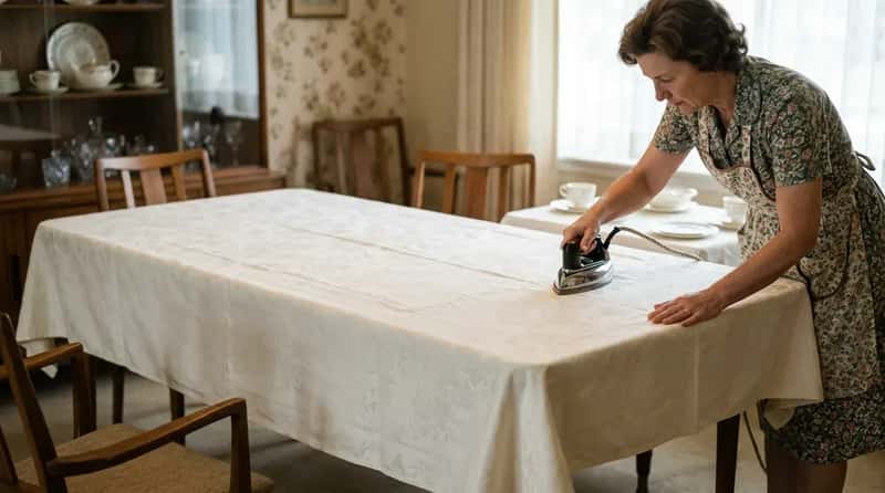
The 1960s household ran on a strict two-tablecloth system. The everyday cloth – cotton, slightly faded, possibly embroidered – covered the table for family dinners. Then there was the formal cloth: crisp white or ivory damask, pressed with military precision, stored in the hutch between holidays like a sleeping ritual object. When it came out, something serious was happening. Company was coming. A holiday was imminent. Someone important was about to be fed at this table.
The ironing of the formal tablecloth was its own ceremony, and it had to be done the day of – never the day before – or it would develop fold lines that announced to every guest that it had been taken out of storage. An obvious fold crease in a formal tablecloth was a social failure of a specific and recognized kind. Younger generations own maybe one tablecloth total, used at Thanksgiving, possibly still in its original store packaging. The two-tablecloth system implied a level of domestic infrastructure that takes real effort to fully comprehend in 2025.
#9 – The Matching Dining Room Suite That Came as One Coordinated Set
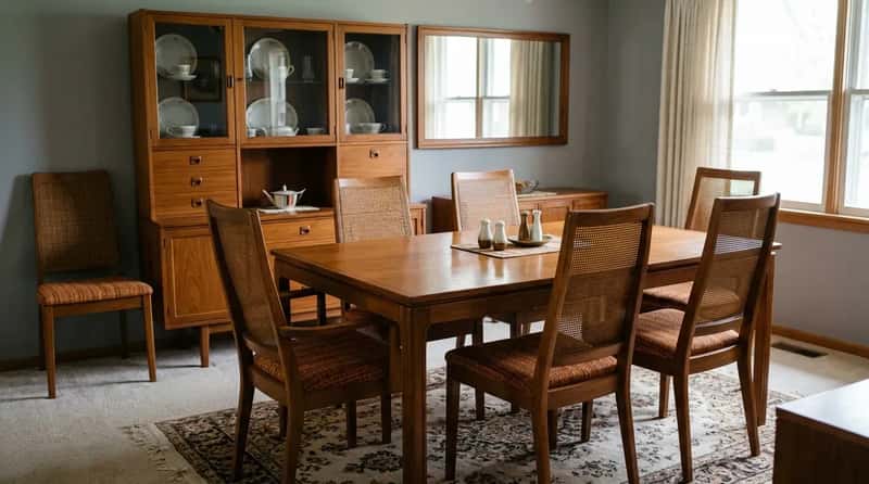
Everything in the room came from the same collection: table, chairs, buffet, hutch, and sometimes even the mirror above the sideboard. Manufacturers like Broyhill, Lane, Drexel, and Kent Coffey sold complete dining suites as a package, and owning the full matched set was the aspiration – sold that way at department stores and furniture showrooms, and understood to say something specific and important about the household displaying it.
The concept of a fully matched dining suite has almost completely disappeared from modern home design. People now mix vintage chairs with a new table, a secondhand sideboard with a custom bench, and call it “curated.” In the 1960s, a mismatched dining room wasn’t a style choice – it was a financial limitation you quietly apologized for. The suite was the goal, and arriving at it meant something. The dining room was the room where that arrival was put on permanent display.
#8 – Bold Geometric or Floral Wallpaper Covering All Four Walls Without Apology
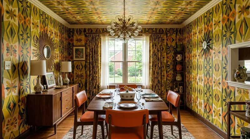
Dining room wallpaper in the 1960s was rarely subtle. Starbursts, diamond grids, and repeating geometric patterns filled the space with energy, often in saturated shades of orange, olive green, mustard yellow, black, and red. Alongside these bold modern designs were oversized stylized florals, climbing vines, and fruit prints that covered entire walls from baseboard to crown molding – and sometimes right across the ceiling in the most committed households.
Big paisley and overscaled botanical patterns created an experience of being inside the decor rather than simply surrounded by it, which was entirely the point. The instinct to wallpaper every surface reflected a belief that negative space was a missed opportunity. Modern minimalism has completely overturned that logic. But standing inside one of those fully papered dining rooms felt like being inside a painting – immersive, specific, and unmistakably alive in a way that a white wall never manages to be.
#7 – The Ashtray on the Table That Was Designed to Match the China Pattern
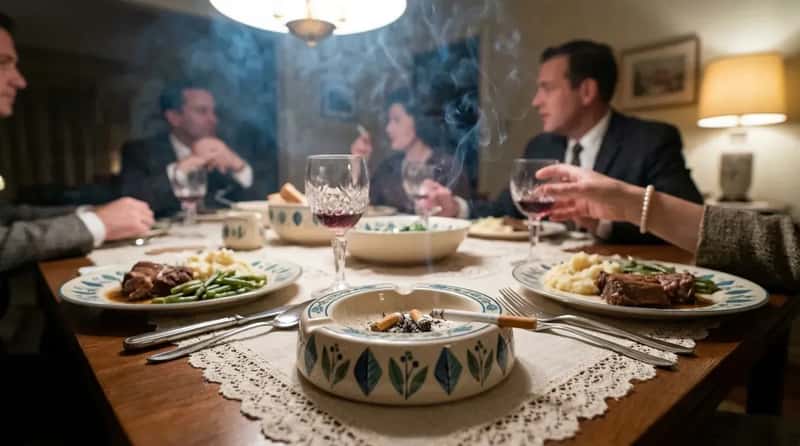
Every ashtray on the table was both decorative and fully functional, and no one thought twice about either quality. The crystal ones came out for company. The ceramic ones shaped like leaves or boomerangs lived there permanently. Dinner conversation in 1960s America happened inside a slow blue haze, and the combination of burning cigarettes, pot roast, and perfume was simply the smell of a dinner party. Nobody excused themselves to the porch. The Surgeon General’s report landed in 1964 and barely made a dent in the dinner table ritual.
Ashtrays were designed to match the china pattern. They were wedding gifts. They were heirlooms. Cigarette advertising didn’t disappear from American television until 1971, and for the entire decade, an ashtray was as standard a piece of formal dining table hardware as salt and pepper shakers. The idea of a purpose-designed ashtray as a formal dining accessory – selected, purchased, and gifted with genuine intention – is one of those details that hits differently with every passing year, and becomes more surreal the further we get from it.
#6 – The Pass-Through Window Between the Kitchen and the Dining Room
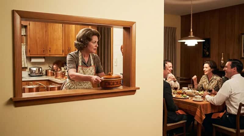
Before open-plan living became the standard, the pass-through window was the thoughtful compromise: a rectangular cutout in the wall between kitchen and dining room, usually with a small ledge just wide enough to slide a casserole dish through. It meant the cook could hand food directly to the table without walking the long way around – practical in a very specific, mid-century way that acknowledged the two rooms should communicate without actually committing to removing the wall between them.
The pass-through also served a social function nobody formally acknowledged: it let the cook hear the dining room conversation without being in it. The host could plate food, follow the whole discussion, and occasionally lean through the opening to contribute a sentence before sliding a bowl of mashed potatoes across the ledge. It was the transitional technology between the closed Victorian kitchen and the fully open modern floor plan – a half-measure that turned out to be surprisingly charming, and that disappeared so completely you almost never see one anymore.
Why It Stands Out
- Required zero electrical work and zero construction beyond a framed wall opening — any competent homeowner could add one on a weekend
- Kept the cook acoustically connected to guests without disrupting the formal dining room atmosphere
- The ledge doubled as a staging area: hot dishes sat there briefly while the host finished plating, preventing the cold-food problem entirely
- Disappeared almost completely once open-plan floor plans became the suburban default in the 1970s and 1980s
- Interior design accounts are now calling the pass-through “charming” and “underrated” — the very wall feature people paid to remove is quietly coming back
#5 – The Electric Carving Knife Brought Out With the Gravity of a Surgical Instrument
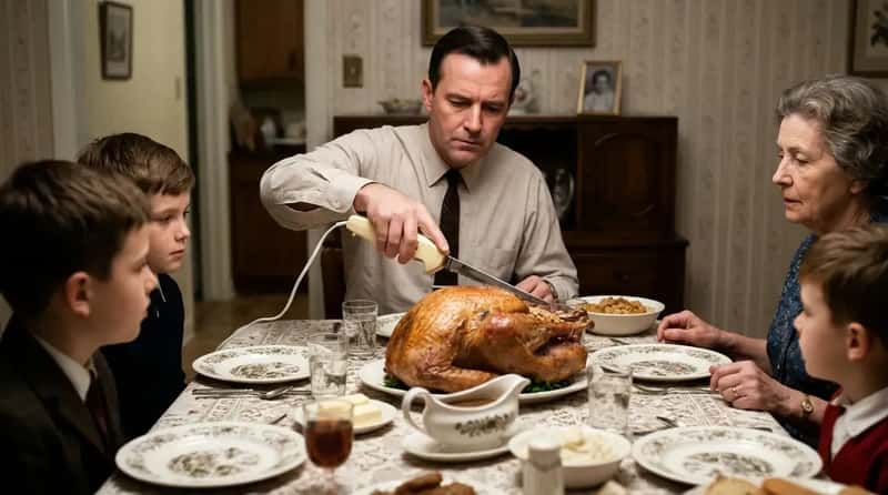
The electric carving knife was in a class of its own among 1960s kitchen appliances – a two-bladed, vibrating, plugged-in device that transformed carving the Sunday roast into something halfway between a kitchen task and a performance. The person who wielded it, almost always the father in the cultural script of the era, did so with visible, deliberate authority. The table fell quiet. Everyone watched. Department stores like Sears sold them alongside fondue sets and hostess carts as essential entertaining equipment.
The electric carving knife required an outlet near the table, which meant a cord running across the tablecloth or trailing over the edge onto the carpet. None of this was considered a problem. The machine itself looked like something from a science fiction movie set in a kitchen – which, in 1965, was essentially the highest compliment a home appliance could receive. Most people under 35 have only ever seen one at a thrift store. Their grandparents treated it like the greatest invention since sliced bread, a comparison the electric knife made slightly redundant.
#4 – The Breakfront Display Cabinet Showing Off Silver and Crystal Nobody Ever Used
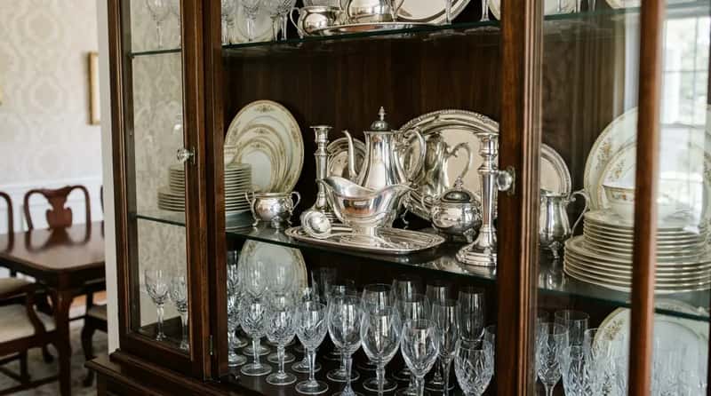
The arrangement inside the breakfront was always deliberate: stacked plates in graduated sizes, crystal glasses angled just so, the silver gravy boat front and center where every guest could appreciate it. It was stage design applied to dinnerware – beautiful things existing primarily to be witnessed. The breakfront was the stage. The silverware was the cast. And everyone who entered the dining room was the audience, whether they realized it or not.
The silver in those cabinets required actual polishing – not once a year, not just before holidays, but regularly, with cloth and silver polish and real effort, to keep it from tarnishing behind the glass. These weren’t passive objects. They were maintained. Today the equivalent might be a carefully lit shelf of things from a small ceramics artist. The 1960s version was silverware that cost more than a used car and was touched roughly twice a decade, but polished with genuine devotion every few weeks regardless.
#3 – The Vinyl Wallcovering That Looked Like Brick or Wood Grain But Was Absolutely Neither
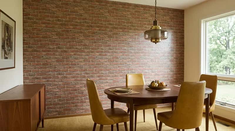
Faux-finish vinyl wallcovering – panels printed to convincingly suggest exposed brick, aged wood planks, or rough stone – appeared in American dining rooms in the mid-1960s and hung there, completely straight-faced, until someone eventually painted over it in 1987. It wasn’t considered kitschy at the time. The ranch-home movement had popularized the idea of bringing natural materials like brick and stone indoors, and when the real thing wasn’t available or affordable, the printed version served the same visual purpose without apology.
The faux-brick dining room accent wall was the 1960s version of the shiplap accent wall that dominated home renovation shows fifty years later – a specific design choice that felt deliberate and fresh to the people who made it, and that future generations would look back on with a mixture of affection and bafflement. The difference is that the 1960s version was printed vinyl that occasionally peeled at the corners, adding its own accidental texture to the whole enterprise over time.
#2 – The Formal Dinner Party Rules That Made the Room Run Like a Rehearsed Play
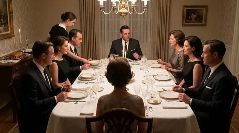
Even the “casual” 1960s dinner party operated on a set of rules that younger generations would find completely alien: the host sat at one end of the table, the hostess at the other, guests were seated by some unspoken hierarchy, and the meal proceeded in courses announced by the removal of one dish before the next appeared. Nobody started eating until everyone was served. Seconds required an explicit offer from the host. Leaving the table before the meal concluded required a visible reason.
Classic dinner party dishes of the era – beef Wellington, cheese soufflés, rumaki, which was bacon-wrapped chicken livers – were not foods you casually assembled. They required timing, preparation, and genuine culinary investment. All of that effort was invisible to the guests, which was the entire point. The dining room was the stage where the work was finally revealed, finished and composed. Today’s dinner parties involve everyone standing in the kitchen while the host cooks. In 1965, you didn’t see the kitchen. You were seated, and the food arrived. The separation between effort and arrival was the whole performance.
#1 – The “Good” Dishes That Were Never Used Because They Were Too Good to Use
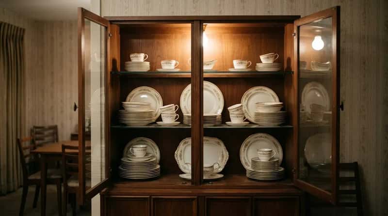
The dishes inside that cabinet were perfect. Every single one of them, every single year. And they stayed that way because the understanding – never spoken aloud but absolutely clear to every child in the house – was that touching them without a holiday-level justification was essentially a violation of something important. Some families had full twelve-place settings of fine bone china that were used maybe eleven times in thirty years, and yet were treated with the reverence of inherited jewels. The little light inside the cabinet glowed on them whether anyone was looking or not.
The “good dishes” were almost always a wedding gift – a full set chosen by someone who was twenty-two years old and has probably not eaten off them since. They represented something real about the era: a belief that there was a version of life important enough to deserve the best you owned, and that version of life was always just around the corner. Keep the dishes ready. Keep them perfect. The moment worthy of them is coming. The quiet tragedy – and the genuine beauty – of those dishes is that the moment they were meant for never quite arrived. They’re still sitting in cabinets all over America right now, behind glass, under that little light, waiting.
The 1960s dining room was a room with rules, rituals, and a specific belief about what a shared meal was supposed to mean. It had dark wood and plastic fruit and dishes you couldn’t touch and a clock that looked like a brass explosion. None of it was accidental. Every single detail served the same underlying purpose: to signal that this room, and this family, took the act of eating together seriously enough to maintain a space worthy of it. That idea – that the dining room deserved to be protected, decorated, and kept ready – is the hardest thing to explain to anyone who grew up with an eat-in kitchen and a television mounted on the wall. Which one of these hit closest to home?