

Walk into a house built in the last ten years and you’ll notice it immediately – everything is white, everything is open, and somehow, despite all that square footage, it doesn’t feel like a home. Now walk into a well-kept house from 1984. There’s carpet under your feet, warm light bouncing off brass fixtures, a fireplace anchoring the living room, and three distinct spaces you can actually hide in. Something is different. Something is better. And most people can’t quite name what it is.
Turns out, it’s not nostalgia playing tricks on you. The design choices that defined 1980s homes – the ones we’ve spent decades tearing out and replacing – were actually doing serious heavy lifting for human comfort. Here are 39 of them, and a few will make you genuinely regret the last renovation you approved.
#39 – The Sunken Living Room That Made You Feel Like You Were Somewhere
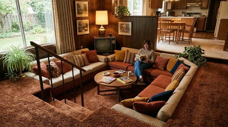
The sunken living room was the 1980s home’s architectural statement piece – and the step down did something clever. It created a boundary without a wall, defining the space as the room where you actually sat and talked rather than just passed through. That single move gave a house a sense of geography that today’s open-concept floor plans completely erased. You knew exactly where you were, and where you were felt intentional.
Set down a step from the rest of the main floor, often lined with plush carpeting, the sunken room created an intimate atmosphere that encouraged people to actually linger. Nobody builds these anymore – liability concerns and open-concept fashion conspired against them. But walk into one today and you’ll feel the difference inside of ten seconds. That’s not nostalgia. That’s architecture working.
Fast Facts
- The sunken living room peaked in popularity between 1965 and the mid-1980s, appearing in millions of suburban tract homes across the U.S.
- The step down was typically 12 to 18 inches – just enough to define the space without requiring a railing.
- Sectional sofas became commercially dominant largely because they were designed to fill these L- and U-shaped pits.
- Liability concerns over tripping hazards are the most commonly cited reason builders stopped including them after the late 1980s.
- Interior designers have quietly been bringing conversation pit layouts back since 2022 – with or without the actual step down.
#38 – Wall-to-Wall Carpet That Actually Felt Like Something
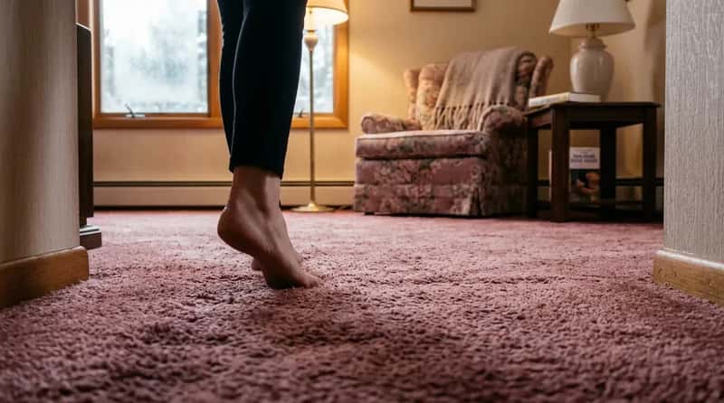
Step barefoot onto thick carpet on a January morning and you understand immediately why wall-to-wall carpeting was considered a luxury. In the 1980s it came in plush pastels – mauve, dusty rose, cornflower blue – and it turned the floor into a major design element. It wasn’t just underfoot comfort. It absorbed sound, softened light, and made the entire room feel warmer without touching a thermostat.
Today’s polished concrete and wide-plank hardwood photograph beautifully and feel brutal at 6 a.m. The 1980s had that figured out. We undid it in the name of resale value and got floors that look great in listing photos and punish everyone who actually lives on them.
#37 – Brass Fixtures That Glowed Like Candlelight
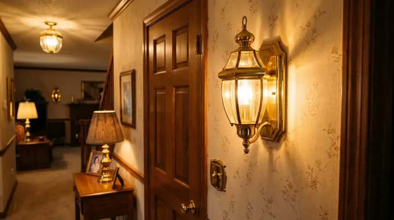
Shiny brass dominated everything from door handles and light fixtures to bathroom faucets and cabinet pulls, creating a cohesive golden glow throughout the house. That warm metallic tone did something that today’s matte black and brushed nickel finishes simply don’t – it made artificial light feel soft. Every lamp, every ceiling fixture, every sconce reflected a little amber warmth back into the room instead of bouncing cold white light off hard surfaces.
Brass fell out of fashion and we called it dated. Then designers started bringing it back and calling it timeless. Both things are true, but the 1980s version was better because it was everywhere at once – a full-house commitment to warmth rather than a single accent faucet in a gray bathroom. When brass was the default, rooms had a glow that modern finishes are still trying to recreate.
#36 – The Formal Dining Room Nobody Used (But Everyone Needed)
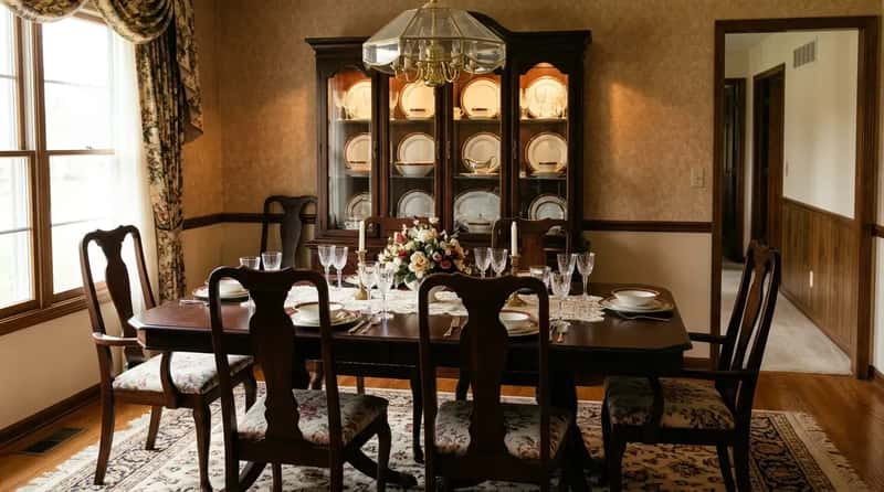
The formal dining room was reserved for Thanksgiving, Christmas, and birthdays – and that reservation was the whole point. A room set aside for celebration teaches everyone in the house that some moments are worth marking differently. Open-plan living is great for daily flow, but it erased that lesson entirely. When every meal happens in the same multipurpose kitchen-living-dining blur, nothing feels special anymore.
There was ritual in setting that table. The good china came out. The kids knew to behave. Behind those glass cabinet doors lived a parallel life – crystal wine glasses arranged by height, a gravy boat that had maybe seen gravy once in 1987, every piece positioned with intention and almost never touched. That restraint was its own kind of warmth. The room existed to mark occasions, and it did its job every single time.
#35 – The Built-In Wet Bar That Said “Adults Live Here”
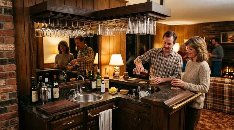
The wet bar was aspirational real estate. Usually built into the corner of the family room or formal living room, it had a small stainless sink, a mirrored back panel, and a row of glasses hanging upside down from a wooden rack overhead. It announced something: this house was built for people who knew how to have a good time. Entertaining wasn’t an afterthought. It was engineered into the architecture.
There’s something about a dedicated space for hospitality that changes the feeling of a whole room. The bar gave a party an anchor. Guests gravitated toward it. Conversations happened there. Today we either haul drinks from the kitchen or spend $15,000 on a freestanding “beverage station” that looks like a hotel mini-bar. The 1980s built it in and it looked like it belonged – because it did.
#34 – Wood Paneling That Made Rooms Feel Like a Den Should
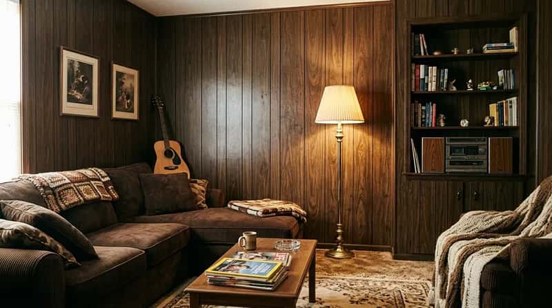
Entering a room with wood-paneled walls delivered an immediate sense of warmth and enclosure that flat painted drywall simply cannot fake. In the 1980s, wood paneling was a popular choice for family rooms and dens, lending a rustic, contained feel to interior spaces. The texture of those panels also absorbed sound differently than smooth drywall, which made rooms feel quieter, more private, and more settled.
Dark faux-wood paneling created a cozy, cave-like ambiance that was perfect for a room meant for relaxing rather than impressing. We stripped it out by the mile and got flat white walls that bounce every sound and reflect every flaw. The rooms got colder. The irony is that wood accent walls are back on every design blog – just at ten times the cost and half the coverage.
#33 – Vaulted Ceilings With Exposed Wooden Beams
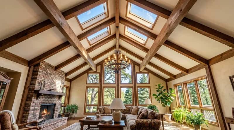
The grandeur of vaulted ceilings in 1980s homes created an open, airy feeling that made living rooms seem genuinely large. Often paired with skylights or tall windows, they let natural light flood the space from above. But the real magic wasn’t the height alone – it was the exposed wooden beams running across the vault that gave the eye something warm and structural to rest on instead of an empty expanse of white drywall.
Those beams did what exposed wood always does: they brought the outside in and reminded you that the house was made of real material. Vaulted ceilings also provided perfect opportunities for dramatic chandeliers and tall windows that connected the room to the sky. New construction occasionally offers vaulted ceilings, but the beams are almost always gone – replaced by smooth, painted surfaces that look clean and feel anonymous.
#32 – The Bay Window Seat That Was Its Own Private World
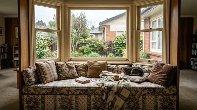
Three angled panes of glass jutting out from the front of the house, capturing light from multiple directions at once – the bay window was the most desirable feature in any 1980s home, and everyone who had one knew it. The built-in window seat below was padded with a cushion in floral chintz or a small-scale geometric print, and it was covered in throw pillows that never quite matched but always looked intentional together.
This was reading territory. Cat-napping territory. The spot you claimed when it was raining and you wanted to watch it without being in it. The light at midday was the best light in the house, and the cushion had a slight give that regular chairs never achieved. New construction rarely includes bay windows. When it does, there’s no seat – just glass and a two-inch sill. That’s not a bay window. That’s a missed opportunity.
#31 – The Separate Family Room (Distinct From the Living Room)
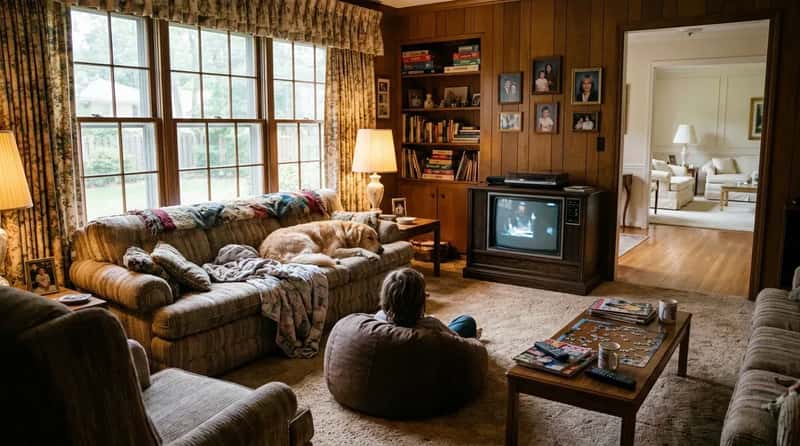
The 1980s home had two distinct gathering spaces: the formal living room and the family room. That distinction mattered enormously. The family room was where the TV lived, where the dog sat on the furniture, where nobody folded their blankets. The living room was where you sat up straight. Having both meant you always had a retreat that matched your mood – performance space and relaxation space, clearly separated.
Modern open-concept design collapsed those two rooms into one undifferentiated space. You gained square footage and lost intimacy. The best thing about a well-designed 1980s house is often exactly this: it gave families more room types, not just more room. A space for the noise and a space for the quiet. You can’t replicate that by moving furniture around. It has to be built in from the start.
At a Glance: Then vs. Now
- 1980s median new home: ~1,740 sq ft, average household size 2.76 people
- 2024 median new home: ~2,205 sq ft, average household size 2.51 people
- The tradeoff: 38% more square footage, fewer distinct rooms, smaller families rattling around in more open space
- Room count then: Formal living room + family room + den + dining room = 4 dedicated social spaces
- Room count now: One great room does the job of all four – and does none of them quite as well
#30 – Chintz and Floral Fabric That Made Sofas Feel Like Somewhere to Actually Sit
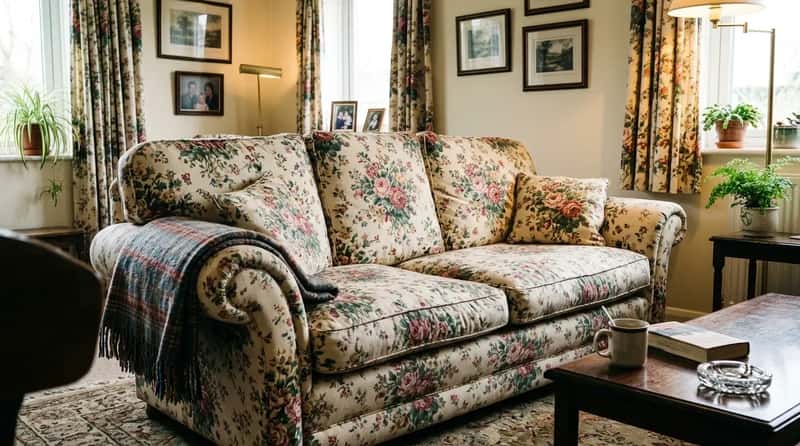
During the early 1980s, floral and chintz fabrics were everywhere – thanks in large part to designers like Laura Ashley, whose dense romantic floral motifs on light backgrounds covered sofas, curtains, and entire bedrooms. It was a look that blended English country charm with folksy warmth, and it made every surface in the room feel like an invitation rather than a surface to keep clean.
Today’s sofas come in “oatmeal,” “fog,” and “stone.” They photograph beautifully, show every crumb and pet hair, and feel like they’re waiting for a film shoot rather than a family. The 1980s chose pattern over pristine – and that choice made rooms feel lived in, which is exactly what homes are supposed to feel like. We traded comfort for photography and called it progress.
#29 – Overstuffed Sofas With Cushions You Actually Sank Into
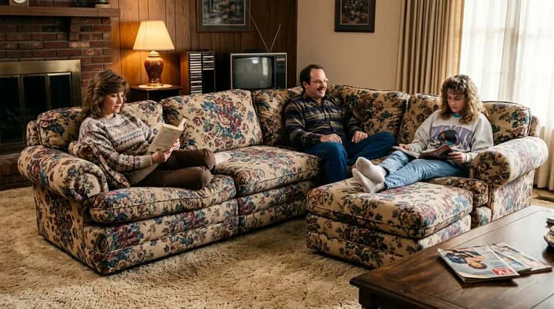
Comfort reigned supreme in the 1980s living room, and nothing embodied it better than the overstuffed sofa. These plush, deep-seated couches – covered in chenille, floral prints, or rich jewel-tone velvets – were designed for maximum relaxation. With their rounded arms and pillowy cushions, they were the gravitational center of any family room, the place where everyone eventually landed.
The 1980s sectional also had a major moment – large, modular designs that families could customize to fit their room perfectly, with enough space for everyone to pile on for a movie. The modern equivalent is a sleek, low-profile sofa in performance fabric that looks great in a showroom and seats three people at a careful, polite distance. Nobody piles on. Nobody stays long. The furniture is telling people how to behave, and it’s not being friendly about it.
#28 – Skylights That Delivered Real, Unfiltered Daylight
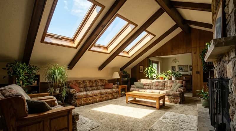
In the 1980s, skylights weren’t an afterthought – builders punched them through vaulted family rooms and kitchen ceilings with genuine generosity, flooding rooms with overhead light that no lamp has ever been able to replicate. On a clear afternoon, that shaft of sunlight across a carpeted floor was the coziest thing in the house. At night, it turned into a window on the stars.
Skylights have fallen out of fashion partly due to leaking concerns with older models and partly because modern energy codes have made builders cautious about glass. The result is rooms that rely entirely on artificial light from fixtures that cannot produce the same feeling as actual sky. The 1980s installed skylights without apology, and the rooms felt alive because of it. That’s a trade most homeowners today would make in a heartbeat.
#27 – Glass Block Windows That Gave Privacy Without Darkness
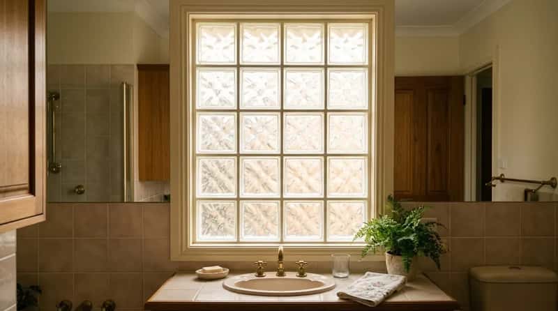
In 1980s bathrooms and foyers, glass block walls solved a real design problem elegantly: they let in diffused, glowing light while keeping the space completely private. The light that passed through them was softened into something almost luminous – not the harsh white of a clear window, not the murky nothing of an opaque wall, but a warm, gentle glow that made the room feel like it had a source of light all its own.
Modern builders replaced glass block with frosted film on a standard window, or skipped the window entirely. Neither version gives you that warm diffused quality. We called glass block dated and designed it out, which means we traded an actual elegant solution for something simpler that works worse. The 1980s had it right. We just didn’t recognize it until it was gone.
#26 – The Brick Fireplace With a Raised Hearth
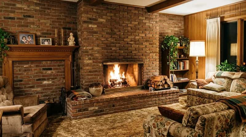
The full-surround brick fireplace – floor to ceiling, with a raised hearth wide enough to sit on – was the gravitational center of the 1980s living room. Everything pointed toward it. Furniture faced it. People gathered around it. It wasn’t decorative. It was structural to how the room functioned socially, and the raised hearth doubled as informal seating overflow when the party got larger than planned.
The combination – warm fire, deep-pile rug in front of it, low light from a single floor lamp – produced a specific kind of coziness that no home design trend since has quite replicated. Today’s fireplaces are often gas inserts in a drywall surround with a floating white mantel shelf. They look fine. They feel like a screensaver. The 1980s version didn’t just look warm. It made the room warm, in every sense.
Worth Knowing
- Brick has genuine thermal mass – it absorbs heat slowly and releases it for hours after the fire dies down.
- A raised hearth at 16 to 18 inches high doubles as bench seating for up to 4 people around the fire.
- Full-surround brick fireplaces were a standard feature in the majority of new suburban homes built in the early-to-mid 1980s.
- Today’s gas fireplace inserts in drywall surrounds offer convenience but zero thermal mass and a fraction of the radiant warmth.
#25 – Ceiling Fans That Actually Made Rooms Feel More Human
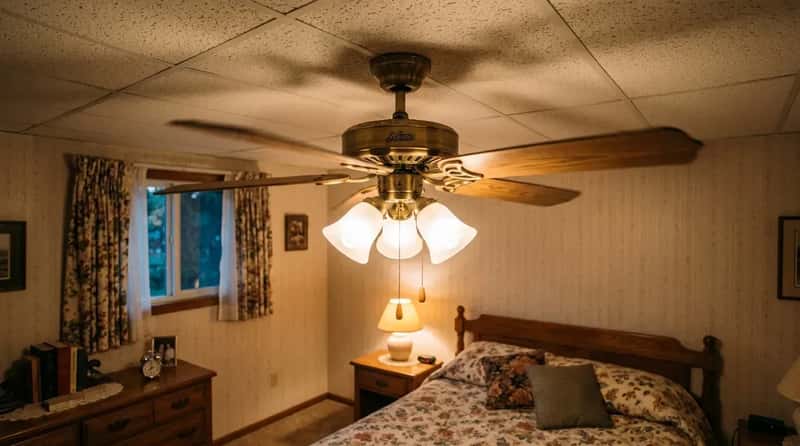
Decorative ceiling fans replaced traditional overhead fixtures in bedrooms, living areas, and even formal dining rooms, offering both illumination and air circulation in one package. The slow rotation of a ceiling fan on a warm evening created a rhythm in a room – gentle air movement that made the space feel alive in a quiet, unobtrusive way. Light and breeze from a single fixture was a genuinely elegant solution that required no app, no hub, and no firmware update.
Modern minimalist design has pushed ceiling fans into the “optional” category, treating them as visual clutter. The result is rooms that rely entirely on HVAC, which produces neither the gentle air movement nor the soft, distributed light that fans provided. A ceiling fan gave a room a heartbeat. The 1980s understood that. We designed it out and called the result sleek.
#24 – The Dedicated Den or Study With a Door That Closed
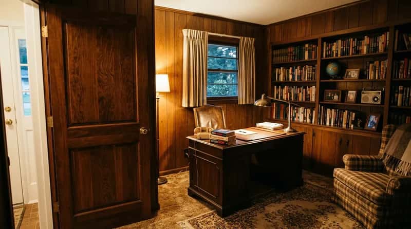
The den was a room with walls and a door – often paneled, always slightly darker than the rest of the house, completely separated from everything else. It was Dad’s room, or the reading room, or the home office before home offices were a formal concept. The door closed. The world stayed out. That architectural privacy was not incidental. It was the whole point of the room.
In a smaller, enclosed room you are closer to walls, windows, furniture, and the warm pool of light from a lamp. It feels comforting in a way that open spaces rarely achieve. Today’s “office nook” – a desk tucked into the corner of an open-plan living area – offers zero acoustic separation and zero psychological retreat. The 1980s den solved a real human need. We opened it up, knocked out the walls, and lost something that can’t be recovered with a room divider from Target.
#23 – Shag and High-Pile Rugs That Made Floors Worth Walking On
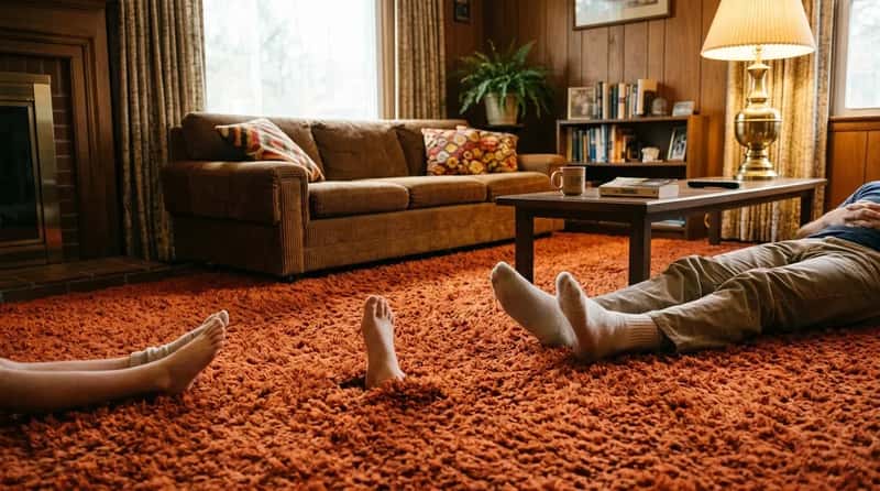
Shag carpets were the stuff of 1980s TV shows, basement hangouts, and Friday nights with no particular place to be. These plush, high-pile carpets added comfort and warmth underfoot in living rooms and bedrooms, in earthy browns, vibrant oranges, and deep teals. The tactile experience of thick carpet underfoot is something no amount of plush bath mat placed over cold hardwood fully replicates.
When the entire floor of a room is soft, the room itself feels soft. That warmth radiates upward into everything – the furniture, the light, the general atmosphere of the space. It’s interior design doing what it’s actually supposed to do: making a place feel good to be inside of. We replaced it all with hard floors and then spent $800 on area rugs trying to get a fraction of that feeling back.
#22 – Track Lighting That Could Actually Be Aimed
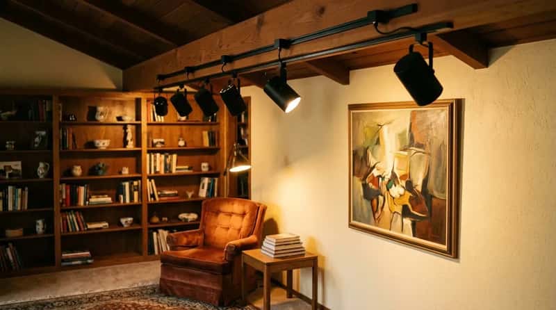
Track lighting became popular in the 1980s as an adjustable solution that let homeowners direct light exactly where they wanted it. Mounted on slanted ceilings or along walls, those swiveling spotlights could illuminate a painting, warm a reading chair, or highlight a built-in bookshelf – creating layers of light that gave rooms visual depth and personality. It was flexible in a way that recessed cans in a grid simply are not.
Today’s interiors often favor cool-toned recessed lighting that floods the entire room evenly and creates the ambiance of a well-lit dentist’s office by evening. Without warmer, directional light sources, spaces feel exposed rather than inviting. Rooms lose visual depth and shadow – and it’s the shadow, more than the light, that makes a room feel cozy. The 1980s track lighting understood the value of pointing light at specific things instead of drowning everything equally.
#21 – Mirror Walls That Made Rooms Feel Like an Event
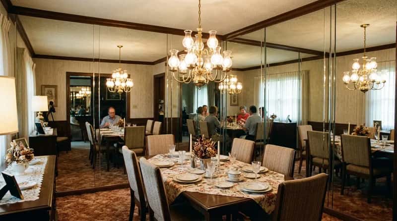
Entire walls covered in mirror tiles or large mirror panels made rooms appear twice as large while multiplying light throughout the space. In dining rooms, bathrooms, and formal living areas, mirrored walls served both functional and aesthetic purposes, creating dramatic visual depth – especially when combined with chandeliers that bounced light in every direction at once. The room felt like it had been dressed for an occasion.
Yes, mirror walls read as dated now. But their underlying logic was genuinely smart: multiply light, expand perceived space, add depth to a flat surface. A dining room with a mirrored wall and a chandelier felt like the kind of place where occasions happened. It had glamour. Today that same room would be a flat white box with a pendant light, and we’d call it “clean.” The 1980s called it living. They weren’t wrong.
#20 – The Entertainment Center Built-In That Organized an Entire Life
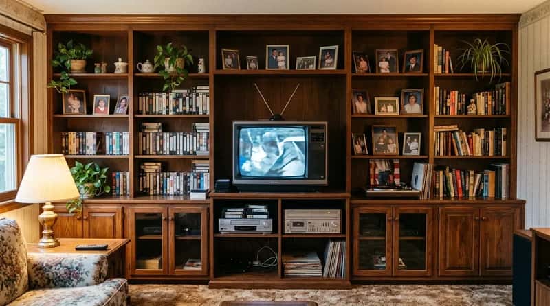
Before flat-screen TVs, entertainment systems were massive affairs that required custom-built wooden cabinets to house televisions, VCRs, stereo equipment, and record collections. These built-ins became focal points of family rooms, often stretching floor to ceiling with adjustable shelves for components, framed photos, and the accumulated evidence of a family’s interests. The entertainment center was the technological heart of the home, and it looked like it belonged there.
The entertainment center gave the family room a spine. Every shelf held something that mattered. Today we hang a 75-inch screen on the wall and put the streaming box somewhere invisible, and the room has no center anymore – just a dark rectangle surrounded by pale walls. The 1980s built-in wasn’t just holding equipment. It was holding the family’s cultural life in one organized, wood-trimmed, intentional place. You knew who these people were by looking at those shelves.
Quick Compare: The Family Room Then vs. Now
- Then: Floor-to-ceiling entertainment center | Now: Floating TV on a blank wall
- Then: Overstuffed sectional facing the fireplace | Now: Low-profile sofa facing the screen
- Then: Ceiling fan + floor lamp + table lamp | Now: Recessed LED grid on a dimmer
- Then: Wall-to-wall carpet, closed off from the kitchen | Now: Hardwood, open to everything
- Then: A room that said “this is where we live” | Now: A room that says “this is where we list”
#19 – Wallpaper Borders That Gave Rooms a Finished Frame
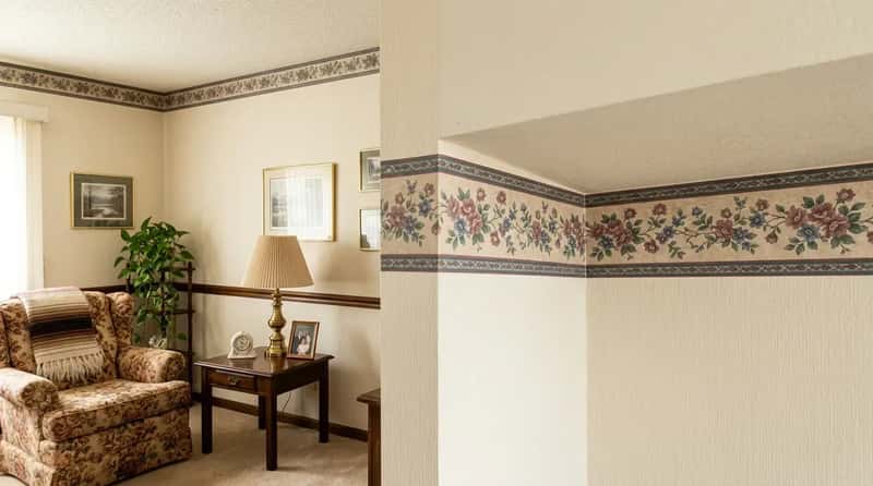
Often featuring floral or geometric designs, wallpaper borders ran along the top of walls or at chair-rail height, creating a visual frame that gave every room a sense of completion. It was a relatively easy design choice with an outsized effect: a border told you this space had been considered from floor to ceiling, not just painted and abandoned. The room felt finished in a way that a single coat of paint rarely achieves.
Today we paint rooms a solid color and call it done. The 1980s understood that a room needs detail at every scale – large architectural features, medium-scale furniture, and fine-detail elements like borders, trim, and hardware that give the eye something to move through. Without that hierarchy of detail, rooms feel flat no matter how expensive the paint color. The wallpaper border wasn’t clutter. It was craft. And we scraped it off and called ourselves minimalists.
#18 – Pastel Color Palettes That Were Bold Without Being Aggressive
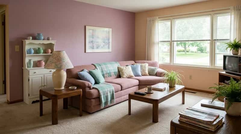
Dusty rose, seafoam green, powder blue, peach – the 1980s pastel palette has been mocked for decades, but spend a week living inside grays and whites and then walk into a room painted in soft mauve. Something in your nervous system relaxes. These weren’t timid colors. They were warm, human, and emotionally generous in a way that neutral palettes are constitutionally incapable of being.
Modern homes emphasize whites, grays, and blacks – sophisticated tones that can feel stark or quietly depressing without accent colors to break them up. The absence of contrast and warmth contributes to a flat emotional environment that’s hard to pinpoint but easy to feel. The 1980s palette understood that color isn’t decoration. It’s atmosphere. We traded atmosphere for resale appeal and ended up with homes that look great in listing photos and feel like hotel lobbies to live in.
#17 – The Separate Laundry Room With Its Own Door

The 1980s laundry room was a real room – often on the main floor, always behind a door, frequently with a folding table, a utility sink, and enough space to stand in without your elbows hitting the dryer. It kept the noise, the humidity, and the visual chaos of housekeeping physically contained. When the washer was running, the rest of the house didn’t know about it. That separation was a luxury disguised as basic planning.
Modern “laundry closets” – a stacked washer-dryer behind bifold doors wedged into a hallway – are spatially efficient and existentially depressing. You cannot fold anything. You cannot pretend the laundry is somewhere else. The 1980s gave the laundry room dignity and a dedicated space, and the house was better organized and felt more composed for it. The people inside it felt it even when they couldn’t explain why.
#16 – Decorative Tile Backsplashes That Made Kitchens Personal
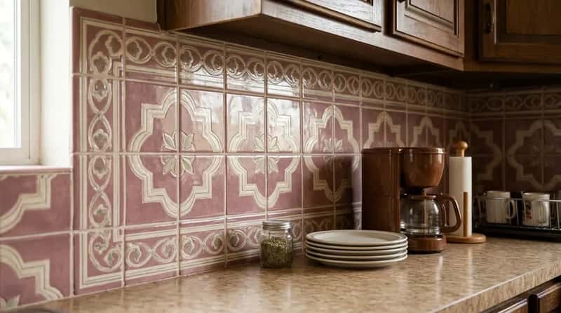
1980s kitchen backsplashes embraced color and pattern – mauve and cream with decorative borders, bold geometric tiles, intricate floral designs that made the kitchen unmistakably itself. A tile backsplash in a specific, considered pattern wasn’t subtle, and that was exactly the point. It told you a person had made a choice. The kitchen belonged to someone. You could picture it thirty years later because it was specific.
Today’s kitchen backsplash is almost always white subway tile. Safe. Resale-friendly. By the tenth kitchen you’ve seen it in, completely invisible. The 1980s kitchen backsplash was unique to the house and the family in it. That specificity is a form of warmth – a room that remembers who chose it. Modern kitchens are designed for the broadest possible buyer, which means they’re designed for no one in particular. You feel that difference the moment you walk in.
#15 – Raised-Panel Oak Cabinets That Looked Substantial
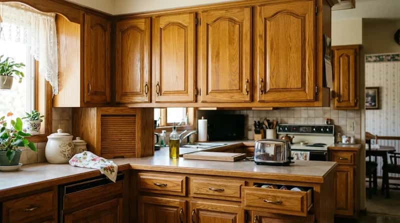
Those raised-panel oak cabinet doors – warm honey tones, visible wood grain, a profile you could run your finger along – had actual visual weight. They looked like they were made of something. Rich, warm, and robust, they brought a solidity to kitchens that flat-front slab cabinets in “greige” simply cannot replicate, no matter how expensive the hardware.
Modern kitchen cabinets are designed to disappear. Flat fronts, integrated hardware, no visible profile – the goal is to make the cabinets look like a wall until you push the right panel. The 1980s went the opposite direction: the cabinets were the feature. They were the warmth. You could feel that someone had thought about the thing. That tactile reality made a kitchen feel finished in a way that minimalism never quite achieves, because minimalism requires perfection and kitchens are where families live imperfectly, every single day.
#14 – Wicker Furniture That Brought the Outside In
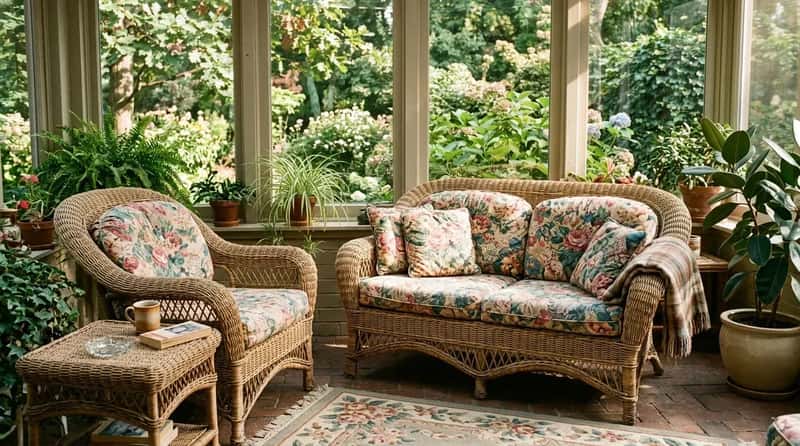
Heavyweight wicker – slightly rattan-scented, piled with chintz cushions, a little irregular in its weave – had a presence in 1980s sunrooms and enclosed porches that modern reproductions can’t quite match. The texture caught light differently than wood or metal: organic, slightly imperfect, visually complex in a way that reads as comfortable rather than designed. It made transitional spaces feel genuinely connected to the outdoors while still being warm and sheltered.
Today wicker is a Pinterest aesthetic with a name and a price tag. In the 1980s it was just Tuesday afternoon furniture – practical, comfortable, completely unpretentious. That lack of self-consciousness is part of what made those rooms feel easy to be in. You didn’t feel like you were sitting inside a mood board. You felt like you were sitting in someone’s house, which is a distinction that matters more than most people realize until they spend time in both.
#13 – Textured Ceilings That Softened Sound and Light
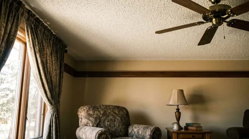
Popcorn ceilings have been a punchline for years, and yet – they worked. That bumpy, stucco-sprayed texture was a genuine sound-absorbing surface. Rooms with textured ceilings were acoustically softer: voices didn’t bounce, music didn’t echo, the general noise of family life was slightly dampened in a way that made the house feel quieter without feeling silent. That acoustic quality was real, and it contributed directly to the sense of comfort those rooms produced.
We spent decades scraping off popcorn ceilings and replacing them with flat, smooth, paint-ready surfaces that bounce every sound directly back at you. The aesthetic upgrade came with an acoustic downgrade that nobody really accounted for. A smooth ceiling in a hard-floored, sparsely furnished room is basically a sound amplifier. The 1980s textured ceiling was an imperfect solution that genuinely solved a real problem. We traded it for something that looks better in photos and sounds worse at dinner.
#12 – The Built-In Intercom System That Kept Families Connected
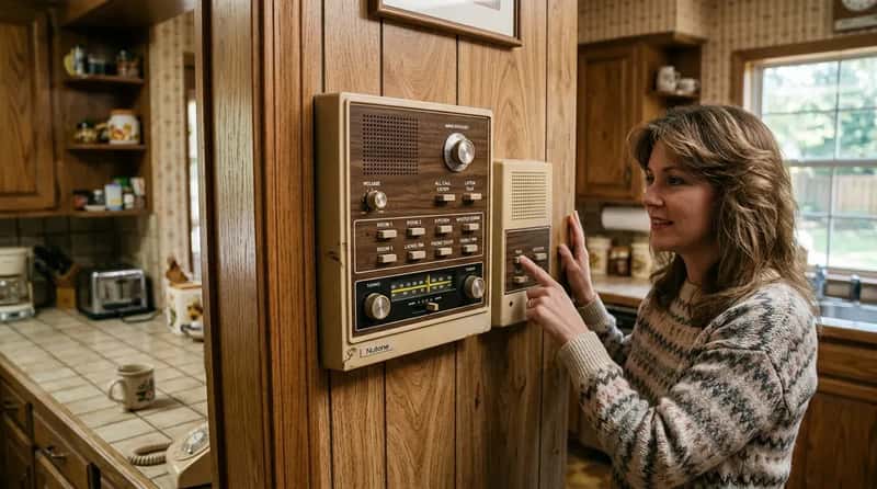
Built-in intercom networks allowed family members to talk between rooms or answer the front door from anywhere in the house – and most systems also included AM/FM radio that could play the same station in every room from a single central panel. It was whole-home audio before Sonos existed, hardwired into the walls, requiring no app update and no password reset. You pressed a button and it worked. Every time.
The intercom gave large houses a connective tissue they’d otherwise lack. You could reach someone in the basement from the kitchen without shouting down the stairs. Some advanced versions included small door monitors that let you see who was outside before opening the front door – a feature we now pay hundreds of dollars for and call “smart home technology.” The 1980s built it in and called it Tuesday. We ripped it out and spent thirty years reinventing it.
#11 – Wallpaper That Gave Every Room Its Own Identity
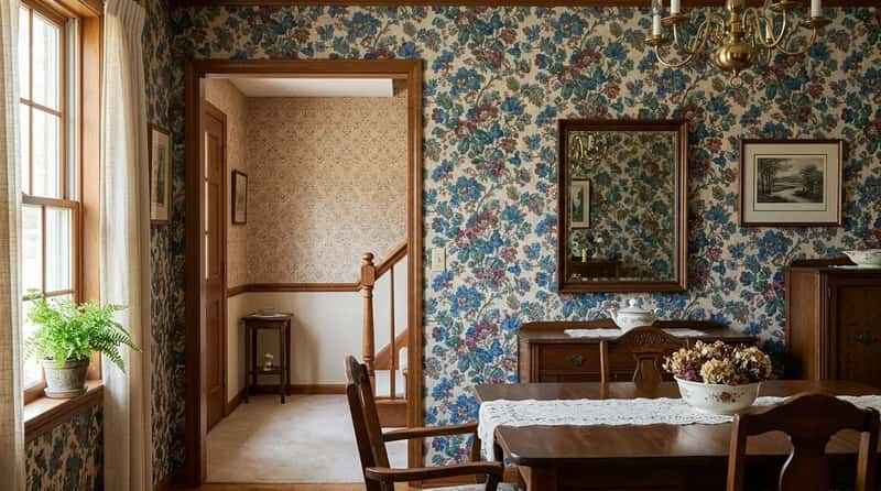
In the 1980s, wallpaper was everywhere – bold florals in dining rooms, subtle geometrics in hallways, country-kitchen patterns above chair rails. Each room had its own visual identity. You walked through the house and moved through distinct atmospheres, each one slightly different from the last. The wallpaper was doing what paint alone can rarely achieve: giving a surface genuine depth, pattern, and personality that rewarded close attention.
Texture absorbs and scatters light in ways smooth drywall cannot – you get softer light, gentler shadows, and an overall warmth that people feel before they understand why. Wallpaper creates exactly this effect. The pattern gives the eye something to explore; the texture diffuses light; the room feels layered and considered. The shift to painted drywall simplified maintenance at the direct cost of character. Rooms became surfaces. The 1980s made them experiences.
#10 – Split-Level Design That Created Real Zones Within One Home
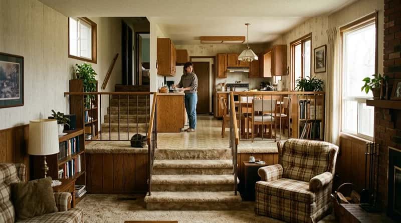
Split-level homes offered a distinctive architectural approach in the 1980s, with staggered floors that created genuine separation between living areas without requiring full-height walls or closed doors. The half-flight of stairs between levels gave each zone its own identity and its own atmosphere. You could call down from the kitchen, but the basement felt like a different world. That gentle layering made a house feel larger and more varied than its square footage suggested.
Modern single-level open-concept design erases all of that. There’s one plane, one sightline, one acoustic environment. The split-level gave a family discovery – the sense that around each corner and down each short staircase was a slightly different version of home. Kids claimed the lower level. Adults owned the main floor. The house accommodated the whole family without crowding anyone. That’s not just floor plan logic. That’s domestic wisdom built into the architecture.
Why It Stands Out: The Split-Level Advantage
- Split-levels create acoustic separation between floors without soundproofing – the half-staircase does the work naturally.
- Lower levels stayed cooler in summer and warmer in winter, making them genuinely preferred hangout zones for different seasons.
- Kids’ basement territory and adults’ main-floor territory created organic boundaries that reduced family friction without a single rule being posted.
- The staggered layout made the same square footage feel like more house – different sightlines, different light, different moods at every level.
#9 – The Round Kitchen Table Where Nobody Sat at the Head
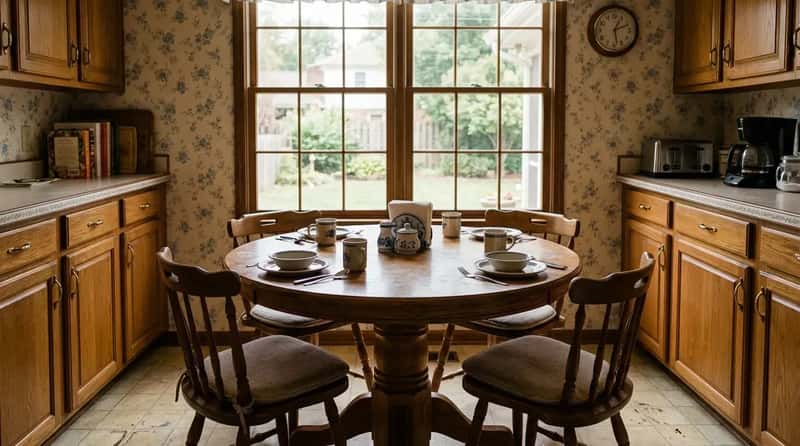
Round tables bring people together in a way that rectangular ones don’t, and in the 1980s they were a kitchen staple. Often made from warm oak or laminate with a wood-grain print, they were sized for a family and shaped for conversation. Everyone was equally close to everyone else. There was no head seat, no power position, no one who got to look down the length of the table at everyone else.
That equality of position changed how meals felt. Kids felt less managed. Adults felt less formal. Conversations flowed in circles rather than up and down a table’s hierarchy. Furniture shapes human behavior more than we tend to admit, and the 1980s round kitchen table quietly encouraged the best kind of family dynamic at every single ordinary meal. We replaced it with a long rectangular farmhouse table that seats twelve and makes a family of four feel like they’re eating in a conference room.
#8 – Warmly Lit Spaces Layered With Multiple Light Sources
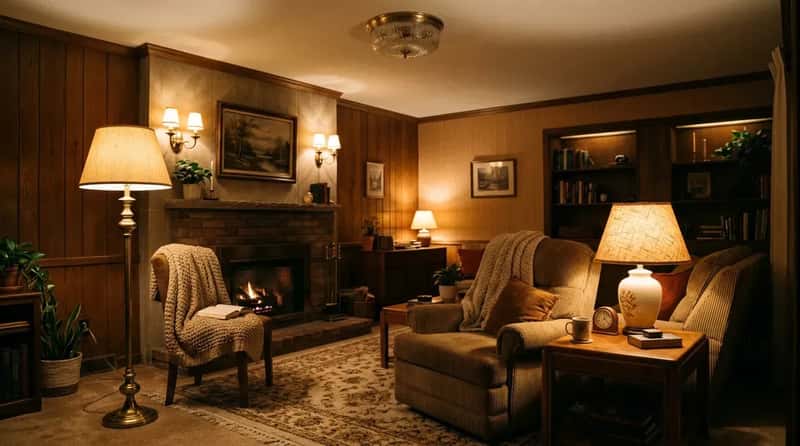
The 1980s home delivered warmth through layered lighting – floor lamps, table lamps, wall sconces, and overhead fixtures working together so that no single source was doing everything. A floor lamp cast a warm circle near the reading chair. A table lamp glowed on the end table. The overhead fixture stayed dim or off entirely by evening. The result was a room that felt inhabited, graduated, and warm rather than evenly illuminated and exposed.
Today’s interiors favor recessed LED grids that flood the entire room from above with equal intensity – which is great for finding your keys and terrible for relaxing. Warmth depends on contrast as much as illumination. When every corner is equally bright, there’s no shadow, no gradient, no sense of a warm center to move toward. The 1980s lamp collection understood instinctively that coziness is about where the light isn’t just as much as where it is.
#7 – Rooms That Were Scaled to Human Bodies, Not Camera Lenses
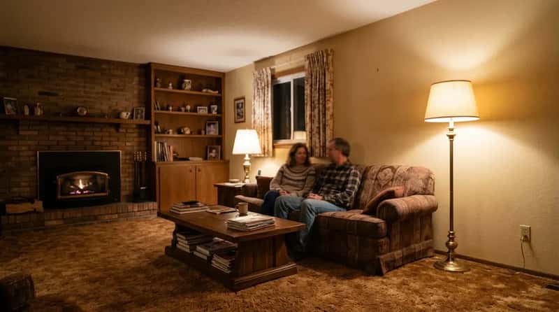
A room can succeed in photography, resale presentation, and construction efficiency while still underperforming as a place to live. Modern homes are often optimized for visual clarity and market legibility – designed to show well, appraise well, and sell well. The 1980s built rooms for people who had to live in them, not for listing photos. That’s a subtle difference that produces a completely different feeling the moment you sit down for the evening.
The 1980s family room had a ceiling height close enough to feel intimate, walls near enough to make a lamp meaningful, and a layout that kept people within easy talking distance of each other. Materials were thicker, details were more deliberate, and rooms were arranged around daily life rather than open-concept resale checklists. That’s not design nostalgia. That’s basic human comfort, built in from the start, and it’s exactly what gets value-engineered out of new construction today.
#6 – Distinct Spaces That Gave Introverts Somewhere to Escape
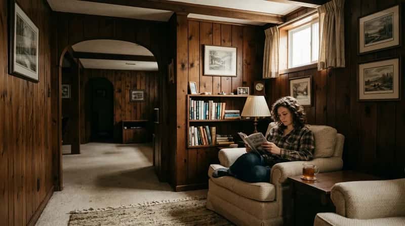
Wide, open spaces look stunning in listing photos and can feel impersonal and quietly lonely in real life. That emotional disconnection surprises people who expected instant comfort when they moved into a modern home. The 1980s house was the architectural opposite: full of distinct, enclosed, purposeful rooms that offered genuine retreat without requiring you to leave the building.
The basement rec room. The master bedroom with its own sitting area. The den. The formal living room. Each space offered a different emotional register – louder or quieter, more social or more private. For anyone who needed to step away from the noise of the house, there were multiple destinations. In an open-concept home, there’s nowhere to go that isn’t visible from somewhere else. The 1980s gave everyone in the family a place to breathe. That’s not decorating. That’s architecture doing its actual job.
#5 – Materials That Had Real Thermal Mass and Physical Weight
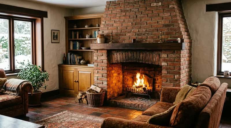
Heavy materials like brick, stone, and thick plaster have thermal mass – they absorb heat slowly and release it slowly, helping keep a house warm in winter and cool in summer. This natural temperature moderation provides a sense of comfort that lightweight modern construction, which heats and cools rapidly and dramatically, simply cannot match. The house feels steadier. More anchored. Less reactive to the weather outside.
The 1980s brick fireplace, the thick tile floors, the solid oak cabinets, the plaster walls – these weren’t just decorative choices. They were thermally functioning parts of a home that literally felt warmer because of what they were made of. Walk into a house built with these materials on a cold day and you feel the difference before you even take your coat off. That’s not imagination. That’s physics. And it’s one of the things no amount of interior decorating can replicate in a house framed in lightweight materials and finished in drywall.
Fast Facts
- Brick and stone can store heat for 8 to 10 hours and release it gradually – a passive heating effect that requires zero energy input.
- A solid oak cabinet door weighs roughly 3 to 5 times more than its modern MDF flat-front equivalent.
- Plaster walls, standard in older construction, are typically twice as dense as modern drywall – absorbing both sound and temperature swings.
- The 1980s embrace of ceramic tile floors in kitchens and entryways added thermal mass right where daily foot traffic concentrated it most.
#4 – Walls With Texture That Made Light Feel Soft Instead of Harsh
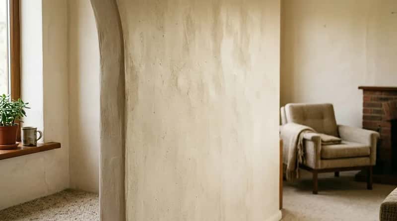
Plaster walls with subtle curves, surfaces that weren’t perfectly smooth, ceilings with a slight spray texture – the 1980s home was rarely flat, and that imperfection was a feature, not a flaw. Texture absorbs and scatters light in ways that smooth surfaces can’t, producing softer shadows and a warmer overall tone that people feel before they understand it. The room looked lived in before anyone moved their furniture in.
Modern homes built with smooth drywall and shiny finishes often look too pristine. Brightness without texture feels sterile in a way that’s hard to correct with decorating. Over time, walls develop a slight softness – small imperfections that catch light in subtle ways, giving surfaces quiet character. The 1980s home had that texture built in from day one. We sanded and skimmed it all to a perfect flat finish and then wondered why the rooms felt like they were waiting for someone to move in.
#3 – A House That Felt Like It Had Been Designed, Not Just Assembled
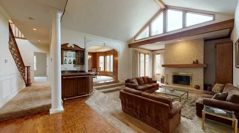
The 1980s were a decade of conspicuous ambition, and that desire to impress translated directly into residential architecture. Builders and buyers invested in details – columns, arched doorways, decorative moldings, specialty windows, sunken rooms, built-in bars. The house was making an argument about the people inside it, and that ambition produced character. These homes were designed to be noticed, which meant they were designed with intention.
When bigger was better and homeowners weren’t afraid to make bold choices, houses had distinct personalities that reflected genuine optimism and a willingness to commit to a vision. That confidence produced homes with real character – something most new construction actively avoids in the name of broad market appeal. A house designed for everyone ends up feeling like it belongs to no one. The 1980s chose specificity, and specificity is what warmth is made of.
#2 – The Sense That Every Room Had a Story and a Purpose
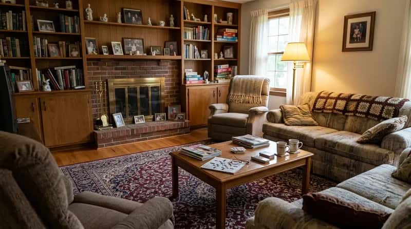
Older homes feel like they’ve been shaped by time, by families, celebrations, and quiet daily routines. That accumulated history creates a warmth that brand-new construction simply hasn’t had time to develop. The 1980s home had rooms that gathered meaning year after year – the den where Dad watched the game, the kitchen table where homework got done, the living room that sat perfectly preserved until Christmas arrived and suddenly justified its existence completely.
A brand-new build feels unfinished because it lacks history, personality, and detail – it’s a strong starting point, not a finished product. The 1980s home arrived with personality already built in: wood grain, color, texture, dedicated rooms, built-ins, and details that told you someone had thought about it. You moved in and the house already felt like it had lived. That head start on warmth is something new construction has to earn the hard way, over years. The 1980s handed it to you on day one.
#1 – The Overall Feeling That a Home Was Meant to Be Inhabited, Not Photographed
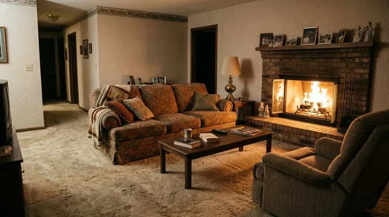
New construction tends to prioritize efficiency, scale, and resale. The 1980s home was built differently – for a life to happen inside it. Carpet you could fall asleep on. A fireplace that actually heated the room. A kitchen table you could crowd eight people around on a Tuesday night. A basement that felt like a completely different world. These weren’t design choices made for a listing. They were choices made for the people who had to live there every day.
The rooms weren’t perfect. The colors were sometimes too much. The brass needed polishing and the carpet showed footprints and the wallpaper border was slightly crooked in the hallway. None of that mattered, because you walked in and felt immediately, unmistakably at home. There’s a reason people still drive through older suburban neighborhoods on autumn evenings and feel something they can’t quite name. It’s not just memory. It’s design doing its actual job – creating spaces where human beings feel sheltered, specific, and genuinely comfortable. The 1980s built that into the walls. We’ve been trying to get it back ever since.