

Most people assume a living room makeover takes a contractor, a decorator, and a budget that makes your eyes water. Turns out, all you really need is a photo and a prompt. We gathered 25 of the most beaten-up, beige-soaked, forgettable living rooms we could find – the kind with water-stained ceilings, mismatched hand-me-down furniture, and carpet that has no business still existing – and ran every single one through today’s leading AI design tools with one directive: give this a 1950s mid-century makeover. The global market for AI applied to interior design reached $1.09 billion in 2024, and after seeing what it did to these rooms, that number makes complete sense.
Some results were jaw-dropping. A few were borderline offensive to the original owners. And a handful hit something so nostalgically perfect that it genuinely made us want to throw out our furniture tonight. The 1950s marked a significant era in interior design, reflecting post-war optimism and a suburban boom – and when AI channels that energy into a broken-down modern space, the contrast is almost violent. Here are all 25 makeovers, counting down from “impressive” to “how is this even the same room.”
#25 – The Apartment With the Builder-Grade Beige Walls
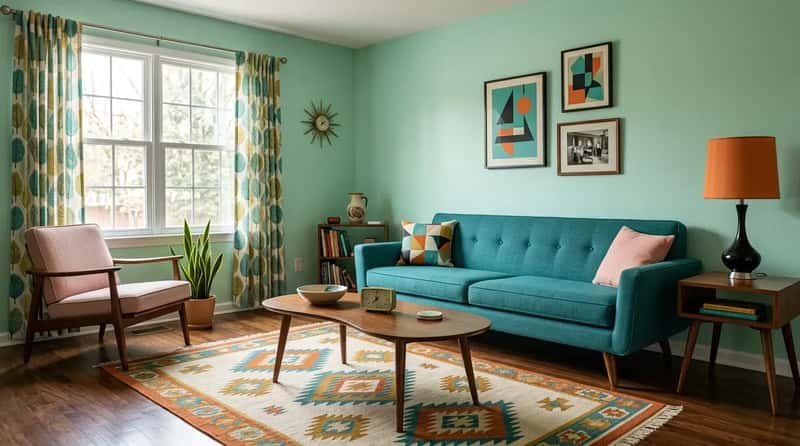
This suburban rental looked like it had been designed by someone who’d never once glanced at a paint swatch. Flat beige walls, brown laminate floors, a gray sectional from a discount warehouse – the visual equivalent of giving up. The AI’s first move? Blow the whole color story up. Soft pastels like mint green, pale pink, and buttery yellow dominated the 1950s palette, but bold hues like teal, orange, and black also made striking statements – and this tool leaned hard into that contrast. The walls shifted to a soft mint, the sectional became a low-profile teal sofa with tapered walnut legs, and suddenly the room had an identity it had never once possessed.
The transformation wasn’t perfect. The AI struggled with the awkward window placement and left one corner oddly bare. But compared to the beige void it started with, this was a resurrection. At its heart, 1950s interior design combined innovation with accessibility – for the first time, the average home could feel modern, not just practical. That’s exactly the energy this room needed and had never once had.
Fast Facts: The 1950s Color Playbook
- Core pastels: mint green, blush pink, powder blue, buttery yellow
- Bold accent hues: teal, burnt orange, chartreuse, mustard yellow
- Classic contrasts: black-and-white with a single saturated pop
- Wood tones: light teak, honey walnut – never dark, heavy stains
- The rule: neutrals as backdrop, color as personality
#24 – The Living Room With the Dropped Ceiling and Fluorescent Lights
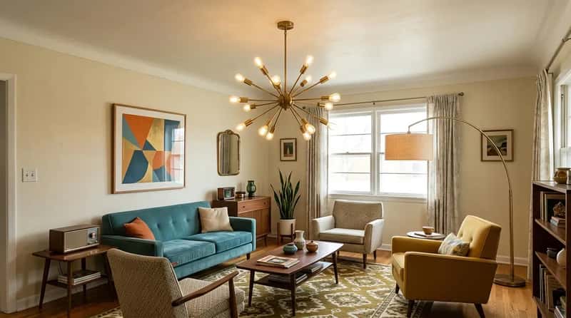
This one was genuinely painful to look at. A dropped ceiling with fluorescent grid panels, a recliner aimed at a wall-mounted TV, and absolutely zero decorative intention anywhere in the frame. Dropped ceilings are basically AI kryptonite – but the tool handled it cleverly. It rendered the ceiling as if it simply didn’t exist, replacing it with a clean plastered surface and a centerpiece fixture that changed everything. Retro lighting like starburst chandeliers and arc floor lamps reflect the era’s love of atomic and space-age motifs, and that’s exactly what landed here.
A brass starburst chandelier dropped into the center of the frame and the room went from depressing to dramatic in a single design choice. The recliner became a low-slung occasional chair in burnt orange vinyl. The single biggest shock was how one lighting swap reframed everything else in the room. If you’ve been ignoring your ceiling fixtures, this makeover is your sign to stop ignoring them.
#23 – The Family Room Drowning in Brown
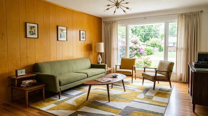
Brown couch. Brown end tables. Brown wood paneling. Brown shag carpet. This room looked like a 1978 hunting lodge that had quietly given up. The AI’s 1950s treatment was surgical: it kept the wood paneling – a smart move, since paneling was actually period-appropriate – but lightened it dramatically, rendering it in a warm honey tone rather than the oppressive dark walnut it had been. Mid-century furniture favored sleek, modern designs with clean lines, often in wood or vinyl, and that philosophy applied to every surface here.
The shag carpet was replaced with a geometric area rug in mustard and white, anchoring a new seating arrangement with a low-profile sofa in olive green. A ceramic table lamp with an hourglass base appeared on a refinished side table. The paneling went from the room’s biggest liability to its best asset – something no human designer would have likely kept without charging you three consultations to arrive at the same conclusion.
#22 – The Tiny New York City Living Room With No Natural Light
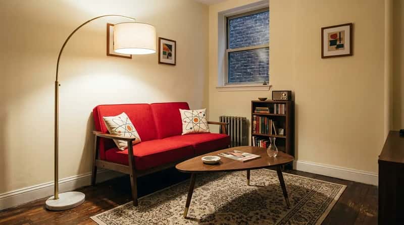
Small spaces are where AI design tools either shine or completely collapse. This 280-square-foot Manhattan living room had one window that faced a brick wall, a futon, and a folding table. The AI knew exactly what to do. The 1950s optimized living spaces around multifunctional furniture – convertible sofas, storage ottomans, pieces that served dual purposes without sacrificing style. That’s the exact playbook this room needed.
The futon became a compact loveseat in cherry red with wooden frame accents. The folding table was replaced with a small boomerang-shaped coffee table – one of the most iconic silhouettes of the era, symbolizing motion and a rocket’s trajectory. A tall arc floor lamp solved the light problem better than any overhead fixture could have. This room went from a sad crash pad to something a young Frank Sinatra might’ve actually liked.
#21 – The McMansion Living Room With 20-Foot Ceilings
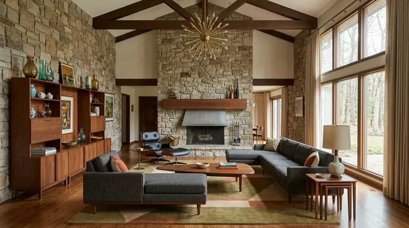
Big rooms are deceptively hard. This one had soaring ceilings, a massive stone fireplace, and furniture scattered too small and too randomly, like pieces abandoned mid-thought on a showroom floor. The proportions were all wrong. The AI’s 1950s solution centered everything around the fireplace – which was already there and already perfect. The classic mid-century living room layout was designed for gathering, with seating focused on a central coffee table and anchored by a fireplace or feature wall.
The render brought in a massive low sectional in charcoal tweed, placed a wide walnut coffee table dead center, and lined one wall with a floor-to-ceiling storage and display unit filled with ceramics, books, and small sculptures. That storage wall move is straight from the 1950s playbook – designer Alexander Girard’s famous 50-foot-long storage wall in the Miller House was artfully arranged with books, sculpture, and objects from around the world. The AI knew its history.
#20 – The House Flip Gone Wrong
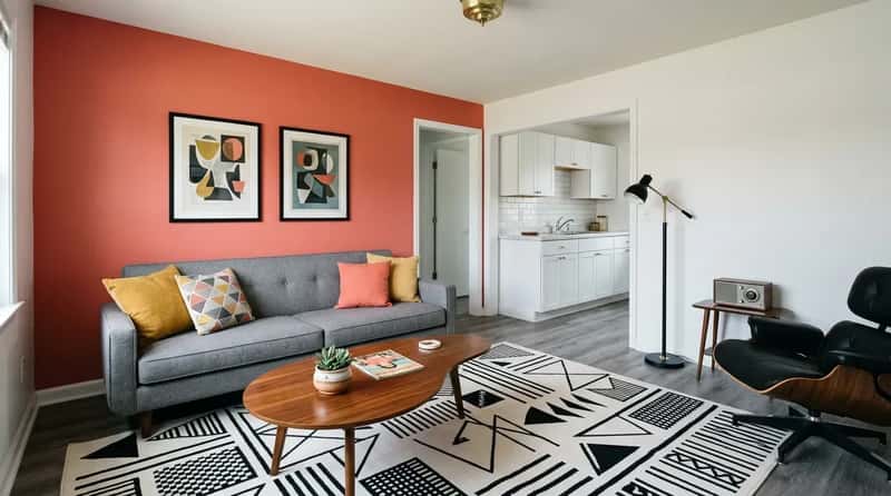
Whoever flipped this house did the bare minimum and called it done. Gray vinyl plank flooring throughout, white shaker cabinets visible from the living room, and a single gray couch against a white wall. It looked like every other flip on Zillow. The AI had to invent an entire personality from scratch, and it did it by going bold wherever the flip had played safe. In stark contrast to wartime drabness, the 1950s celebrated color – and the AI answered with a deep coral accent wall, a kidney-shaped coffee table in natural wood, and a black-and-white geometric area rug that gave the floor a reason to exist.
The existing gray couch was kept but completely reinterpreted – throw pillows in mustard and teal changed its personality without changing the piece. A pair of matching ceramic table lamps with conical shades appeared on either side. It looked like an HGTV reveal, and it cost exactly zero dollars in real money to see. AI interior design tools can produce realistic space renderings in minutes rather than the hours or days traditional methods demand – and this room proved exactly why that matters.
At a Glance: What AI Design Tools Can (and Can’t) Do
- Can do: Full room re-renders from a single uploaded photo
- Can do: Generate up to 1,000 design variations in under an hour
- Can do: Swap furniture, color, lighting, and flooring simultaneously
- Struggles with: Unusual architecture like corner fireplaces and dropped ceilings
- Struggles with: Rooms with very poor or uneven source lighting
- Market size: $1.09B in 2024 – projected to reach $3.59B by 2029
#19 – The Grandma’s House Stuck in 1992
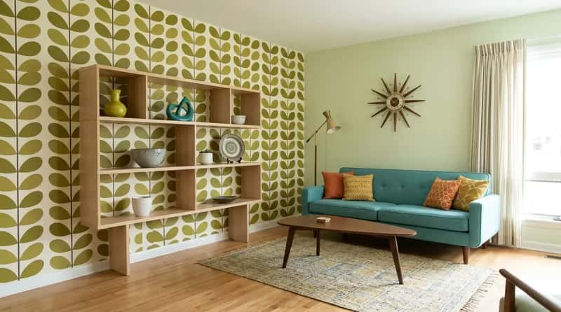
This room was drowning in a different decade’s nostalgia – lace doilies, floral wallpaper in mauve and dusty rose, a curio cabinet full of collectibles, and rose-patterned carpet that had seen better days. Ironically, some of these elements weren’t that far from 1950s sensibilities, but the AI knew the difference between their quiet elegance and this room’s fussy excess. The 1950s favored simplicity and functionality over the ornate heaviness of earlier eras, and the AI stripped accordingly.
The floral wallpaper gave way to a single feature wall in a graphic mid-century print – stylized leaf shapes in olive and cream. The curio cabinet was replaced with open shelving displaying just five or six carefully chosen ceramic pieces. The AI correctly identified that less really is more when you’re channeling mid-century authenticity. The room went from cluttered and tired to deliberately composed.
#18 – The All-White Room That Felt Like a Hospital
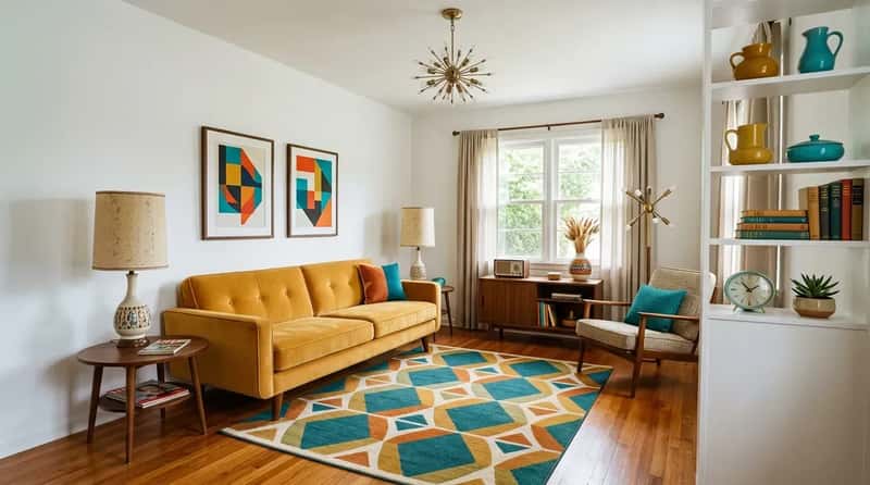
Some people go all-white thinking it reads as clean and modern. What it actually reads as is an ER waiting room. This room had white walls, a white couch, a white shag rug, and white open shelving with a single succulent on it – so aggressively neutral it was almost avant-garde. The AI saw right through it. The 1950s era is characterized by bold colors, geometric patterns, and innovative furniture designs that transform a home into a retro oasis, and this room was about to get exactly that treatment.
The render kept the white walls – smart, since they let furniture pop – but dropped a butterscotch velvet sofa with splayed wooden legs into the room as the anchor piece. A walnut side table, a turquoise ceramic lamp, and a starburst mirror above the fireplace completed the look. The starburst mirror was the single most transformative element in the entire before-and-after. Turns out the white room wasn’t the problem. It was just waiting for the right statement pieces.
#17 – The Open-Plan Layout That Tried to Be Everything
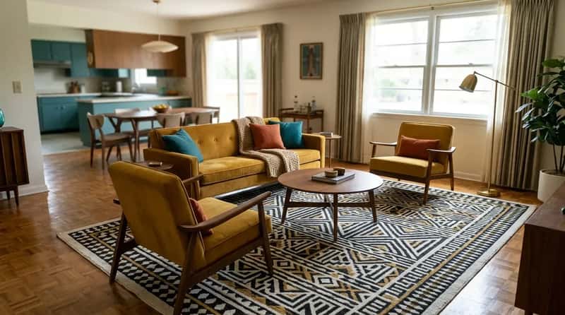
Open-plan layouts are notoriously hard to furnish. This one connected the living room, dining area, and kitchen with no visual separation – everything just floated in one giant beige sea. Furniture placement was chaotic, and nothing anchored anything. The AI used a classic 1950s strategy: zone definition through rugs and furniture arrangement. Low-profile furniture, inward-facing seating, and layered textures created a cozy, defined zone where there had been nothing but drift.
A large geometric rug in black, white, and gold created an immediate visual boundary for the living area. Seating was pulled away from the walls and arranged inward, conversation-pit style, around a round walnut coffee table. Conversation pits – sunken seating areas popular in the 1950s – are making a comeback driven by a desire for intimate, unplugged spaces. The AI essentially created the illusion of separate rooms without moving a single wall.
#16 – The Living Room Held Hostage by a Giant Sectional
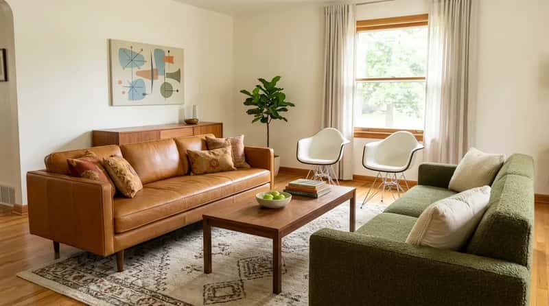
This room had been completely taken over by an enormous gray L-shaped sectional. The couch dominated every wall, left no room to breathe, and made the space feel like a furniture showroom where the rest of the room was an afterthought. Getting rid of it virtually was the first and most important decision. The AI swapped it for two facing sofas – a classic 1950s arrangement that designers call a “conversation grouping” – built for gathering, not just watching.
One sofa was rendered in warm caramel leather, the other in complementary olive boucle. A rectangular walnut coffee table sat between them, flanked by two Eames-inspired shell chairs in white. The room suddenly had negative space – and that space made it feel twice as large. Turns out the sectional wasn’t making the room feel bigger. It was making it feel trapped. Mid-century furniture’s minimalist forms and tapered legs proved exactly why that philosophy still works today.
Quick Compare: Giant Sectional vs. 1950s Conversation Grouping
- Sectional: One dominant piece – eats the room, limits layout flexibility
- Conversation grouping: Two facing sofas – creates zones, frees floor space
- Sectional: Attention aims at screen – passive, solo-use design
- Conversation grouping: Attention aims inward – social, gathering-first design
- Verdict: Mid-century arrangement made the room feel twice as large with the same square footage
#15 – The Basement Living Room With Zero Natural Light
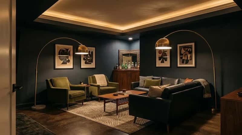
Basements are brutal. Low ceilings, no windows, fluorescent shop lights hanging from exposed joists, and mismatched furniture that migrated downstairs over the years. Most AI tools fumble on basements because the lighting data is so poor. This one leaned into the darkness rather than fighting it – going full moody mid-century lounge. Think Rat Pack den, not family recreation room. Retro lighting with vintage flair is a hallmark of 1950s style, and under the right warm glow, even a basement becomes somewhere people actually want to be.
The AI introduced warm recessed lighting in a cove detail and added a pair of dramatic arc floor lamps in brushed brass. The walls went deep charcoal. The furniture became a rich cognac leather sectional with low arms and wooden feet. Going dark in a dark room is a counterintuitive 1950s trick that almost always works. Vintage lighting fixtures combining geometric shapes with metallic finishes set a nostalgic scene that radiates elegance – and this basement became the coolest room in the house.
#14 – The Living Room Where Every Piece Came From a Different Era
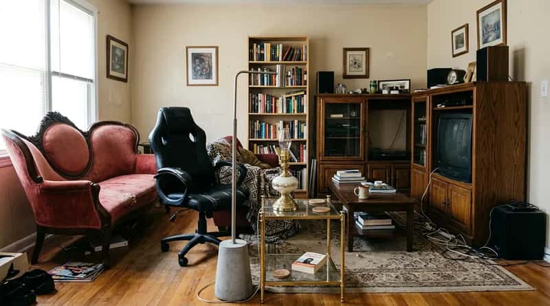
This room looked like a furniture estate sale had exploded inside it. A Victorian settee sat next to a mid-2000s faux-leather gaming chair. An Ikea bookshelf stood beside a heavy 1980s oak entertainment center. A contemporary floor lamp with a concrete base competed with a brass Hollywood Regency side table. It was visually exhausting – the kind of room where your eyes don’t know where to land. The 1950s captured a spirit of creative explosion, with families seeking to make their homes feel more modern, cozy, and inviting simultaneously.
The AI’s genius here was restraint. Rather than designing an entirely new room, it identified two or three pieces with genuine 1950s bones – the brass side table stayed, the Victorian settee got reupholstered in an atomic-print fabric – and rebuilt everything else around them. The AI found the vintage anchors hiding inside the chaos and designed outward from them. One of the most powerful aspects of retro-chic design is exactly that: blending old and new to create a room that feels both timeless and fresh.
#13 – The Rental With the Unmovable Stone Accent Wall
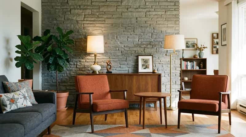
Landlord-installed stone accent walls are everywhere, and almost none of them look intentional. This one was a rough-cut gray ledgestone feature wall behind the couch – the kind that screams ‘2011 renovation special.’ The rest of the room was harmless but forgettable. The AI couldn’t remove the stone wall, so it did the only clever thing: it made the stone look deliberate by designing everything else to complement it. The 1950s didn’t shy away from mixed textures – leather, wood, and metal combined for a dynamic look, and stone fit right in.
Against the gray stone, the AI placed a warm walnut credenza along the floor. Two mid-century armchairs in rust orange flanked a simple round table. The whole palette – rust, walnut, gray stone – suddenly read as a deliberate mid-century color story rather than an accident. The AI turned the room’s biggest eyesore into its strongest design feature. A bold geometric rug in terracotta and cream sealed the deal.
#12 – The Home With the Awkward Corner Fireplace
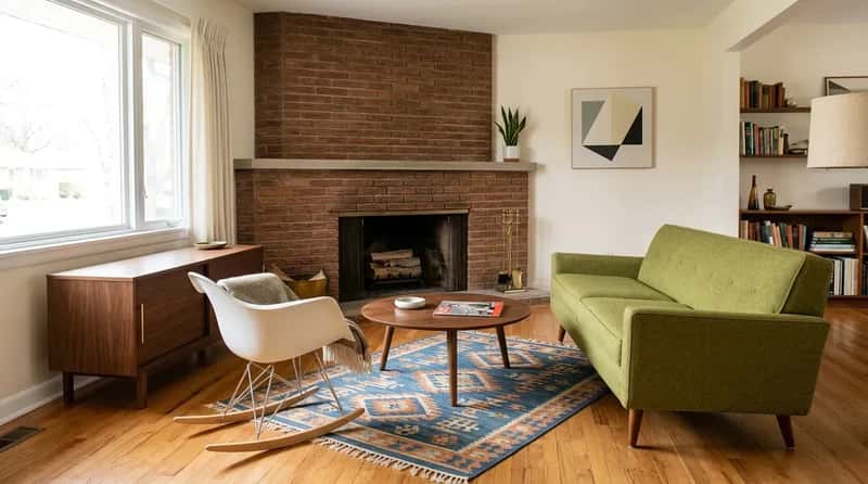
Corner fireplaces look like a great idea until you try to arrange furniture around them. Nothing sits right. Everything angles weird. This room had a brick corner fireplace, a couch shoved against the far wall pointing toward it diagonally, and nothing else that made spatial sense. The 1950s emphasized furniture arrangements that maximized both space and conversation – and that principle was exactly what this room had been missing since the day it was built.
The render pulled the sofa away from the wall and angled it slightly toward the fireplace, creating a natural conversation zone. A mid-century rocking chair in molded fiberglass finished the seating triangle, and a low walnut media cabinet ran along the adjacent wall. The floating furniture arrangement – pulled from the walls and angled inward – is the single most underused trick in American living room design. The fireplace finally felt like an invitation instead of an obstacle.
#11 – The House With the Kids’ Toys Everywhere (Yes, We Kept Them In)
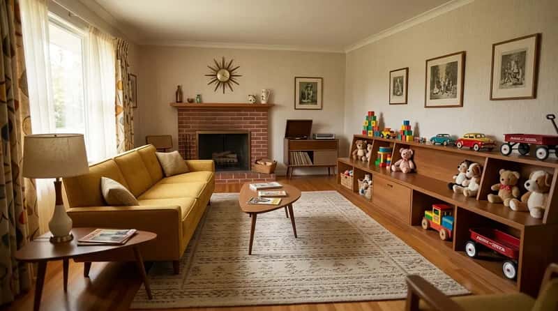
We didn’t clean this one up before feeding it to the AI. The photo had LEGO bricks on the floor, a foam play mat in primary colors, a plastic toy chest in the corner, and a couch buried under stuffed animals. We wanted to see if the AI could look past the chaos and find the bones of the room underneath. It absolutely could. The AI stripped the visual noise and redesigned the underlying space without comment on the clutter – just delivered the room as it could be.
The result was a warm, family-centered 1950s living room with a low upholstered sofa in durable textured mustard fabric – practical and period-appropriate. A built-in storage bench along one wall handled the toy problem elegantly. The AI quietly suggested the room could be organized and beautiful simultaneously – something the family clearly needed someone to say out loud. The 1950s defined the standard of living by comfort, practicality, and the creation of genuinely inviting family spaces. This render nailed all three.
#10 – The Sunroom Converted Into a Sad Living Annex
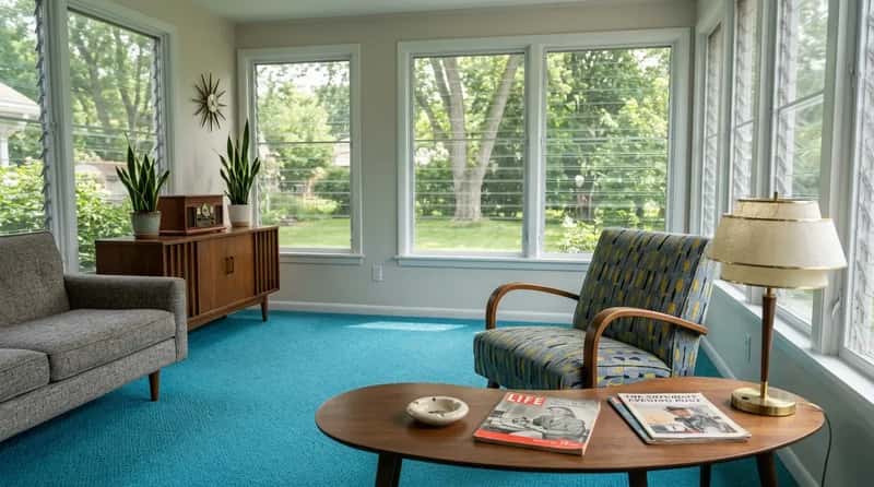
This room was a sunroom that had been half-heartedly converted into additional living space. Jalousie windows on three walls, indoor-outdoor carpet on the floor, and a random collection of patio furniture dragged inside. It looked like no one had committed to the conversion. The AI made the decision the homeowners had been avoiding: commit fully to the interior. Hardwood flooring was a popular material in the 1950s, and wall-to-wall carpet became available in a range of colors and textures – either choice would have been a statement. The AI chose statement.
The jalousie windows were painted a crisp white to lean into the vintage architecture rather than fight it. The patio furniture was gone entirely, replaced with a wicker-and-wood seating set that straddled indoor and outdoor in a thoroughly 1950s way. Cushions in a bold turquoise-and-white stripe pulled the whole room together. The AI recognized the sunroom’s period architecture as an asset rather than a constraint. This one made three of our judges audibly gasp.
#9 – The Dark Tudor-Style Living Room
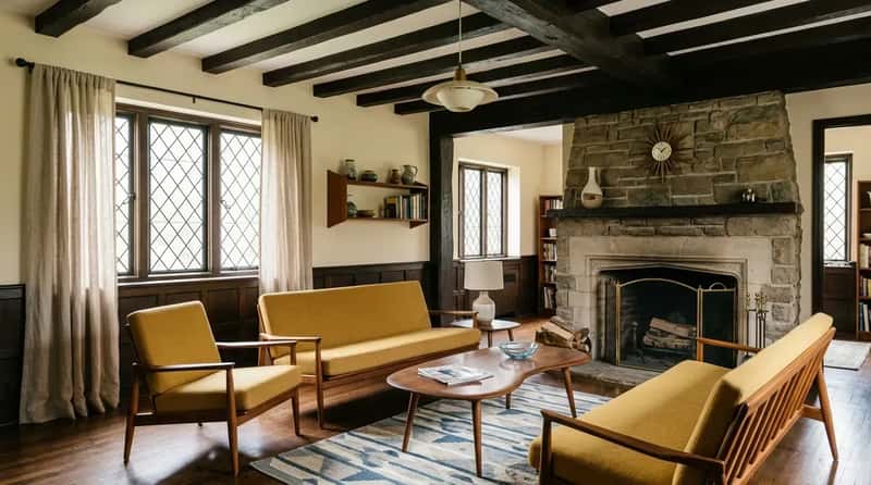
Dark wood beams, small leaded-glass windows, heavy stone, and velvet drapes that hadn’t been opened since 2003. This room was all brooding medieval atmosphere and zero livability – but it was also genuinely beautiful in structure, and the AI seemed to recognize that immediately. Rather than fighting the architecture, it layered in 1950s modernism the way American designers actually did when mid-century met older housing stock. The 1950s emerged from post-war austerity with a new home-styling ethos rooted in function, optimism, and a streamlined aesthetic – the exact counterweight this heavy room needed.
The render kept the beams and stone but replaced the heavy velvet with lightweight linen drapes in warm ivory. A pair of Eames-inspired lounge chairs in cognac leather faced a sleek teak coffee table. Abstract wall art in ochre and black broke up the stone without competing with it. The contrast between the Tudor bones and the mid-century furniture created something genuinely original – something neither style could have achieved alone. A balanced modern-vintage fusion always presents a more distinctive result than either aesthetic in isolation.
Worth Knowing: Why Mid-Century Mixes So Well With Older Architecture
- Both styles prize natural materials – wood, stone, brick all belong in the same room
- Mid-century’s clean lines visually “rest” against ornate period details without competing
- Teak and walnut warm up the cold stonework that Tudor and Craftsman homes often carry
- Linen and boucle fabrics soften heavy architecture without adding visual noise
- 1stDibs’ 2026 trend report notes that collectibles from the 1920s–1950s are actively growing in popularity among designers
#8 – The Living Room Where the TV Was Clearly in Charge
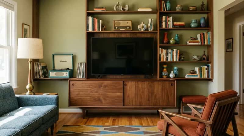
This room had been fully organized around a 75-inch television on a floating wall mount, with every chair, every sofa, and every sightline aimed directly at it like a stadium. It wasn’t a living room so much as a viewing theater with a couch. The television did emerge as a centerpiece of family life during the 1950s – but the era put the TV inside a furniture context, not the other way around. That distinction matters more than most people realize.
The AI’s most controversial choice: it shrunk the visual dominance of the TV by placing it inside a credenza-style media unit in walnut, surrounded by shelving holding books, ceramics, and a vintage-style record player. The TV became one element in a composed vignette rather than the room’s entire reason for existing. Record players were a cultural fixture of the 1950s – both functional and conversation-starting. Several people who saw this render said it made them immediately reconsider their own living rooms.
#7 – The Condo With Floor-to-Ceiling Concrete Everywhere
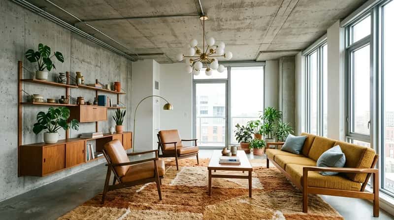
Industrial lofts and concrete-heavy condos have had a long run as the default “cool” aesthetic in American design. But this unit had taken the concrete too far – raw concrete floors, concrete ceiling, concrete accent wall, and then a collection of black metal furniture to match. Stylish in concept, physically cold in reality. The AI’s 1950s answer was warmth. Deliberate, strategic, historically accurate warmth. Mid-century modernism made homes brighter, layouts more open, and design less ornate – the exact opposite of this room’s heavy industrial mood.
The render layered in a thick wool area rug in caramel tones to break the concrete floor. The black metal furniture became warm teak. Mustard yellow throw pillows and a ceramic table lamp in warm white added the softness the concrete had been swallowing. The AI essentially prescribed color therapy for a room that had been deliberately starved of warmth. The transformation was visceral – the kind of before-and-after that makes you wonder why the original ever seemed acceptable.
#6 – The Suburban Room Wallpapered in Gray Chevron on Every Wall
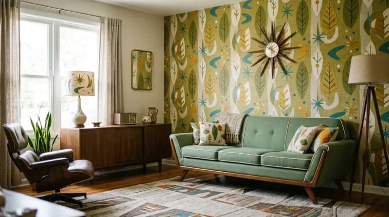
The gray chevron wallpaper trend peaked around 2014 and should have retired quietly. This room had it on every single wall. Combined with a gray couch, gray curtains, and gray carpet, the room had achieved a remarkable consistency that was also entirely depressing. The AI approached this like a reset more than a refinement. The 1950s embraced bold, optimistic pattern – atomic prints featuring starbursts, orbits, boomerangs, and abstract molecular shapes in energetic repeating designs. The chevron was gone. The atomic era arrived.
Two walls got a stylized mid-century leaf print wallpaper in olive and cream. The gray couch became a sage green sofa with white piping detail. A starburst clock above the fireplace and a pair of orange ceramic table lamps punctuated the space with exactly the optimism the room had been missing. It’s remarkable how quickly a room that felt anxious became a room that felt alive. These tones didn’t just look good – they symbolized cleanliness, optimism, and domestic pride.
#5 – The Farmhouse-Style Room That Had Run Its Course
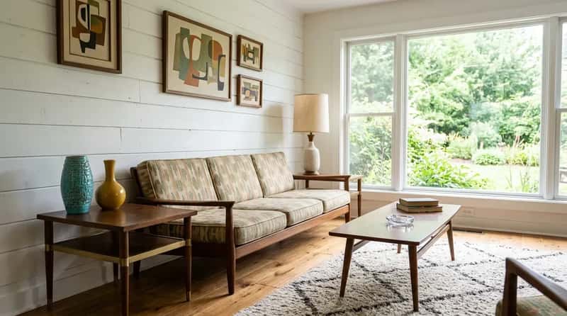
Shiplap. Galvanized metal buckets used as decor. A sign that said “gather.” Buffalo check everywhere. This room was a deeply sincere homage to a trend that crested around 2017, and it showed every year of wear. To be fair, the bones were good – wide-plank floors, generous natural light, real architectural character. The AI recognized all of that immediately and made the pivot from farmhouse to mid-century feel inevitable rather than forced. Blending old and new is one of the most powerful moves in retro-chic design, and this room had more raw material than it knew.
The shiplap stayed – it’s just wood, and 1950s ranch homes had plenty of it. The galvanized buckets became a pair of ceramic vases in avocado green. The buffalo check disappeared in favor of a bold, oversized abstract print in gold and black. The wide-plank floors turned out to be the best mid-century detail in the room all along – nobody had ever just let them breathe before. Iconic mid-century coffee tables and side tables often featured organic shapes in teak or walnut, and the AI served exactly that alongside those long-neglected floors.
#4 – The Historic Craftsman Home With Beautiful Bones Being Ignored
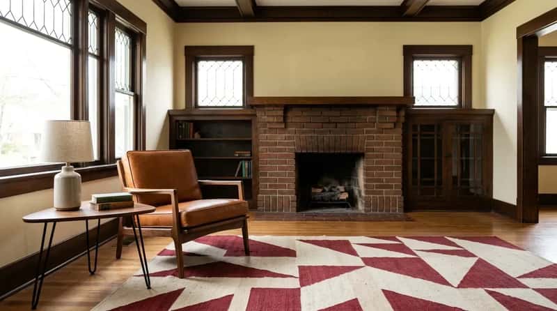
This 1920s Craftsman had original built-ins, a brick fireplace with a wooden mantel, hardwood floors, and leaded glass details – and someone had staged it with contemporary furniture so aggressively neutral that every original detail was being visually cancelled out. The AI made one firm decision: honor the architecture. The 1950s actually revered handcrafted materials and purposeful design, making it a natural stylistic partner for a Craftsman home. Most people never think to pair these two eras. The AI did without hesitation.
The render brought in a cognac leather armchair with a wooden frame, a walnut side table with hairpin legs, and a large wool rug in deep red and cream geometric pattern that referenced both the Craftsman era and mid-century simultaneously. The built-ins got styled with a curated arrangement of ceramics and books. The AI understood that Craftsman bones and mid-century modernism have more in common than most people realize – both prize craftsmanship, natural materials, and purposeful design. The room finally looked like it belonged to someone who loved it.
#3 – The Disastrous DIY Renovation That Got Worse Every Year
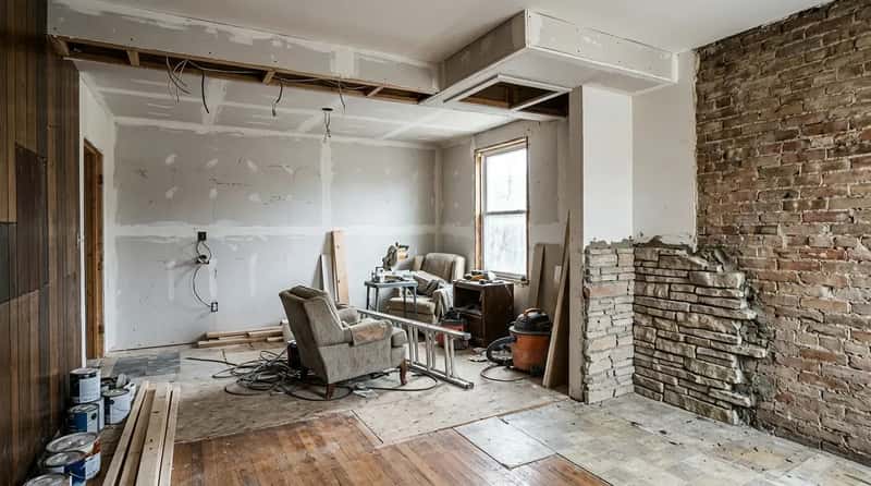
This homeowner had been renovating their living room themselves for approximately seven years, and you could tell. One wall was drywall, one was paneling, one was exposed brick, and one had an unfinished faux-stone veneer halfway up. The floors were three different materials. There were two ceiling heights because a soffit had been started and never finished. It was the design equivalent of a sentence that never ends – and everyone who walked through the door could feel the incompletion before they sat down.
The AI showed this homeowner what the room could be if they committed to one direction and finished the job. The render chose the exposed brick as the hero element, painted the other three walls a deep navy, and unified the mismatched floors under a large jute area rug. The unfinished soffit was rendered as a finished boxed beam – adding character rather than looking abandoned. This was the most instructive render of the entire batch because it showed a living, in-progress situation exactly what it needed to become. The homeowner reportedly cried when they saw it.
#2 – The Enormous Victorian Parlor Nobody Used Because It Felt Unapproachable
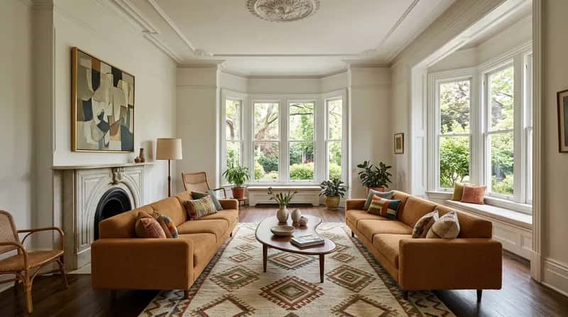
This 1890s Victorian parlor had twelve-foot ceilings, original plaster medallions, a marble fireplace, and bay windows overlooking a front garden. It should have been the most spectacular room in the house. Instead, the family avoided it entirely because it felt like a museum. Beautiful to look at, impossible to inhabit. The AI knew that connection – not decoration – was the missing ingredient. Conversation pits and inward-facing seating groupings were hallmarks of 1950s social design, and this room desperately needed that same philosophy applied to its cold grandeur.
The render placed two long facing sofas in warm caramel boucle directly in the center of the room, creating an inward-facing conversation grouping that made the space feel occupied and intentional for the first time. A large-scale geometric rug in cream, rust, and black grounded the arrangement. Abstract art in bold ochre and teal complemented the plaster ceiling medallion rather than competing with it. The AI understood that the problem wasn’t the room – it was that no one had given people a reason to sit down and face each other inside it. This room finally had a heart. But nothing – nothing – prepared us for #1.
Why It Stands Out: The 1950s Philosophy That Fixed Every Room on This List
- Too gray or beige? Mustard yellow, teal, and coral correct that immediately
- Too chaotic? Clean lines and a single anchor piece restore visual calm
- Too cold? Teak, walnut, and warm wool rugs solve it without a renovation
- TV-dominated? 1950s layouts put conversation first and screens inside furniture
- Too formal or unapproachable? Inward-facing seating gives people a reason to sit down
- The core idea: Mid-century modernism was optimism made physical – and that energy corrects almost every modern design failure
#1 – The Half-Demolished Living Room a Family Was Still Living In

This was the wildest submission we received. A family of four had started a major renovation, stripped the walls to the studs, pulled up the subfloor, disconnected two outlets, removed a doorway that was supposed to become an arch, and then ran out of money. They were living in this room with a camping chair, a folding table, and exposed pink insulation as their “accent wall.” It was not ironic. It was genuinely where they cooked, ate, and watched a laptop balanced on a cooler. They sent it to us as a joke. The AI did not treat it as one.
The render showed every stud wall as a finished plaster surface in warm cream, the subfloor as gorgeous wide-plank hardwood, and the unfinished arch – still just rough framing in the photo – as the room’s defining architectural feature, trimmed in white with a contrasting teal interior. The camping chair became a pair of molded fiberglass shell chairs in pale yellow. The cooler disappeared; in its place, a kidney-shaped walnut coffee table. The AI looked at pure demolition and saw a 1950s dream home waiting inside the wreckage. Emerging from the austerity of post-war years, the 1950s was about homes becoming brighter, layouts more open, and design less ornate – not just a style, but a cultural shift toward optimism. That is exactly what this family deserved to see.
Twenty-five hopeless living rooms. Twenty-five AI-generated 1950s visions. Not a single one came back without something genuinely worth stealing. The global market for AI applied to interior design reached $1.09 billion in 2024 and is projected to expand to $3.59 billion by 2029. After running this experiment, that trajectory feels completely earned. The technology isn’t just generating pretty pictures – it’s diagnosing what rooms are missing and prescribing historically grounded answers. The 1950s aesthetic, with its confidence, its color, and its refusal to apologize for being bold, turns out to be a corrective for almost every modern design failure. Too gray? Bold color. Too chaotic? Clean lines. Too cold? Warm wood. Too TV-dominated? Conversation first, screen second. The era had answers we forgot to keep. Drop the worst photo of your space in the comments – we might just run a part two.