
Walk into a house built before 1990 and there’s a good chance the bathroom stops you cold. Not because it’s broken or ugly – but because it operates on a completely different set of rules than anything you’ve ever lived with. Mauve toilets. Wall-to-wall carpet. A telephone mounted next to the towel bar. These weren’t mistakes. They were deliberate, expensive choices that people were proud of.
Today’s bathrooms are calm, pale, and practically anonymous – white subway tile, matte black hardware, frameless glass, and nothing that doesn’t need to be there. The 1980s bathroom existed in a parallel universe built on maximalism, matched everything in sight, and had zero fear of color. Some of what’s on this list is coming back. Some of it should probably stay gone. All of it is real.
#23 – Wall-to-Wall Carpeting in the Bathroom
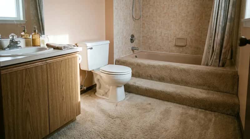
Yes, carpet. Actual wall-to-wall carpet installed right up to the base of the toilet, and in homes that had money to spend, it was considered a sign of luxury. It was soft underfoot in January, it kept the room warmer than tile, and it looked – briefly – like a very cozy decision. The mildew disaster came later.
Moisture, soap residue, and the steady humidity of a working bathroom would work into the fibers in ways no amount of scrubbing could fix. Some homes had the bathtub surround carpeted in white, turning the wettest corner of the room into a textile experiment. Anyone raised on porcelain tile or vinyl plank would look at a carpeted bathroom today and genuinely question what they were seeing.
Fast Facts
- Wall-to-wall bathroom carpet was widely marketed as a luxury upgrade – not a budget option – through the early 1980s.
- Moisture trapped in carpet backing caused mold growth that often wasn’t visible until the floor was pulled up.
- Replacing a damaged section meant cutting and trying to match existing fibers – almost never a clean fix.
- Modern homeowners have largely replaced permanent bathroom carpet with washable area rugs for hygiene control.
#22 – Colored Toilets, Tubs, and Sinks in Matching Sets
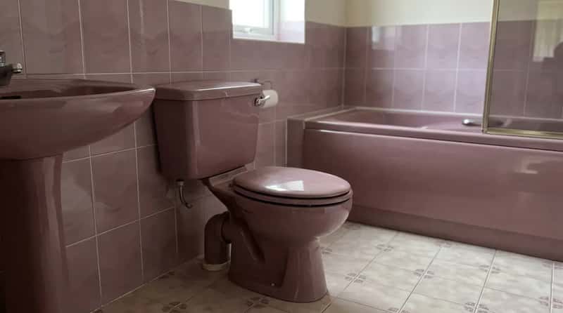
The toilet was mauve. The sink matched. The tub completed the set. These weren’t accent colors – they were the entire color story of the room, and major manufacturers offered coordinated fixture suites in names like “Sunset,” “Magnolia,” and “Stellar.” You could coordinate them with over 60 tile styles in matching color families. The full suite was a status purchase, and people displayed it accordingly.
The practical consequence that nobody talked about at the time: finding a replacement part for a dusty-rose toilet today is nearly impossible. Buyers of older homes have discovered this the hard way when a crack appears in a 1984 peach toilet tank and the only replacement available is bright white. The color match is gone. The whole bathroom suddenly looks like an argument.
At a Glance: The Color Names Were a Whole Era
- Wild Rose and Innocent Blush – Kohler’s signature beige-pinks of the 1980s.
- Peachblow (introduced 1934, peak popularity in the ’80s) – so beloved Kohler brought it back in a limited 2023 Heritage Colors collection after more than 100,000 public votes.
- Spring Green, Mexican Sand, Raspberry Puree – all real fixture colors from real manufacturer catalogs.
- Kohler has billed itself as the first company to introduce full coordinated colored fixture suites, launching the concept in 1927.
#21 – Full-Wall Floral Wallpaper on Every Surface
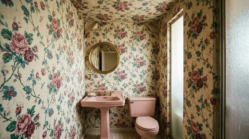
Not one accent wall. Every wall. Floor to ceiling, sometimes extending across the ceiling itself. Bold floral or geometric wallpaper covering every available surface was standard practice in the maximalist ’80s bathroom, and the powder room especially was treated as a showcase for the most dramatic print in the catalog. Small pink roses. Large tropical leaves. Intertwining vines on a cream background. Whatever it was, it went everywhere.
The problem was physics: bathroom steam made wallpaper bubble and curl at the seams within a few years, and the pattern that looked lavish on day one looked tragic by year three. Anyone used to smooth painted walls or clean ceramic tile would walk into a fully papered bathroom today and have a hard time knowing where to look first – which was, arguably, the entire point.
#20 – The Shell-Shaped Sink
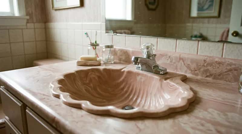
The shell-shaped sink was so iconic that when one homeowner posted a video of herself removing hers during a renovation, it went viral – millions of views, thousands of comments, and a genuine online debate about whether she’d made a terrible mistake. The sculptural basins, usually cast in cultured marble in pastel hues or high-gloss white, turned hand-washing into a small oceanic experience. They were also maddeningly difficult to clean around the ridges.
Marine-inspired elements peaked in the ’80s, and the shell sink was the pinnacle of that trend. The viral backlash when one was removed proved that these fixtures have a surprisingly passionate fan base – people who grew up with them feel genuine affection for the things. For anyone under 30 seeing one for the first time, the reaction tends to land somewhere between confusion and delight, and occasionally both at once.
#19 – Gleaming Polished Brass on Absolutely Everything
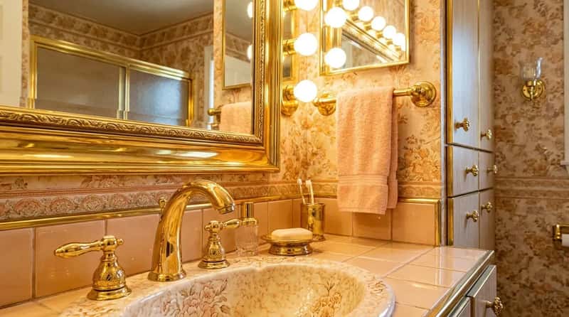
This wasn’t the warm, understated brushed brass that’s quietly trending in modern kitchens right now. This was high-shine, mirror-polished, aggressively golden brass on every metal surface in the room – faucets, towel bars, shower frames, cabinet hinges, light fixture arms, toilet flush handles. If it could be made in brass, it was, and it was finished to catch every photon of light in the room.
The effect, especially under those vanity globe lights, was genuinely dramatic. It looked expensive in 1986. It looked dated by 1998. It looks almost audacious now, which might explain why brass is edging back into design conversations – though the modern version is deliberately muted, almost apologetic by comparison. A fully brass-appointed bathroom from the ’80s looks less like a design choice to younger eyes and more like a dare someone took very seriously.
Quick Compare: 1980s Brass vs. Today’s Brass
- 1980s: Mirror-polished, maximum shine – faucets, towel bars, flush handles, hinges, all matching.
- Today: Brushed or unlacquered finishes, intentionally muted, mixed with other metals.
- 1980s rule: Mixing metals was considered a design error; everything matched perfectly.
- Today’s rule: Mixing metals is encouraged as a sign of a “curated,” lived-in look.
- Comeback status: Brass is back – but the polished, all-in version of the ’80s hasn’t fully returned yet.
#18 – Glass Block Walls and Shower Enclosures
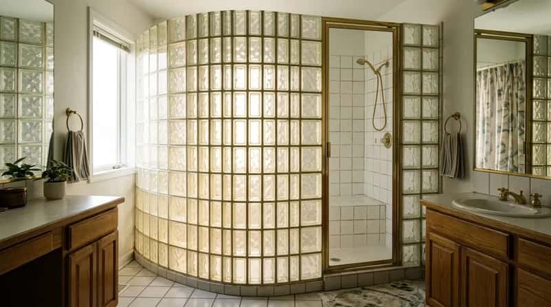
Glass block walls were practically a signature of the 1980s bathroom renovation. Builders loved them because they let natural light filter into shower enclosures while still providing privacy – no solid wall, no frosted glass panel, just a luminous grid of thick translucent bricks that glowed when the sun hit them from outside. In an era obsessed with visual drama, a glass block wall read as architectural, modern, and slightly futuristic.
For a while, glass block became a design red flag – a shorthand for “this house hasn’t been updated since Reagan.” Then something interesting happened: it started coming back. Real estate professionals never stopped appreciating the light they let in, and a new generation of designers is rediscovering the appeal. Still, walking into a bathroom where a chunk of wall is essentially made of translucent bricks is a genuinely strange experience the first time you encounter it.
“Glass blocks get a bad rap in my mind. You still get light and the area feels open, but the privacy is there.”
Jena Salmon, Interior Designer, Dallas
#17 – The Sunken Tub
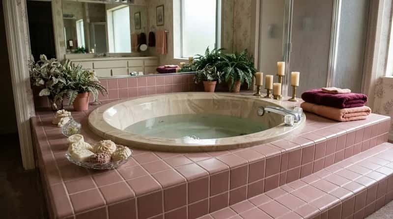
The sunken tub was the centerpiece of the serious 1980s master bath – a step-down whirlpool or Jacuzzi set into the floor, often round, usually surrounded by a tiled deck wide enough for candles, potted plants, and decorative soaps that were never under any circumstances meant to be used. The rest of the bathroom existed to frame it. It was the equivalent of putting a fireplace in the middle of the room.
The raised, tiled platform also doubled as display space, and in fully committed installations, it included built-in planters for ferns. The practical reality that emerged over decades: sunken tubs collect standing water around the drain, the steps become a genuine fall hazard especially when wet, and the elaborate tile surrounds require a staggering amount of grout maintenance. To a younger homeowner, a sunken tub reads as both an obvious luxury and an obvious liability – because it is absolutely both.
Worth Knowing
- During the 1980s, Jacuzzi expanded its home line to include models that functioned as whirlpool baths, hot tubs, or both – bringing spa culture indoors.
- Sunken tubs in 1980s master baths were often round and jetted, set into tiled platforms with wide surrounding decks.
- Today, jetted tubs are widely considered a home-value liability – one of the few 1980s features that actively lowers resale appeal.
- The steps required by a sunken or raised tub installation are now flagged as a fall hazard in accessible-design guidelines.
#16 – The Wall-Mounted Telephone
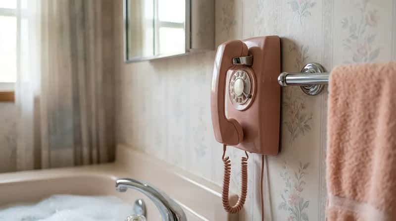
For the luxury bathroom of the 1980s, a wall-mounted phone extension wasn’t a novelty – it was a genuine status symbol. A direct hardwired line, usually in a coordinating pastel color, mounted next to the towel bar so you’d never miss an important call during your bubble bath. No caller ID. No voicemail. Just a phone that rang until someone answered it, because the world needed to reach you at all times, including when you were in the tub.
The cord stretched about four feet. You weren’t going anywhere. For anyone who has grown up with a smartphone that follows them into every room automatically, a dedicated hardwired telephone mounted in the bathroom feels simultaneously redundant and weirdly charming – a monument to the specific anxiety of a decade that feared missing things before the technology existed to miss everything constantly.
#15 – Mirrored Walls Everywhere
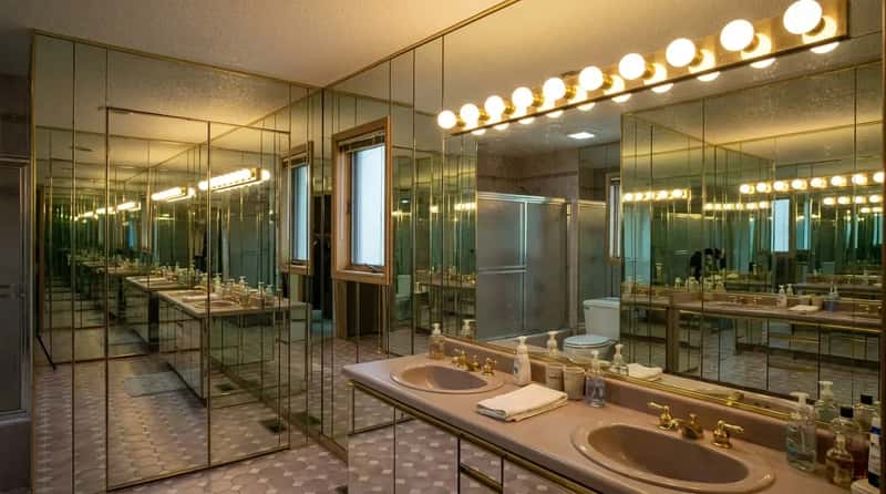
One mirror above the sink wasn’t enough. The ’80s bathroom covered entire walls – sometimes multiple walls – in mirrored panels, often floor to ceiling, framed in polished brass. The design logic was real: mirrors expand the perceived size of a small room and bounce light around in ways that make a space feel brighter. Combined with those vanity globe lights, a mirrored wall created a genuinely dazzling effect.
The disco era had seeded the idea in the ’70s – mirrors on walls, mirrors on ceilings, mirrors on cabinet fronts – and the early ’80s inherited it with full commitment. The maintenance reality was relentless: every water splash, every hair spray mist, every steam cloud from the shower left evidence on a mirrored wall in ways that painted drywall simply doesn’t. A young homeowner walking into a bathroom where their reflection is multiplied across four brass-framed walls is justified in thinking they’ve stepped into a funhouse.
#14 – The Hollywood Vanity Light Bar
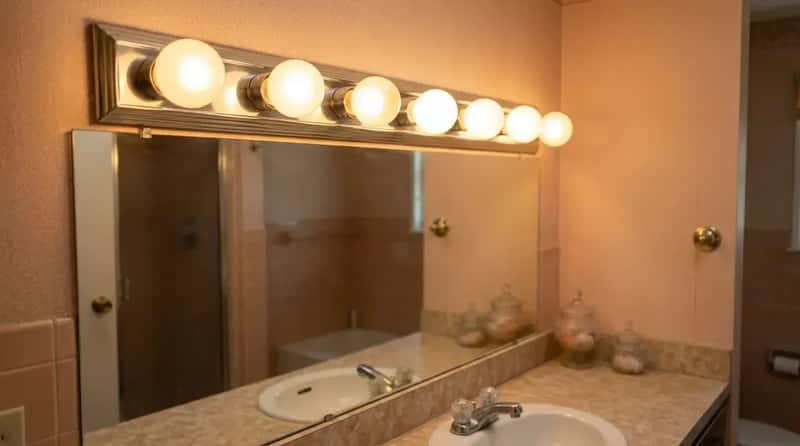
A row of large exposed globe bulbs mounted directly above the mirror, casting warm even light from directly in front of your face – the Hollywood-style vanity light bar was the bathroom lighting standard of the 1980s. It recreated the look of a film star’s dressing room, and it actually worked beautifully for applying makeup, which is why professional makeup artists still use the same configuration today.
The bulbs were large incandescents, usually running at 60 watts each, and a standard six-to-eight-bulb bar could consume as much electricity as several modern LED bathroom setups combined. They ran hot. They burned out frequently. They cost real money to operate. None of that mattered, because under those lights, in that bathroom, you looked like someone who belonged on a movie set. In the ’80s, that was a perfectly valid reason to make a decision.
#13 – Coordinated Towels Displayed as Pure Decoration
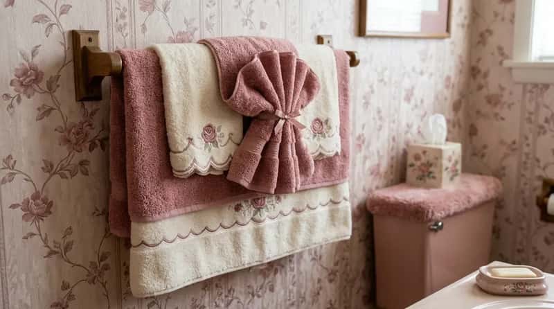
The good towels were never to be touched. This was a rule so deeply embedded in 1980s bathroom culture that it required no explanation – everyone in the house simply understood. Thick, color-coordinated towels were folded into elaborate fan shapes or layered on the towel bar specifically as décor. They matched the wallpaper, which matched the rug, which matched the toilet tank cover. They were visual elements, not functional ones.
The actual towel you were allowed to dry your hands with lived behind a cabinet door – slightly thinner, less photogenic, the working-class cousin of the display set. Homeowners would sometimes apologize to guests for handing them a non-decorative towel, as if the functional one represented a failure of hospitality. To anyone under 30, the concept of bathroom fabric that exists purely to be seen and never to touch water is a deeply strange piece of social history.
#12 – The Toilet Seat Cover and Tank Topper Set
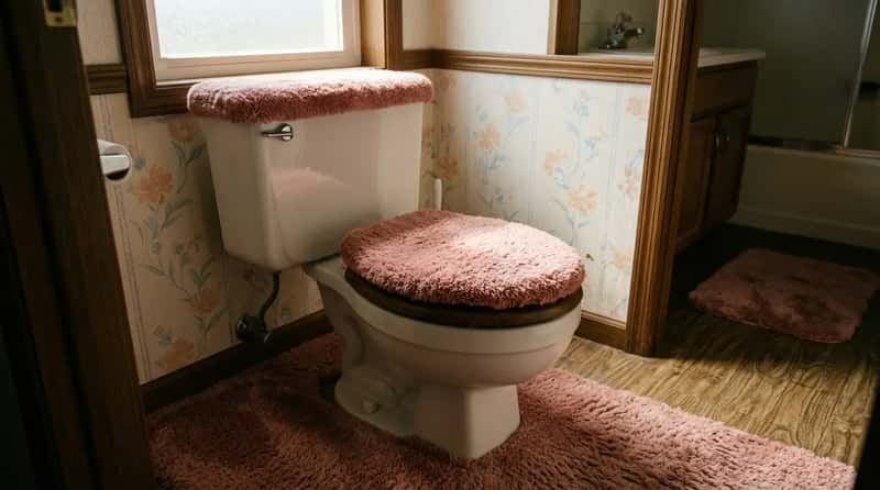
Fabric toilet seat covers and matching tank lid toppers were not a quirky outlier in the 1980s – they were mainstream bathroom décor, sold in every department store and found in millions of American homes. Usually made in plush shag material and available in mauve, dusty rose, teal, and powder blue, they were designed to soften the toilet’s hard lines and fold it into the room’s overall color story. The toilet was not allowed to look institutional. The toilet was part of the décor.
A complete set typically included the lid cover, the tank topper, a floor mat that wrapped around the base of the toilet, and a small coordinating rug for the vanity area. The color scheme of an ’80s bathroom left nothing uncovered – literally. The fabric toilet tank cover is one of those objects so completely tied to a specific cultural moment that simply seeing one is enough to place you instantly in time. It’s a portal. A shaggy, mauve-colored portal.
At a Glance: The Full Toilet Coordinating Set
- Lid cover (fabric or shag)
- Tank topper (matched to lid cover)
- Floor mat wrapping the base of the toilet
- Coordinating vanity-area rug
- Available palette: mauve, dusty rose, powder blue, teal – in the same color family as the fixtures
#11 – Geometric Patterns Everywhere (The Memphis Milano Effect)
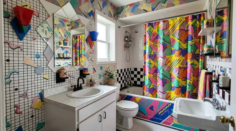
The Memphis Milano design movement – bold shapes, contrasting colors, aggressive pattern mixing – arrived in American homes in the early ’80s and hit bathrooms with full force. Zigzag tile borders. Diamond-shaped mirror accents. Shower curtains printed with overlapping triangles in colors that should not logically coexist. The whole effect was energetic, slightly chaotic, and unmistakably of its moment. It looked like the room had opinions.
Some bathrooms fully committed to the Memphis aesthetic with asymmetrical elements, clashing prints, and a playful rebellion against every rule of traditional design. For a generation raised on Scandinavian minimalism and calm neutral palettes, walking into a bathroom where the tile, the wallpaper, and the shower curtain are all aggressively patterned in competing geometric prints produces a specific kind of visual overwhelm. It genuinely looks like the room is vibrating. The ’80s considered that a compliment.
Fast Facts: Memphis Milano
- Founded by Ettore Sottsass and a group of young designers in Milan in December 1981 – named after a Bob Dylan song that kept skipping at their first meeting.
- The movement debuted publicly at Milan’s Salone del Mobile in 1982 and drew enormous crowds.
- Defining hallmarks: bright colors, geometric shapes, strong patterns, clashing hues, and plastic laminate surfaces.
- Memphis design influenced everything from tile borders to shower curtains in American homes within just a few years of its Italian debut.
- The movement is officially experiencing a revival – the Memphis Milano Collective exhibited more than 200 original objects at the 2022 Triennale Milano.
#10 – The Double Vanity With His-and-Hers Sinks
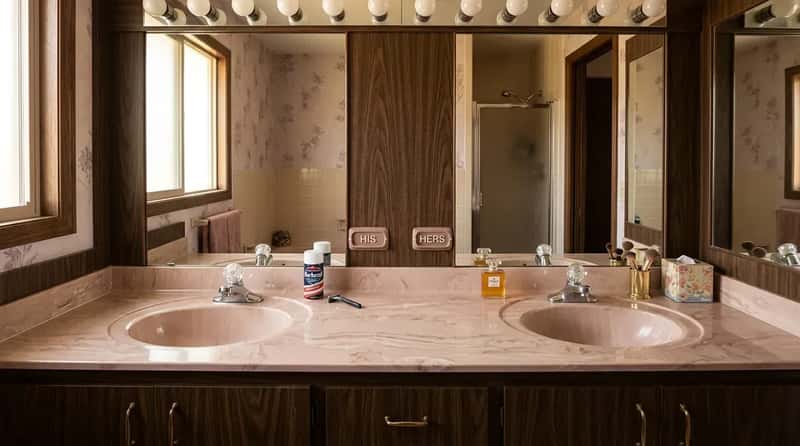
The double vanity was a luxury marker in 1980s home design, and builders who included one made sure potential buyers knew it. Master baths featured wide expanses of cultured marble countertop running the full length of the wall, with matching lavatories positioned on each side – designated his and hers with the kind of explicit gender labeling that the decade applied to everything from razors to deodorant. The countertop was invariably a shade of pink, beige, or off-white cultured marble with distinctive veining.
What would confuse a younger homeowner today isn’t the double sink itself – that’s still popular – but the complete ecosystem surrounding it: the laminate-framed mirror running in one solid piece across both basins, the matching brass fixtures on each side, the louvered cabinet doors in glossy white paint. It was a very specific, very complete aesthetic system. It looked like it had been designed by someone who had just discovered the word “luxurious” and intended to use it in every sentence.
#9 – The Raised Tub Deck Tiled in Mosaic
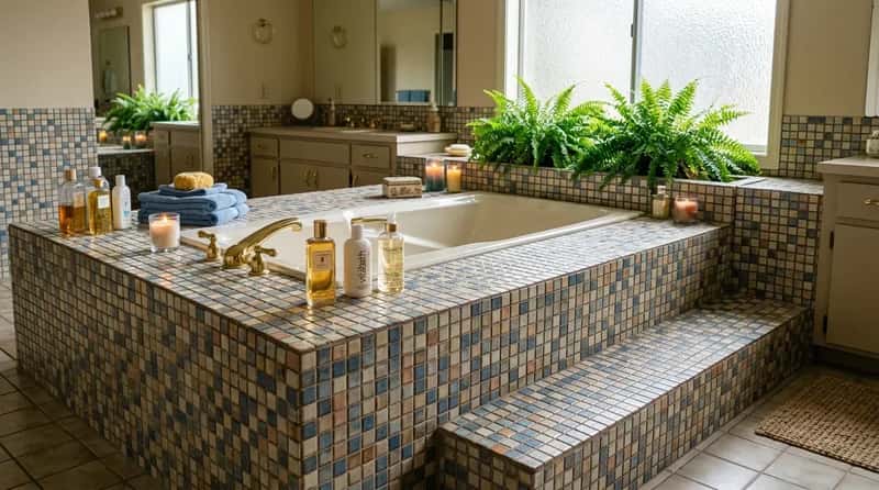
The raised tub platform – a step-up structure that elevated the bathtub above floor level, surrounded by a wide tiled deck – was one of the signature architectural moves of the 1980s master bath. The deck around the tub served as display space for candles, bath oils, and carefully arranged accessories, and was almost always finished in the same ceramic or mosaic tile as the rest of the room. Bonus points for built-in planters along the surround holding Boston ferns.
The structural complexity of a tiled, elevated tub platform is completely foreign to anyone who has only ever lived with a drop-in soaking tub or a walk-in shower. It required a structural subfloor, a waterproofing system, and – as owners discovered years later – an extraordinary commitment to grout maintenance. Every square inch of that mosaic deck was a grout line waiting to stain. The ’80s homeowner installed it anyway, because it looked spectacular, and spectacular was the whole point.
#8 – The High-Contrast Miami Vice Color Scheme
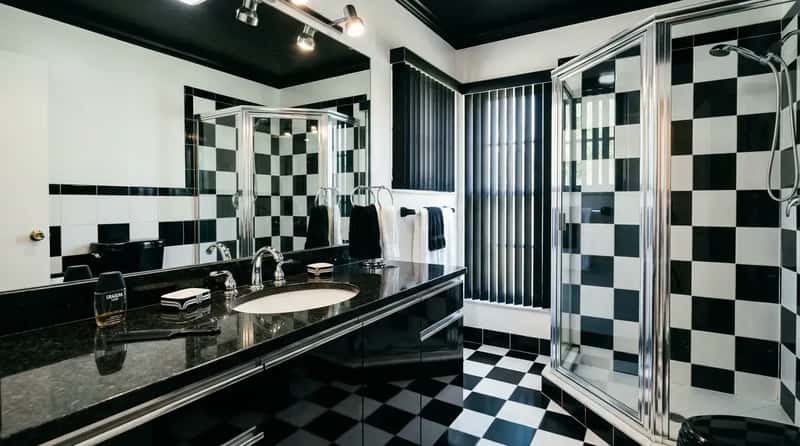
Not every ’80s bathroom was soft and pastel. By mid-decade, a harder-edged aesthetic had emerged – black granite counters, white fixtures, black-and-white geometric floor tile, chrome accents. High-contrast and completely uncompromising, it looked like something out of a Miami Vice set, which was not an accident. The show premiered in 1984 and its visual language – saturated color, sharp contrast, cinematic lighting – spread immediately into interior design.
Where the early ’80s bathroom whispered in mauve and peach, the late-decade Miami Vice bathroom shouted in black and white with a chrome megaphone. It was a direct reaction against the softer palette that had opened the decade, and it hit powder rooms and master baths with equal force. By the early 2000s, neutral stone tile and brushed nickel had erased almost all of it, making the whole high-drama period feel like a fever dream – vivid and a little surreal in retrospect.
#7 – The Three-Way Medicine Cabinet Mirror
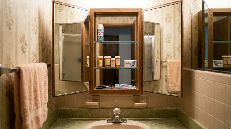
The three-panel medicine cabinet – a central mirrored door flanked by two hinged mirror panels – was practically standard issue in 1980s bathrooms. You could swing the side panels out and examine the back of your own head, check your profile, or achieve the specific anxiety of seeing approximately seven angles of your face simultaneously. The infinite mirror effect created when both panels faced each other was either mesmerizing or deeply unsettling, depending on your age and philosophical outlook.
The cabinet depth was usually just enough to hold a row of prescription bottles, a can of Aqua Net, and a bar of soap. Storage efficiency was not the point. The point was the mirror, and in a decade that believed more reflective surfaces meant better design, the three-way cabinet was the logical conclusion of that philosophy. A younger homeowner encountering one today would probably open and close the side panels repeatedly, which is the correct response.
#6 – Lush Indoor Plants as a Core Design Element
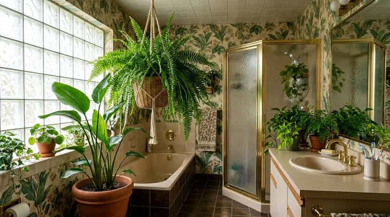
The 1980s bathroom practically required a fern. Not a small succulent on a shelf – a full, cascading Boston fern in a wicker basket positioned near the window to absorb steam from the shower, or a bird of paradise in the corner that was technically too large for the space. Beyond live plants, botanical motifs appeared on shower curtains, wallpaper, and accessories, often in the decade’s characteristic saturated palette. The bathroom was supposed to feel alive.
This was genuinely clever logic: humidity-loving plants thrive in bathrooms, the greenery softened hard reflective surfaces, and a well-placed fern made even a maximalist room feel less aggressive. The modern minimalist bathroom has largely abandoned this in favor of empty countertops and bare windowsills. The result is cleaner, easier to photograph for Zillow, and noticeably less alive. The ’80s bathroom had a pulse. You could feel it walking in.
Worth Knowing
- The bathroom-plant trend began in the late 1970s but peaked firmly in the 1980s, with ferns, potted palms, and philodendrons all common choices.
- Ferns positioned over or near the tub were particularly popular – they genuinely thrive in high-humidity environments.
- With interest in biophilic design rising in the 2020s, plants in the bathroom are catching on again – though the modern version tends toward a single small plant, not a jungle.
- The ’80s approach: the bigger and more dramatic the plant, the better. A large ficus tree next to a sunken tub was considered an achievement.
#5 – Pattern-on-Pattern Mixing as the Default Approach
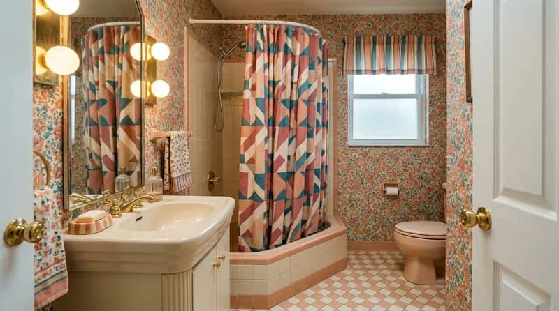
The ’80s didn’t stumble into pattern mixing – it pursued it deliberately. Interior design magazines of the era ran actual instructional features on how to layer prints: pair a small-scale floral with a large-scale geometric, choose a consistent four-color palette across all patterns, use a stripe as the neutral that holds everything together. A bathroom might have a small floral wallpaper, a large geometric shower curtain, a diamond-pattern floor tile, and a striped window valance – all in the same color family, all simultaneously present.
To eyes trained on modern minimalism, the result looks chaotic. But there was real craft in doing it well. The best ’80s bathrooms pulled off a visual complexity that contemporary design has mostly abandoned as too difficult to execute without looking like a mistake. The difference between a masterfully patterned ’80s bathroom and a chaotic one was real skill – the decade just expected more of its homeowners than “keep it simple.”
#4 – Everything From the Same Manufacturer’s Coordinated Suite
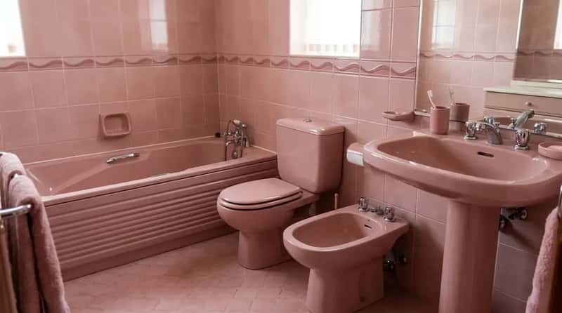
The real power move wasn’t just matching colors – it was buying everything from a single manufacturer’s coordinated suite. Toilet, tub, sink, and bidet all in the same proprietary color, all from the same catalog page, all guaranteed to match because they came out of the same factory in the same batch. Since the early 20th century manufacturers had sold coordinated fixture sets, but by the 1980s this concept had reached its fullest and most elaborate expression.
A younger homeowner today is accustomed to mixing brands, finishes, and eras to create a deliberately eclectic “curated” look. The 1980s philosophy was the direct opposite: everything came from the same family, everything matched, and anything that didn’t was considered an error in judgment rather than a creative choice. The ’80s bathroom was a unified argument. Every object in the room voted for the same color, the same finish, the same aesthetic position. There was no dissent.
#3 – The Bidet That Almost Nobody Knew How to Use
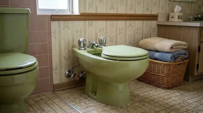
The bidet appeared in American bathrooms during the 1980s primarily as a status symbol. Manufacturers like Eljer actively promoted them as part of luxury bathroom suites, and installing one signaled that you had traveled to Europe, had opinions about personal hygiene that your neighbors did not share, and were comfortable spending money on something you couldn’t easily explain to visitors. It was a fixture of aspiration first and function a distant second.
The irony is almost perfect: bidets are genuinely popular again, with bidet attachments for standard toilets becoming one of the most common bathroom upgrades of the 2020s. But the standalone porcelain bidet of the ’80s – a separate low-profile fixture requiring its own plumbing connections and an unwritten owner’s manual – occupied an awkward space between sophistication and confusion for most of its American owners. Anyone under 30 who encounters one today is equally puzzled, but for entirely different reasons.
Why It Stands Out
- In 1980, Japanese manufacturer Toto introduced the Washlet – a bidet toilet seat with rear cleansing, a dryer, and a heated seat – kicking off the modern bidet era.
- Toto has since sold over 60 million Washlet seats worldwide, making the bidet concept mainstream in a way the 1980s standalone fixture never achieved in the U.S.
- The freestanding porcelain bidet required its own separate hot and cold plumbing connections – a significant installation commitment.
- Most American households with a 1980s bidet installed it as a luxury status piece; many owners admitted to rarely or never using it.
#2 – The Fully Coordinated Color System (Down to the Bar Soap)
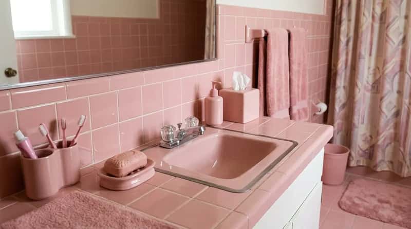
In a fully committed ’80s bathroom, the color story didn’t stop at the fixtures. Tiles, towels, bath mat, shower curtain, soap dispenser, waste basket, tissue box cover, and the actual bar soap were all chosen to reinforce a single palette. Colors like Wild Rose, Innocent Blush, and Desert Sand appeared on every surface. Decorators worked seriously to source complementary shades and pop accent colors that held the whole composition together. Finding the right soap color took effort.
Modern bathrooms are designed to look effortlessly casual – the “I didn’t try too hard” aesthetic, where a few neutral objects suggest calm good taste without visible effort. The 1980s bathroom was the opposite. It was designed to look like someone had tried very, very hard. And they had. The coordinated bathroom was a project. It required planning, sourcing, and a genuine commitment to a single vision. Whether that vision involved mauve or black-and-white, it was executed with total conviction.
#1 – The Bathroom Treated as a Real Room Worth Decorating
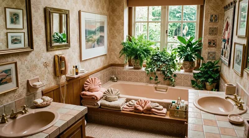
The thing that would baffle a younger homeowner most isn’t any single feature on this list – it’s the philosophy behind all of them together. The 1980s bathroom was treated as a legitimate room in the house, deserving of the same decorating ambition as a living room or dining room. It had art on the walls, plants on the windowsill, a phone by the tub, towels folded as sculpture, and a color story that ran from the grout lines to the hand soap. It was a designed space, not a functional one with decorating as an afterthought.
The decade’s logic was simple and human: you spend real time in this room, so it should be worth spending time in. The yuppie lifestyle meant long hours away from home, which made the personal sanctuary of a well-appointed bathroom feel genuinely important. Modern bathrooms optimize for resale value, easy cleaning, and looking clean in listing photos. The ’80s bathroom optimized for making an impression on the person using it. That’s a different set of values – and it’s not entirely clear which approach was wrong.
Glass block is back. Brass is back. Bold color is quietly appearing in new construction again. The 1980s bathroom was excessive, occasionally absurd, and deeply committed to the idea that a room should have a personality. It was never boring. If you grew up with one of these features, you probably have feelings about it. If you didn’t – now you know what was behind that closed door.