
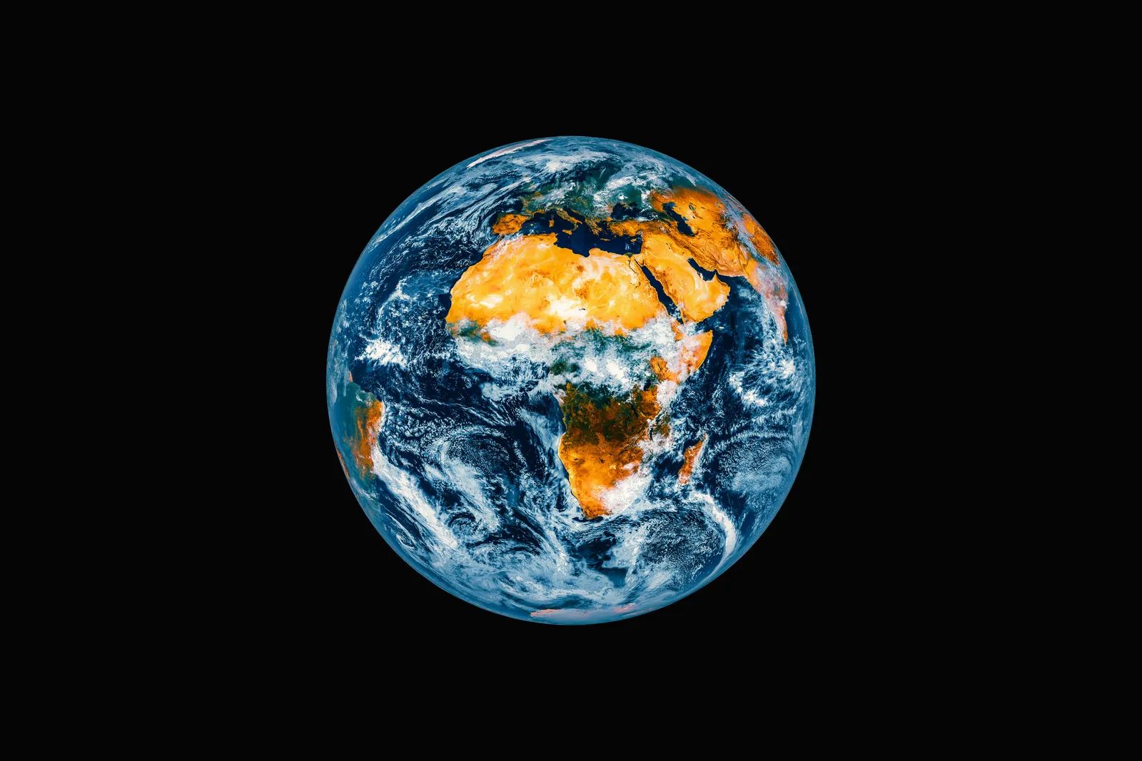
For decades, many schoolchildren have studied a world map that makes Africa look far smaller than it is. The United Nations General Assembly has now endorsed a new standard that shows the continent in its true relative size. Campaigners say the change is about more than geography, and that the people who live in Africa’s forests remain largely absent from the picture. ([1])
A projection that flattened a continent
Africa is the world’s second-largest continent by area and is home to more than a billion people, a scale that older maps failed to convey. The African Union has backed a campaign to end the use by governments and international organisations of the 16th-century Mercator map of the world in favour of one that more accurately displays Africa’s size. The problem, according to the African Union’s deputy chairperson, is that the Mercator projection fostered an impression that Africa was marginal. Geographers have long said the traditional map is only useful for navigation.
The alternative in circulation is the Equal Earth projection, which was developed in 2018 by three cartographers. The table below summarizes how the two compare in the sources reviewed.
| Feature | Mercator | Equal Earth |
|---|---|---|
| Origin | 16th century | 2018 |
| Main strength | Navigation | Proportional land masses |
| Depiction of Africa | Understates its size | Reflects its true scale |
From classrooms to global institutions
The shift gained momentum through the Correct the Map campaign, which the African Union supported. Advocacy groups Africa No Filter and Speak Up Africa pressed organizations to adopt Equal Earth, and they asked institutions such as the World Bank and the United Nations to do the same. ([2]) The General Assembly vote on a Friday in early September marked the culmination of that effort, and the United States was the only member to vote against it. ([3])
Supporters frame the issue as one of perception as much as accuracy. One of the campaign’s officials argued that correcting the map also means correcting a perception. Campaigners now want the new projection used in textbooks, newsrooms and digital platforms, not only in official documents.
The forests that still do not appear on the map
The Mongabay commentary argues that the map debate leaves out a more consequential question. The Congo Basin, the world’s second-largest rainforest, is a patchwork of extractive industry concessions, strictly protected areas and an ever-increasing array of carbon offset projects. According to the authors, those arrangements have done little to halt deforestation and biodiversity loss, and they have brought few gains to local residents. In some cases, they have worsened human rights and food security.
Related Stories From Travelbinger

Conventional maps also omit customary land use. The commentary points to longstanding rights held by Indigenous and local communities that stretch across the region but rarely appear on official charts. The authors call for large-scale participatory mapping of community lands, along with legal and policy reforms that would formally recognize those areas. They say the technology and regional expertise to do this already exist. ([1])
The UN decision corrects how Africa is drawn, but it does not determine who holds rights on the ground. Whether the continent’s forest communities receive the same visibility on paper as the continent itself will likely depend on follow-up policy, not on the map alone.